
EXHIBITION
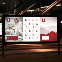
Lugano Region

| Country | Switzerland |
|---|---|
| Year | 2019 |
| Award | GOLD WINNER |
| Client | Ente Turistico del Luganese |
| Affiliation | Caselli Strategic Design |
| Designer | FabioCaselli |
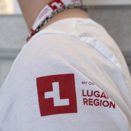
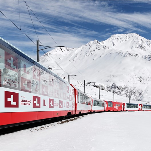
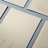
| Description(English) | With its mix of cultures, Lugano represents a very atypical destination within Switzerland: palm trees, olive oil, Mediterranean weather and cuisine can all be found in a safe, quiet and efficient Swiss environment. The brand essence that emerged from this context is "differently Swiss" which has been translated visually in an alteration of the Swiss flag to form the letter "L" of Lugano. A graphic system that aims at displaying the variety of the regional offer has been conceived by designing for each category a specific font in order to give each time a different connotation to the letter “L” of Lugano. |
| Description(Native) | With its mix of cultures, Lugano represents a very atypical destination within Switzerland: palm trees, olive oil, Mediterranean weather and cuisine can all be found in a safe, quiet and efficient Swiss environment. The brand essence that emerged from this context is "differently Swiss" which has been translated visually in an alteration of the Swiss flag to form the letter "L" of Lugano. A graphic system that aims at displaying the variety of the regional offer has been conceived by designing for each category a specific font in order to give each time a different connotation to the letter “L” of Lugano. |
| Website | www.caselli.ch |
| Positive Comments |


|
-
DynaFont King Gothic
-
dBEAT
-
SH-Hero Pen Box (1)
-
Lugano Region
-
HAOK TV Idents 2019
-
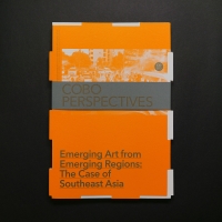
CoBo PERSPECTIVES
-
HODRMEN Brand Design
-
Cashew VS Lacquer
-
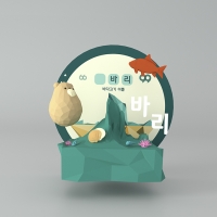
Geongang-won Darin
-
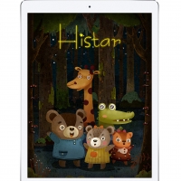
Histar
-
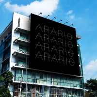
ARARIO Museum
-
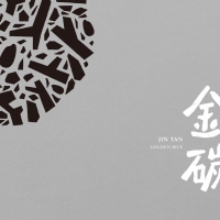
JIN TAN Golden Rice
-
99-Land : AR project
-
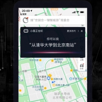
Baidu Map V10 Series
-
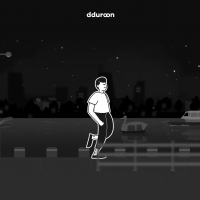
dduroon
-
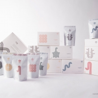
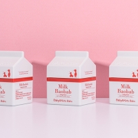
Milk Baobab Baby & Kids
-
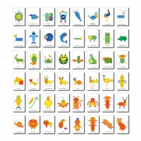
48 animals
-
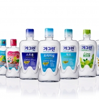
Garglin(Mouthwash)
-
Brand Design
-
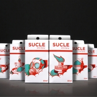
Sucle
-
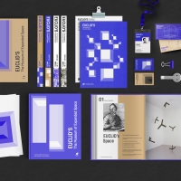
The Museum Of Space
-
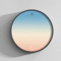
Colors of Time
-
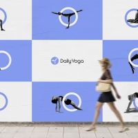
Daily Yoga
-
Coreintive Identity
-
MACAO MUSIC FESTIVAL
-
nonoodle
-
beaytiful ginger
-
Zhe Gu Tea

Designed by sketchbooks.co.kr / sketchbook5 board skin