
EXHIBITION
‘SeptFest 2015’ identity and publicity materials
| Year | 2016 |
|---|---|
| Award | WINNER |
| Affiliation | qu'est-ce que c'est design |
| Designer | Bryan Angelo Lim, May Lim, Victoria Lee |
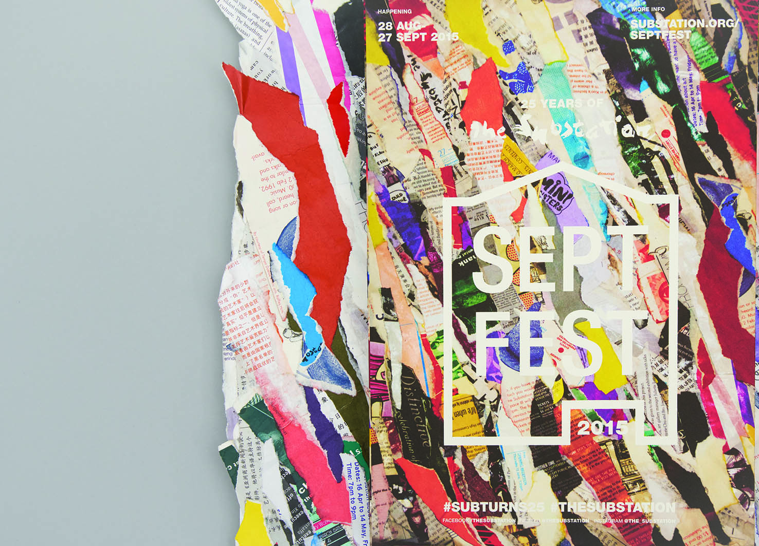
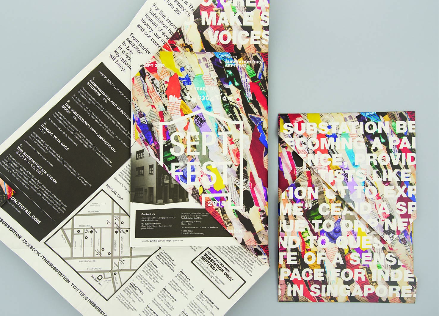
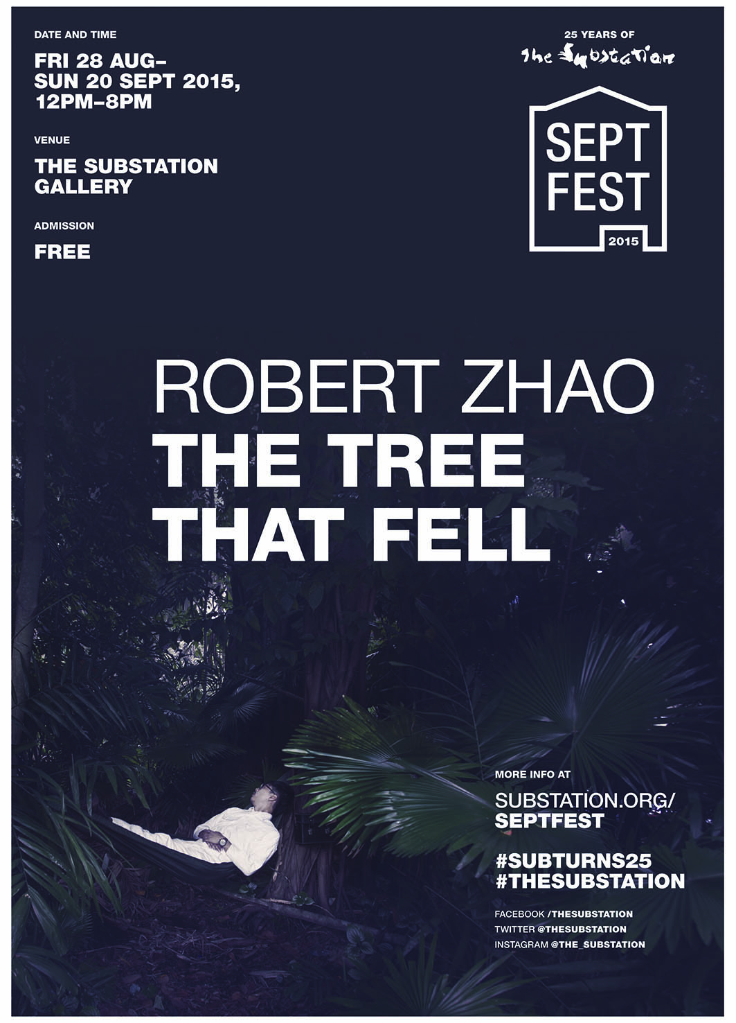
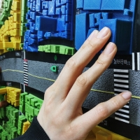
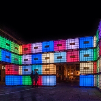
| Description(English) | The identity for Septfest, The Substation’s anniversary celebration, was developed out of the idea “reconstituting the past for the future”. The papier-mâché key visual that was made out of their old printed collaterals was inspired by peeling layers of posters plastered over each other on a wall, which is a visual metaphor for the critical role that the contemporary arts centre has played for emerging artists in Singapore through its programmes for the past 25 years. For its silver jubilee, the organisation was “peeling away its layers” to find its place in the years to come. The logo mark takes reference from handbills and wheat paste graphic posters. |
| Website | http://quest-ce.com |
-
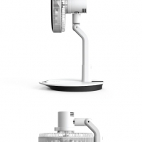
elago W2 Nightstand
-
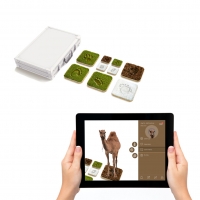
3D Finger Map
-
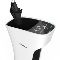
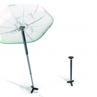
Nuvola - The Smart Umbrella Stand
-
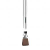
Magnet Brush
-
Wander
-
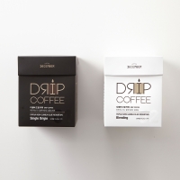
December Drip Coffee
-
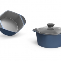
Easy to use pot
-
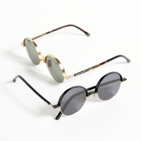
'Johnny' Eyewear Design
-
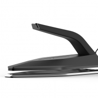
Curling Iron Package
-
Tebashi - Korean traditional soybean paste & red pepper paste miniature set
-
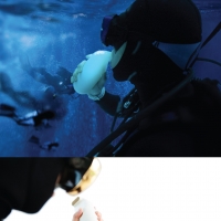
Scubar
-
Fence
-
Nature Mark
-
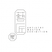
Artistry Master Eexhibition Brand Design & Identity
-
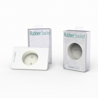
Rubber socket
-
Life style sunshine residents
-
Folding Fan
-
Mirror Toothbrush
-
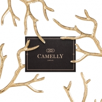
Camelly - Jewelry
-
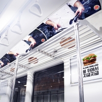
THE SUBWAY GRILL SHELF
-
Reverse umbrella
-
BODY FIT
-
EZEGG
-
Swing Tour
-
There is light
-
StikCharge
-
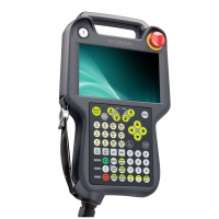
ROBOT TEACHING PANDENT TP-E
-
Bicycle Guardians


Designed by sketchbooks.co.kr / sketchbook5 board skin