
EXHIBITION
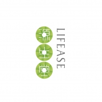
LIFEASE Brand Identity


| Year | 2016 |
|---|---|
| Award | WINNER |
| Affiliation | Willer Design |
| Designer | Ma Hao, Li Shaochen |
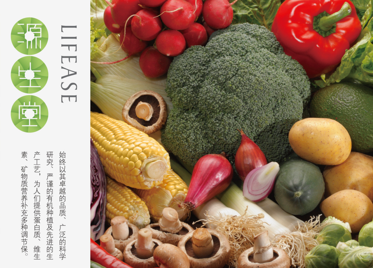
| Description(English) | In the design process, we need to use figurative language to describe the healthy brand concept of LIFEASE, and establish an identification of the brand image. We will use the tender green buds as the basic element, giving fresh and healthy visual experience, and then form a circle in the center, combined with the three characters, namely, yuan, sheng and tang in a vertical column, which is on behalf of the Taoist concept that the way bears sensation, sensation bears memory, sensation and memory bear abstraction, and abstraction bears all the world. In the initiative of LIFEASE, people’s diet standard is rising. The overall brand image is less is more. All the packaging, handbags and posters are clean and elegant, which attracts more young clients that pay more attention to the quality of life. |
| Description(Native) | 在设计过程中我们需要用形象化的语言阐述LIFEASE品牌的健康理念,树立具有识别性的品牌形象。我们将嫩绿色的叶芽作为基本元素,给人新鲜健康的视觉体验。然后中心环绕形成圆,配合“源”“生”“堂”三个字排成竖列组合,代表一生二,二生三,三生无形,生生不息的理念,体现在LIFEASE的的倡导下,人们的饮食水平不断提升。整体品牌形象偏向时尚简约,在所有包装、手提袋及海报上的应用干净优雅,利于给品牌带来更多注重生活品质的年轻消费群体。 |
| Website | http://vidoer.com |
-
Hanbul Cosmetics E NATURE Packaging
-
L.POINT Brand Design
-
Made For IPTV
-
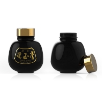
KYUNGOKGO
-
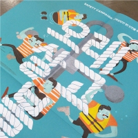
Safety Culture Magazine <You should live a long life.>
-
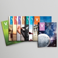
VISANG Education <V Magazine>
-
'betterfly ; Hang Wing For A Better Life' Brand Design
-
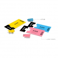
Origami animal tickets
-
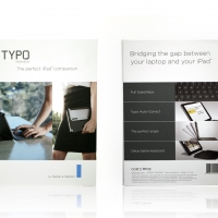
TYPO Keyboard for iPad Air package
-
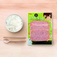
SingCook
-
Korea On-air Cosmetic “RUE”
-
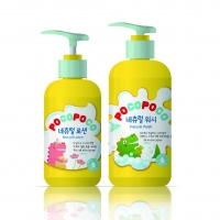
POCOPOCO SKIN CARE
-
HEART
-
Innovation leads to a Better Earth
-
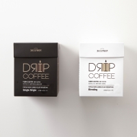
December Drip Coffee
-
Curling Iron Package
-
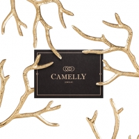
Camelly - Jewelry
-
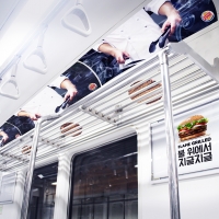
THE SUBWAY GRILL SHELF
-
EZEGG
-
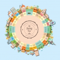
Swing Tour
-
Everlasting Moments
-
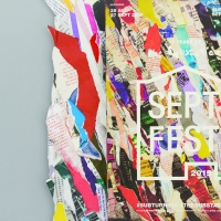
‘SeptFest 2015’ identity and publicity materials
-
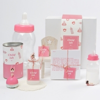
Child-ish Beer Packaging
-
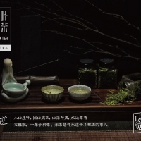
Moni Longjing TEA-MOUNTEA
-
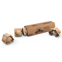
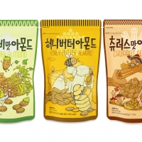
Nuts Snack Series
-
LIFEASE Brand Identity
-
SFUN BOX

Designed by sketchbooks.co.kr / sketchbook5 board skin