
EXHIBITION
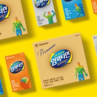
Impactamin- vitamin package
| Country | Korea |
|---|---|
| Year | 2017 |
| Award | BRONZE WINNER |
| Client | DAEWOONG pharmaceutical |
| Affiliation | Daewoong Innovation Design Center |
| Designer | Park ji hoon |
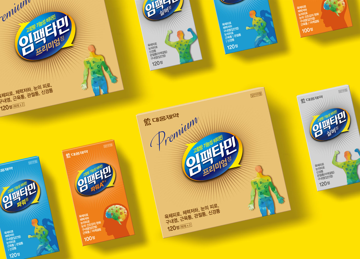
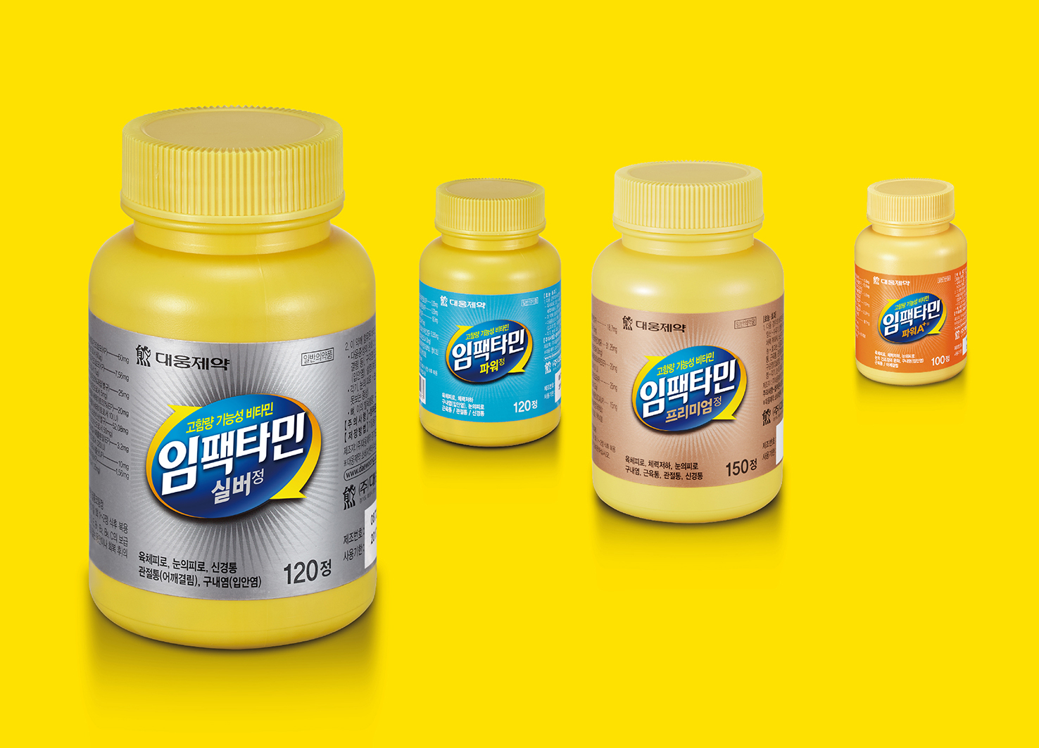
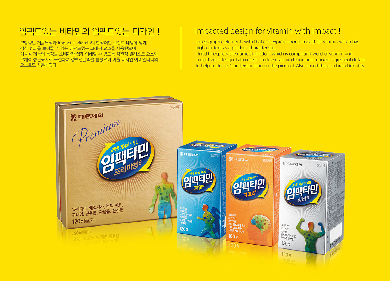
| Description(English) | I used graphic elements with that can express strong impact for vitamin which has high-content as a product characteristic. I tried to express the name of product which is compound word of vitamin and impact with design. I also used intuitive graphic design and marked ingredient details to help customer’s understanding on the product. Also, I used this as a brand identity |
| Description(Native) | 고함량인 제품특성과 Impact + vitamin의 합성어인 브랜드 네임에 맞게 강한 효과를 보여줄 수 있는 임팩트있는 그래픽 요소를 사용했습니다. 기능성 제품의 특징을 소비자가 쉽게 이해할 수 있도록 직관적 일러스트 요소와 구체적 성분표시로 표현하여 정보전달력을 높였으며, 이를 디자인 아이덴티티의 요소로 디자인했습니다. |
-
Happy Dreaming, kkomuri !
-
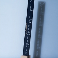
Light & Shadow Calendar
-
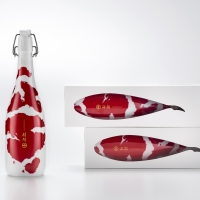
Japanese sake KOI
-
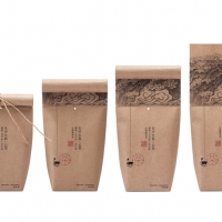
Cloudy Tea
-
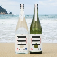
Japanese Sake MIYOSHI
-
KADOKUWA Kanroni
-
KBS 2TV Idents - Channel Branding 2017
-
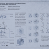
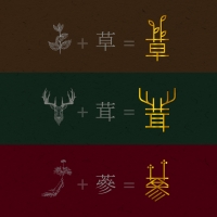
The Typeface Research Project
-
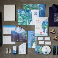
Dongguan Farming History in 1949-1979
-
TAMAMONO
-
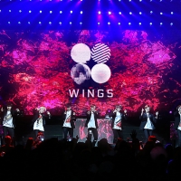
BTS [WINGS] Album Branding Design
-
SWING
-
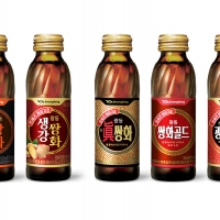
Oriental Herb Packaging design from Kwangdong
-
The package design of Kwangdong Ssang Wha
-
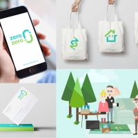
Zero Zero Brand Design
-
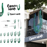
CommeNana
-
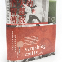
Vanishing Crafts
-
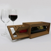
Pack Rack
-
Together
-
Samsung Software Membesrship Brand Design
-
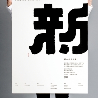
Xin
-
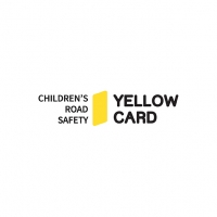
A campaign to educate and distribute ‘Yellow Card’
-
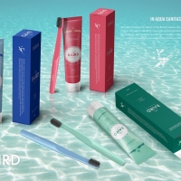
Baird Oral Products Packaging
-
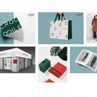
CROCODILE LADY Rebranding Project
-
Impactamin- vitamin package
-
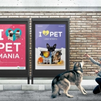
L.POINT PET MANIAC Advertising
-
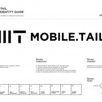
Mobile-tail Brand Identity
-
PAYO
Designed by sketchbooks.co.kr / sketchbook5 board skin