
EXHIBITION
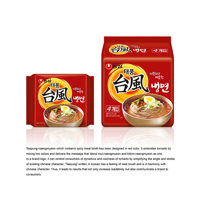
TAEPUNG-NAENGMYEON
| Year | 2015 |
|---|---|
| Award | BRONZE WINNER |
| Affiliation | NONGSHIM COMMUNICATIONS |
| Designer | SANGHEE BAK, YOUNHYUNG KIM |
| Description(English) | Taepung-naengmyeon which contains spicy meat broth has been designed in red color. It embodies tornado by mixing two colors and delivers the message that blend mul-naengmyeon and bibim-naengmyeon as one. In a brand logo, it can remind consumers of dynamics and coolness of tornado by simplifying the angle and stroke of existing Chinese character. 'Taepung' written in Korean has a feeling of neat brush and is in harmony with chinese character. Thus, it leads to results that not only increase readability but also communicate a brand to consumers. |
| Website | http://nscom.co.kr |
-
Azure
-
Essential Oil Hair Dryer
-
ARIUSZ
-
Spark Sofa
-
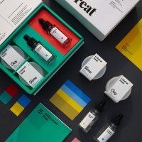
Coloreat
-
CAVALER
-
BILLRUN
-
Mr Ping
-
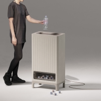
RPC Recycled Plastics Crusher
-
Space Travel Agency NOVA2020
-
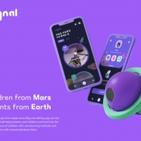
SIGNAL
-
GROW YOUR OWN
-
Smart Posture Measurement BAREUM series
-
360 degree magnetic reading night light
-
Suofeiya Multifunctional bed
-
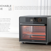
Touchable Love Counter top Oven
-
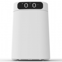
intelligent voice interactive garbage robot
-
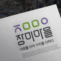
Jang Mi Village Awareness Improvement Project
-
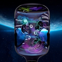
RAYS OF COSMOS
-
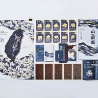
MOUNTAIN Collector
-
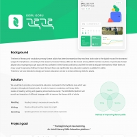
GORU GORU Literacy education for adult
-
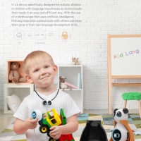
KidLang
-
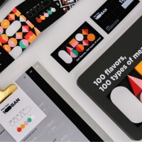
100BAN
-
CARSEE
-
Pass An application for three shift nurses
-
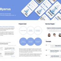
Byerus
-
Low Carbon Campus
-
Duxiaoxiao AI Digital Human Assistant


Designed by sketchbooks.co.kr / sketchbook5 board skin