
EXHIBITION
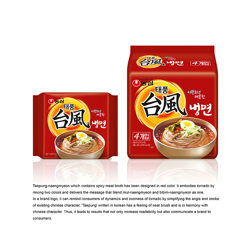
TAEPUNG-NAENGMYEON
| Year | 2015 |
|---|---|
| Award | BRONZE WINNER |
| Affiliation | NONGSHIM COMMUNICATIONS |
| Designer | SANGHEE BAK, YOUNHYUNG KIM |
| Description(English) | Taepung-naengmyeon which contains spicy meat broth has been designed in red color. It embodies tornado by mixing two colors and delivers the message that blend mul-naengmyeon and bibim-naengmyeon as one. In a brand logo, it can remind consumers of dynamics and coolness of tornado by simplifying the angle and stroke of existing Chinese character. 'Taepung' written in Korean has a feeling of neat brush and is in harmony with chinese character. Thus, it leads to results that not only increase readability but also communicate a brand to consumers. |
| Website | http://nscom.co.kr |
-
Earthy Sanctuary
-
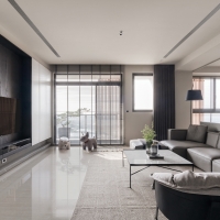
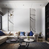
Modernity and Calm
-
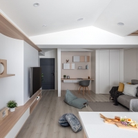
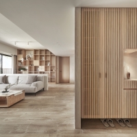
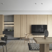
Morden Japanese Design Apartment
-
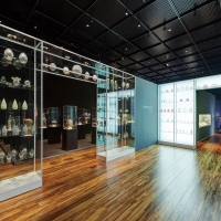
New Era of the Royal Ceramics
-
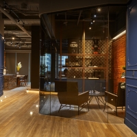
Bauhinia Business Club
-
Shop 195 identity design
-
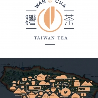
Wan Cha
-
Return
-
VIVIX S F
-
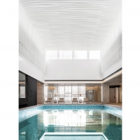
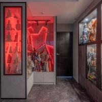
Soaking under Delicate Lights
-
Organic Space
-
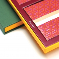
Lamour Red Packet Boxset
-
ZEN
-
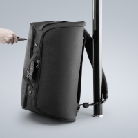
ONE PIECE ANTI THEFT BACKPACK
-
PaMu Z1 Pro TWS Earbuds
-
Twilight
-
Imilab Eye caring Lamp
-
The Beginning of Culture
-
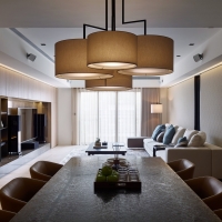
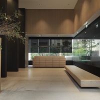
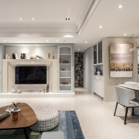
Drama In The Room
-
Waft a sweet smile
-
Blissful encounter
-
Idyllic well being
-
Crisscross Chateau
-
Glitzy Palazzo
-
QING ZHU VILLA
-
Unlimited Serenity
-
Slow soul
-
RECORD


Designed by sketchbooks.co.kr / sketchbook5 board skin