EXHIBITION
Communication
ichiei Branding
| Area | Hong Kong |
|---|---|
| Year | 2018 |
| Award | WINNER |
| Client | ichiei Limited |
| Affiliation | Chatter Design Limited |
| Designer | Nova Hung |
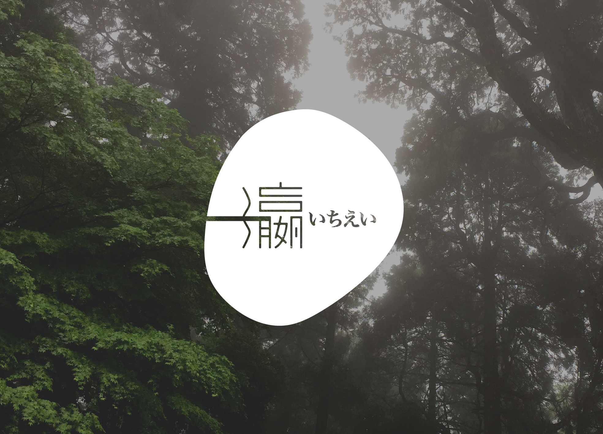
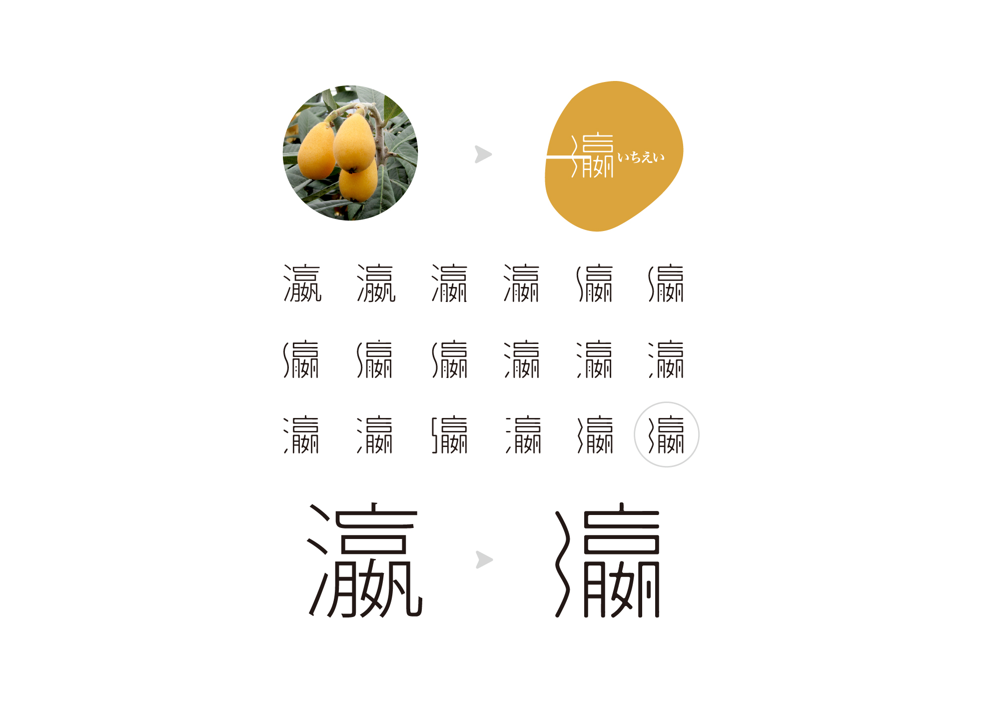
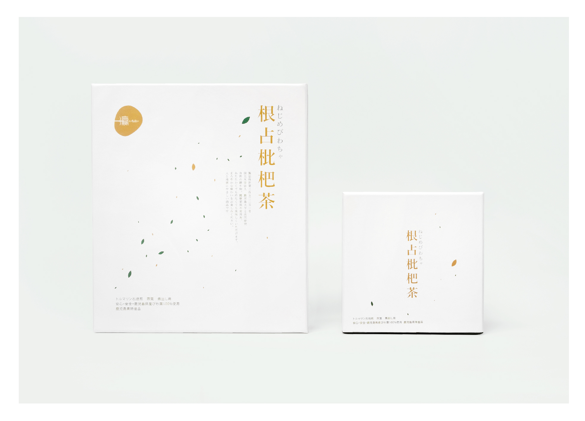
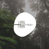
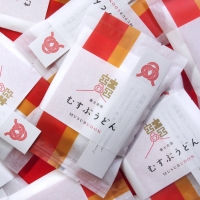
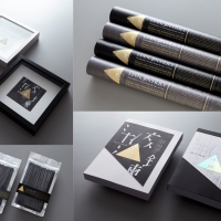
| Description(English) | ichiei engaged in health food agents, their philosophy - "beautiful health from the beginning of eating habits". The product used in Japan Kagoshima loquat leaves, to cope with the main sales market for Asia high-end customers, the design will be the state of tea into a poetic realm, with the simplistic and stylish way to interpret healthy lifestyle of Teaism. ichiei company name in Chinese is 一瀛, Chinese word ONE shape represented by the horizontal line plus Japanese name いちえい. And 瀛 means ocean in Japan, the part of 瀛 using a simply water curve instead of 3 dots. The logo's shape showcases the shape of loquat fruit. |
| Description(Native) | 一瀛從事養生食品代理,公司理念為 "美麗 健康從飲食習慣開始",而主要銷售市場為中國內地、香港及澳門的高端客戶。枇杷是很高藥效性的植物,自古以來一直被中藥和民間療法使用,產品採用日本鹿兒島枇杷葉,用專利製法製成的健康常用茶。設計畫面將品茶的狀態化成詩意的境界,茶葉散落呈現日本的地貌,用最簡潔和時尚的手法演繹一種養生而有品味的生活態度,為品茶藝術添加新的形式。在標誌的設計上,“一” 字的形態從“一” 延伸到日文名稱“いちえい”,形成一個遠處都可看見的巨大“一”字,有統一的喻意。而“瀛”於日本意思為海洋,故將它的三點水部首變成一條流動中的曲線形態。整個標誌的形狀為參考枇杷果的形狀繪畫而成。 |
| Website | chatterdesign.com |
-
R TRUNK
-
Masaccio Furniture Art LOGO Design
-
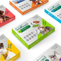
Selaguard
-
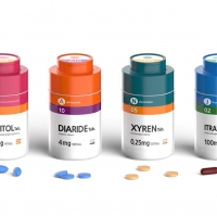
Easycheck Medication
-
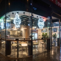
3 italiani
-
Bright Color Jungle
-
Centrat Palace,Vanke
-
Cold and Warm
-
compose
-
Diameter
-
factory of apparel B
-
Green Life
-
Immaculate white
-
K11 Art Mall
-
Line Composition
-
Linear Space
-
Parkview
-
Primus Hotel
-
Rising sun of song
-
The house of light
-
Zen
-
Just Stay Resort
-
ichiei Branding
-
MUSUBUDON
-
MOMENT GARDEN
-
輕工業風 / LIGHT LOFT
-
Alchemy
-
AIWA nursery
Designed by sketchbooks.co.kr / sketchbook5 board skin

