EXHIBITION
| Area | Chinese Taipei |
|---|---|
| Year | 2023 |
| Award | WINNER |
| Affiliation | BIN LIVE Co., Ltd. |
| Designer | BIN LIVE |
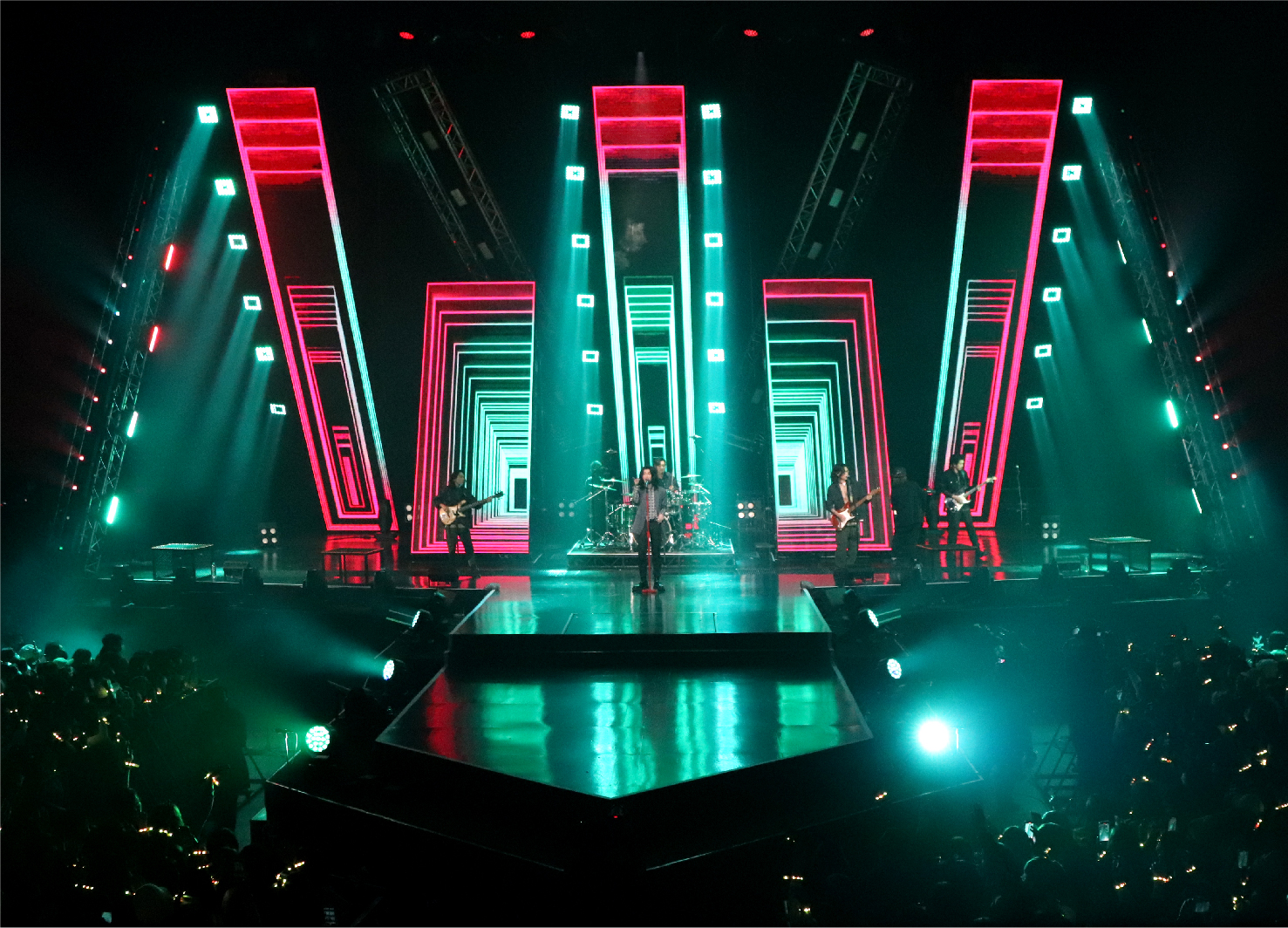
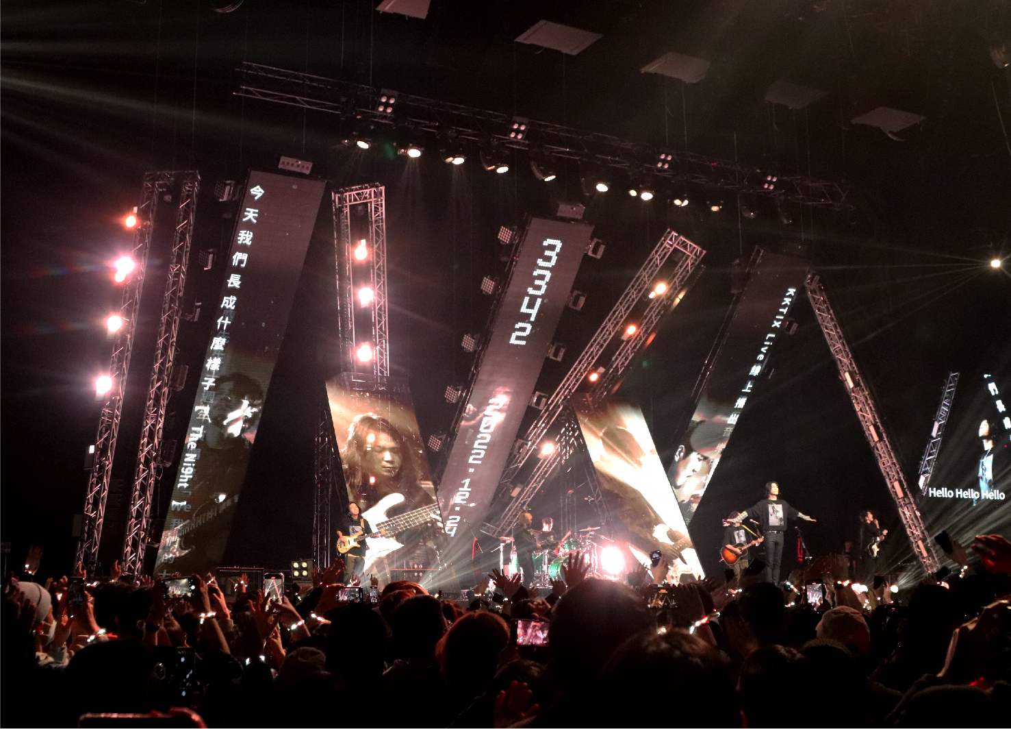
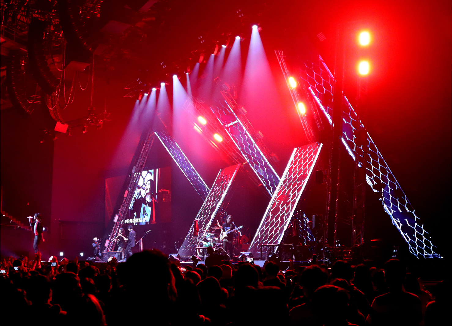
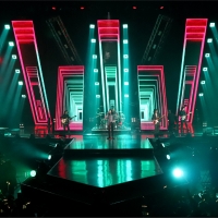
| Description(English) | The stage design starts from the two iconic symbols "Deer Head" and "M" representing Mixer. "Deer Head" is the band logo of Mixer, and is also used as the outline of the stage. The large "M" symbol spliced with lights and truss structure at the back of the stage, represents the band’s name "Mixer." "M" also represents "Me". In the M-shaped stage structure, staggered LED screens are added to form a "W" symbol, which symbolizes "We". The visual effect of the stage will be reversing from "M" to "W" during the show, so as to convey the core theme of the concert: The band was only "Mixer, Me", but now become "We", along with all the music fans. |
| Description(Native) | 麋先生十週年演唱會的舞台設計從代表麋先生的兩個標誌性符號「鹿頭」和「M」作為出發:「鹿頭」是麋先生的樂團 Logo,設計將主舞台與相連的延伸舞台,兩者結合成鹿頭Logo的輪廓;而在舞台後方以燈具和Truss結構拼接而成的大型「M」字符號,則代表著麋先生的英文團名Mixer。 在M字型的舞台結構中,再加入交錯排列成「W」字符號的LED屏幕,並跳脫LED常見僅作為直立平面背景的用途,將LED前後傾斜放置,增加深度空間的層次感,使LED屏成為舞台裝置的一部分,環繞在樂團周遭,提升整體視覺豐富度。 「M」不只象徵著 Mixer,同時也代表著「Me、我」。而LED拼接組合成的「W」符號,象徵著「We、我們」。在演唱會節目中,可以看見舞台視覺效果從「M」反轉鏡射成「W」,以此傳達十週年演唱會的核心主旨:麋先生從「Mixer、Me、我」跟歌迷們一起成為了「We、我們」。 |
| Website | www.behance.net/binlive5 |
| Positive Comments |

|
-
Li Mengmeng girly skin
-
DIAMOND LINE
-
Balance
-
Dayi Design Studio
-
House M
-
MIXER WE 10th Anniversary Concert Stage Design
-
Back to Void
-
Planting Pleasant Palpitation
-
Life that Inherits Architectural Culture
-
Seclusion on the River
-
Shenzhen Metro Line 16
-
The Little Yogaland
-
Cat Walk
-
Pure Shine Immersion
-
Refreshing Light
-
Morii
-
The Realm of Stillness
-
Reduction
-
Guohua Financial Center
-
turning point
-
Flows
-
Infinity
-
Hap Seng 3 Tower
-
Breaking the Vertical and Horizontal Limit
-
ZEST FOR LIFE
-
Kawanishi Spirits
-
Fanatical Art Toy
-
project SY
Designed by sketchbooks.co.kr / sketchbook5 board skin

