EXHIBITION
Space
Compare and Contrast
| Country | Taiwan |
|---|---|
| Year | 2017 |
| Award | WINNER |
| Affiliation | XIANG QI INTERIOR DESIGN |
| Designer | CHEN,WEN-YIN |
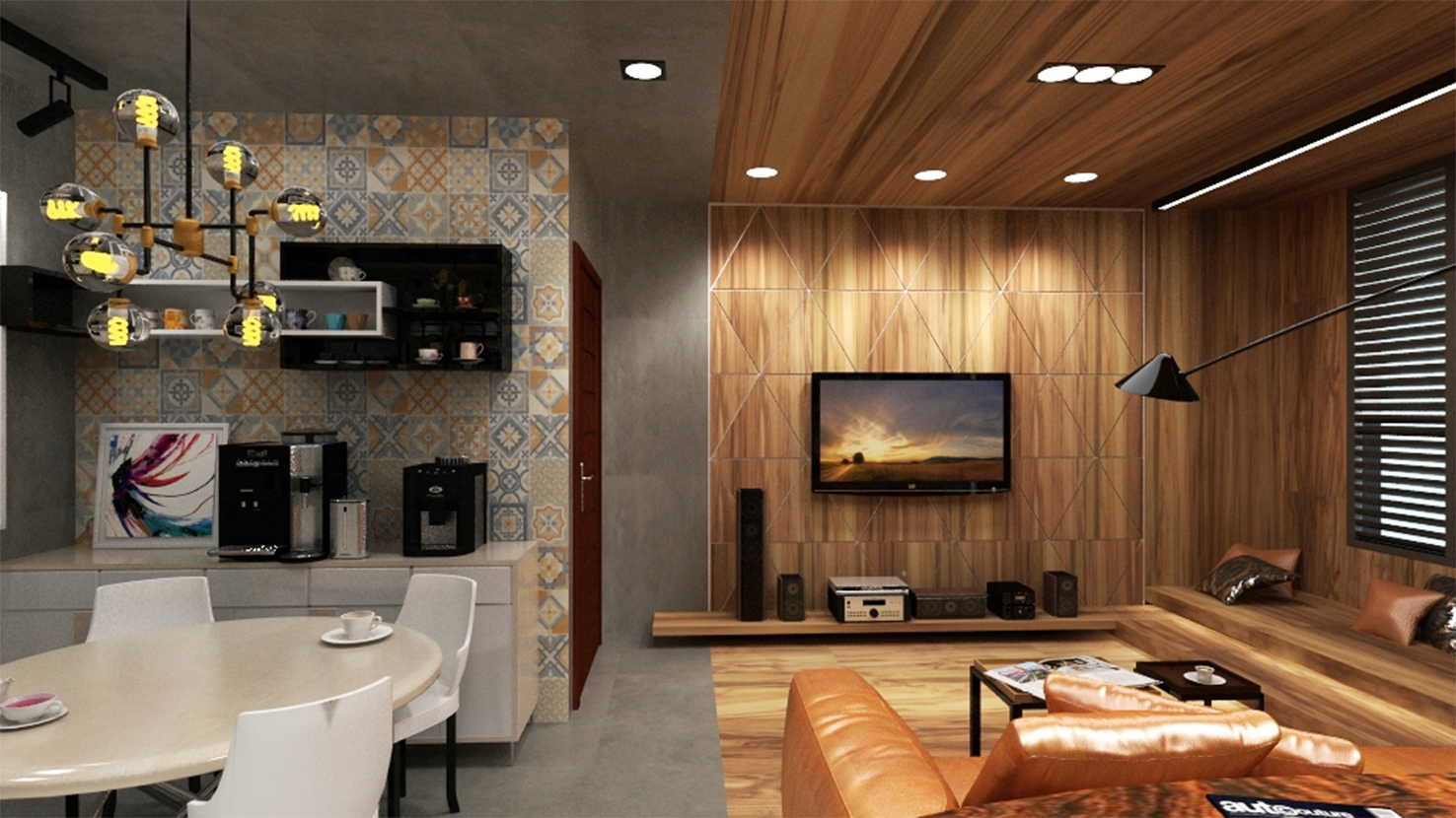
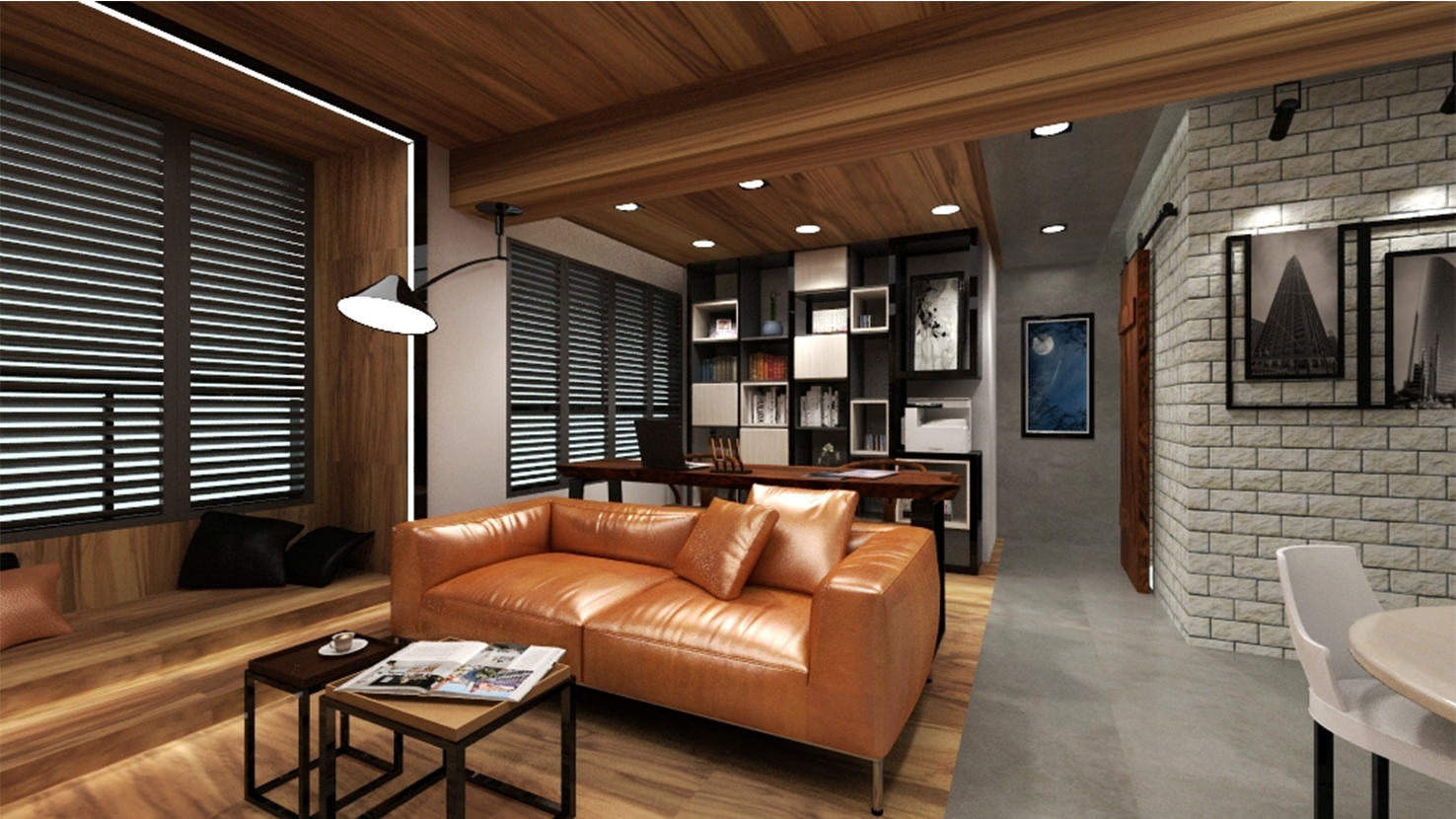
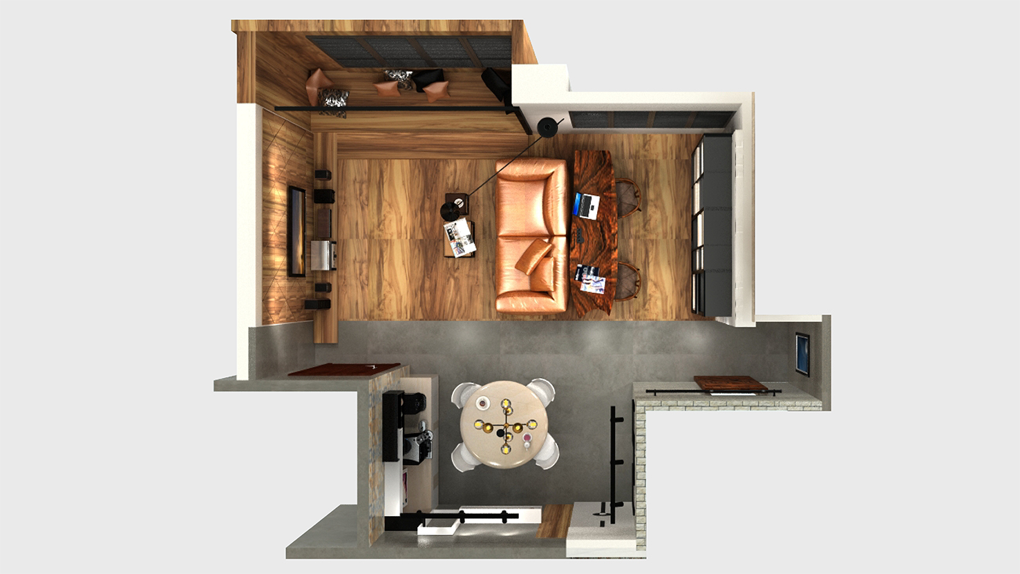
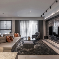
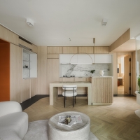
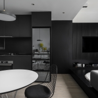
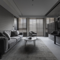
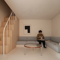
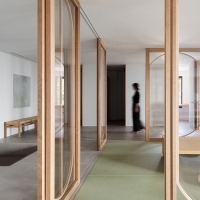
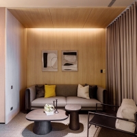
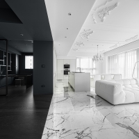
| Description(English) | The first impression of the space is calm and restrained. Only soaking into the space, people would realize the interpretation of the space - the dark gray presents the texture with essence and the wood materials presents moderation with smooth.The space can be divided into living room and dining room by means of contrasting and monochromatic. In this way, it allows the tiny room to be enlarged. No matter what color and what materials shows in the space, they represent stable and steady. |
| Description(Native) | 沉穩而內斂是空間給人的第一印象,而唯有細細品味才能了解其中的詼諧趣味,溫潤自然裡充滿設計感的詮釋。以對比、單一色系的方式,區分出客餐廳,相襯著彼此之間的關係,而這樣的設計讓小空間有放大的視覺,在色調還是材質上都表現出該有的穩重、踏實。 |
| Website | http://rememberdesign.com.tw/ |
-
Nature Charisma
-
Gentle Grey
-
Purity
-
family heirloom
-
Netscape
-
Guigang Hoyo Banquet
-
W Branch of Shanghai Parade
-
project NC
-
Ink Impression
-
ECOLOGY
-
MUZI HOUSE
-
Victory Chapel
-
NGH Kikkei
-
Su Listen Counseling Clinic
-
Distinction
Designed by sketchbooks.co.kr / sketchbook5 board skin

