EXHIBITION
Space
The gaze of whitenes
| Country | Taiwan |
|---|---|
| Year | 2018 |
| Award | GOLD WINNER |
| Affiliation | DOT DOT Studio |
| Designer | MIN CHIN HSU |
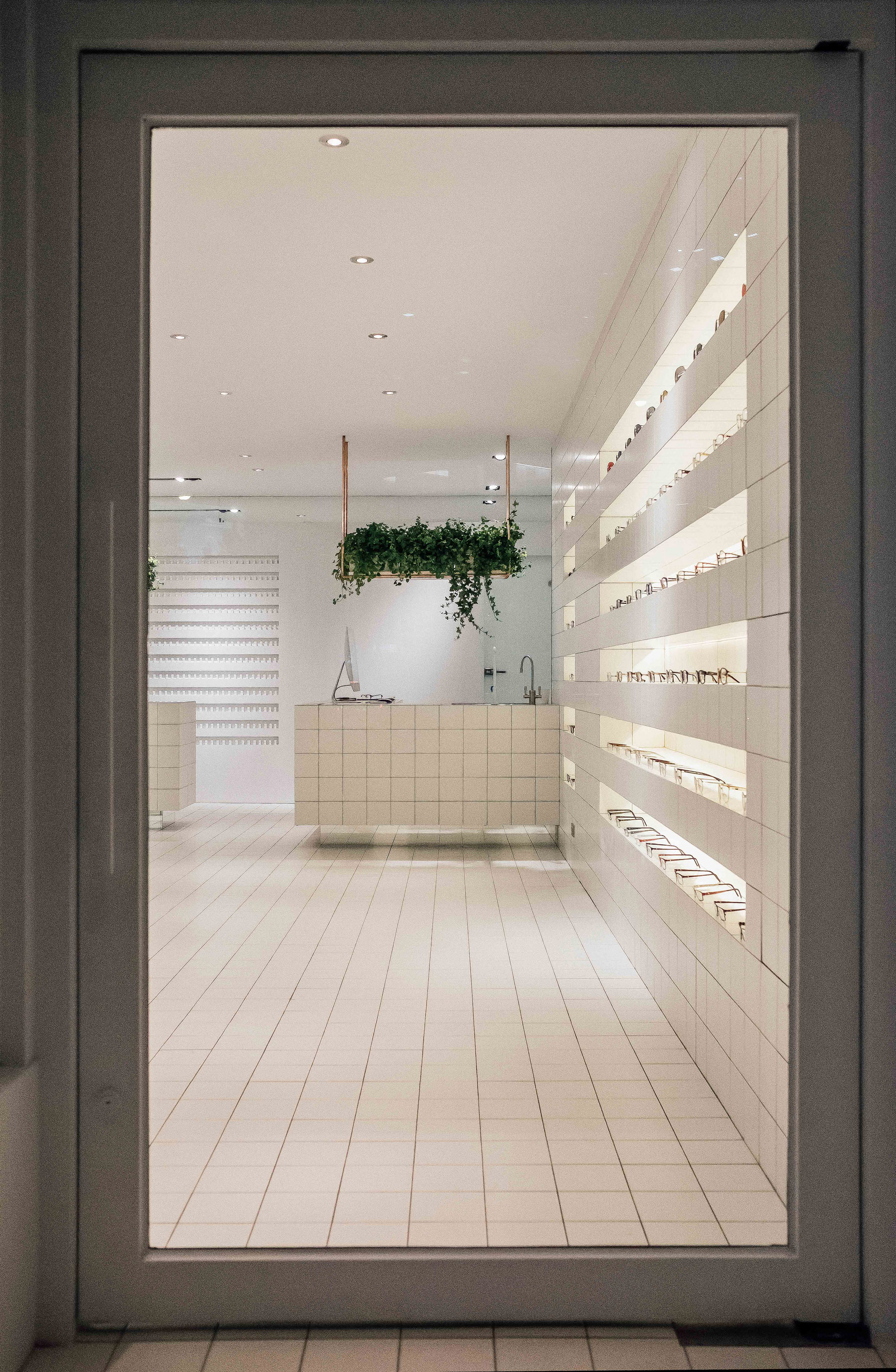
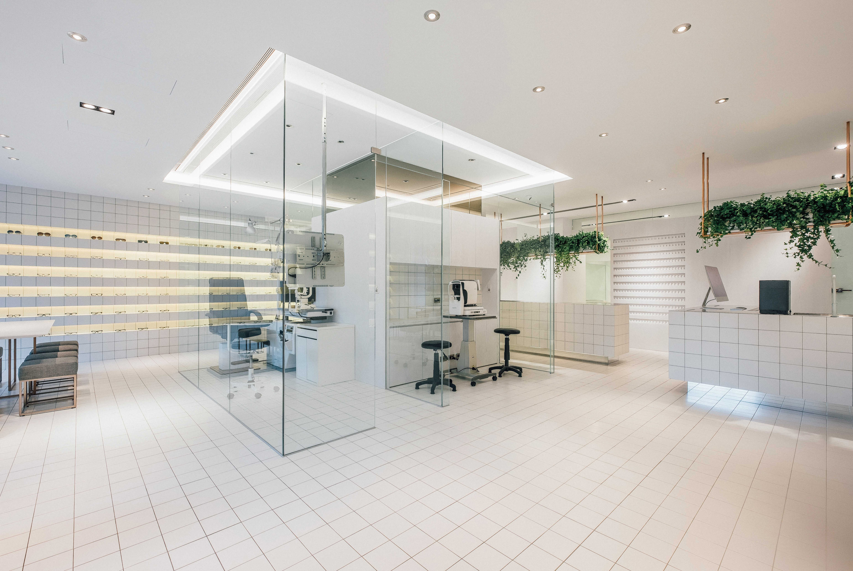
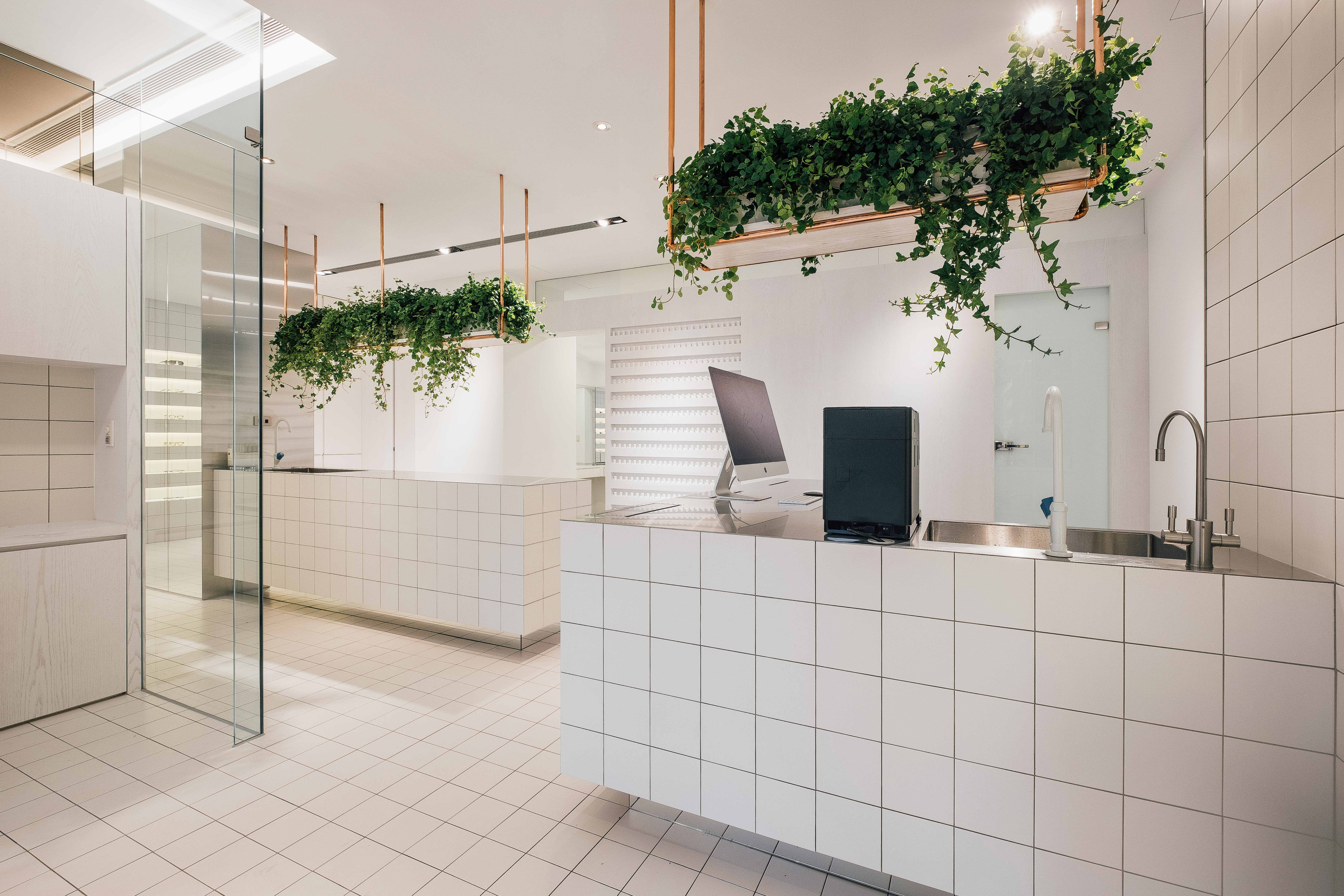
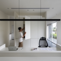
| Description(English) | The starting point of our design is orderly display in rows and columns. Each piece of eyewear is individually showcased on a 15x15cm tile. The linear-shaped tiles add dimension to the space and make the interior appear checkered like a chessboard. Meanwhile, large mirrors create an illusion of depths. In accordance with the linear patterns that define the space, the designer composes the display walls, suspended workbench and the counter. At the center, optometry equipment is emphasized and surrounded by floor to ceiling glass in order to accentuate the brand’s core value. |
| Description(Native) | 在空間中整齊劃一的陳列商品,為設計師第一想到的重點,因此透過一塊塊15x15CM的磁磚來獨立展示每一支眼鏡不同的特色,也透過磁磚間線條的秩序延伸了空間,讓整體空間像棋盤式的擴張,又利用大面積的鏡子創造更大的虛與實,加深了空間的深度。依循著線條的脈絡,構築了展示牆面以及懸浮的工作檯面及收銀吧檯。空間的中心被玻璃包圍的驗光精密儀器,像是在強調其品牌不可或缺的核心價值。 色調以白色作為基調,整合了空間的基本秩序;一條條漫出黃光的展示台,強調了商品的獨特性;2米長的紅銅吊架上點綴植物,跟室外庭院產生對話,讓冰冷的空間活絡了起來。 |
-
Nature Charisma
-
Gentle Grey
-
Purity
-
family heirloom
-
Netscape
-
Guigang Hoyo Banquet
-
W Branch of Shanghai Parade
-
project NC
-
Ink Impression
-
ECOLOGY
-
MUZI HOUSE
-
Victory Chapel
-
NGH Kikkei
-
Su Listen Counseling Clinic
-
Distinction
Designed by sketchbooks.co.kr / sketchbook5 board skin

