
EXHIBITION
OCEANIX Busan Rebranding
| Area | Korea |
|---|---|
| Year | 2024 |
| Award | WINNER |
| Affiliation | SUNGSHIN WOMENS UNIVERSITY |
| Designer | Suyeon Jung |
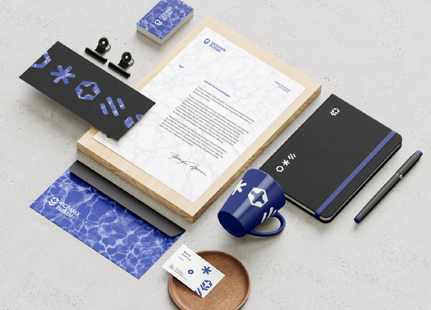
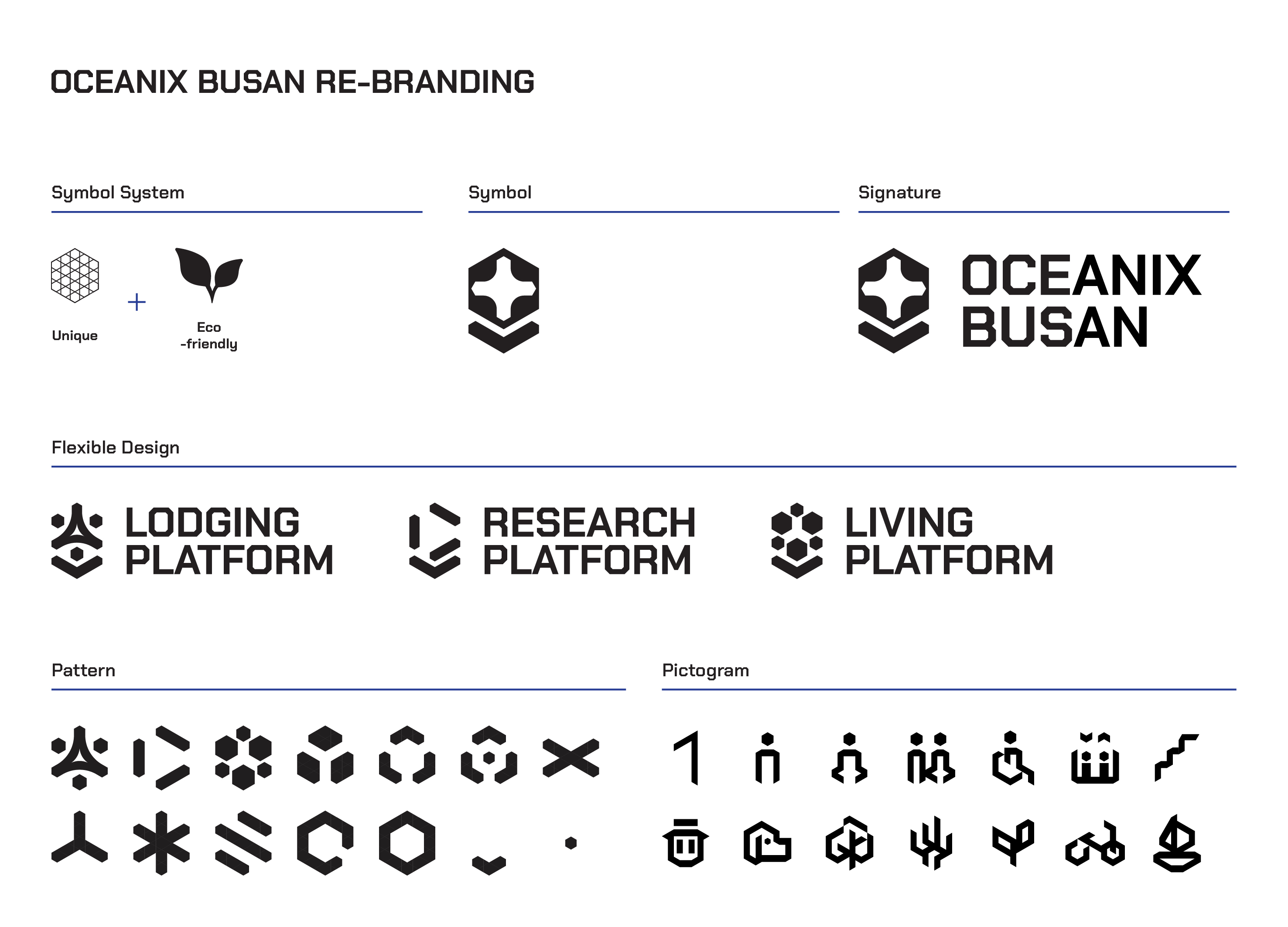
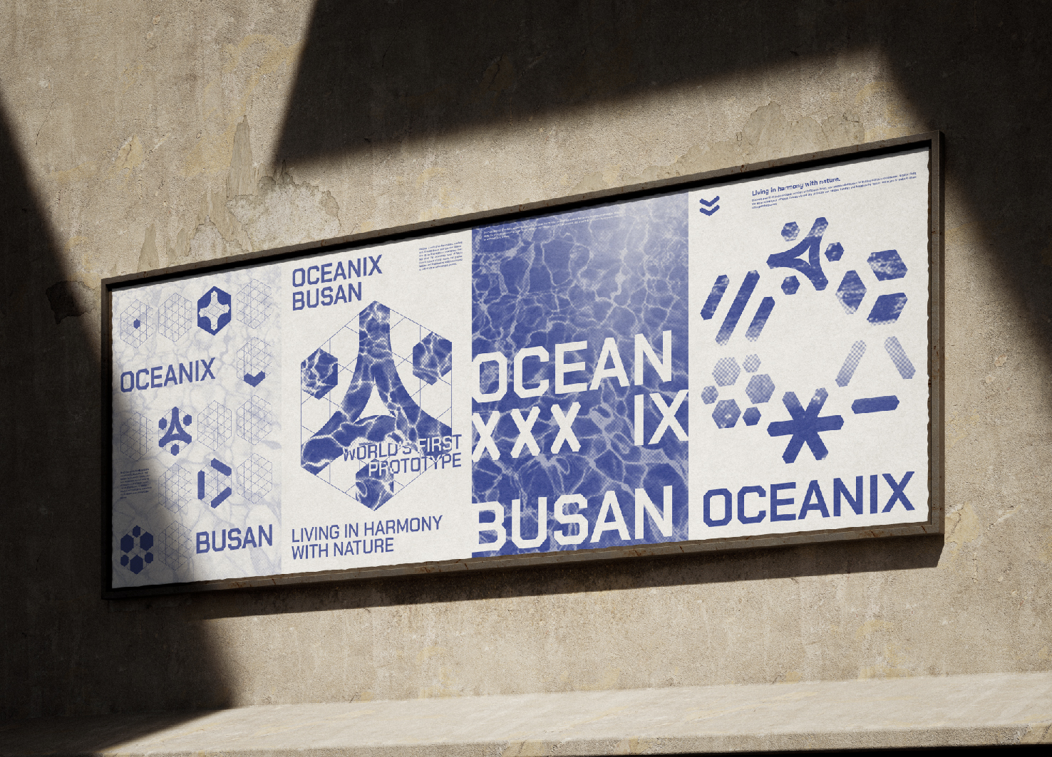
| Description(English) | OCEANIX Busan aims to create a floating city that addresses land shortages caused by rising sea levels while providing a high quality of life. I propose a logo and graphics system for Oceanix Busan that incorporates eco-friendly features into a grid inspired by its unique hexagonal shape. The symbol can be flexibly adapted to represent different platform shapes, and distinctive point colors are used. Various patterns inspired by the hexagonal grid and Oceanix buildings are used throughout the design. Additionally, various applications has been designed to bring people closer to the vision of Oceanix Busan. |
| Description(Native) | 오셔닉스 부산(OCEANIX Busan)은 세계 최초의 지속 가능한 수상도시 프로토타입으로, 기후 변화로 인한 해수면 상승으로 인해 발생하는 토지 부족 문제를 해결하는 동시에 사람들에게 높은 삶의 질을 제공하는 자발적이고 혁신적인 해상도시를 구현하는 것을 목표로 하고 있다. 그러나 해상도시라는 개념은 아직 사람들에게 익숙하지 않은 개념이다. 이러한 배경을 바탕으로, 오셔닉스 부산만이 가지고 있는 육각형의 형태적인 유니크함에서 모티브를 얻은 그리드에 해상도시의 환경친화적인 특성을 담아낸 로고를 제안하였다. 이를 바탕으로 그래픽 시스템을 구축하여 낯설고 추상적인 이미지였던 오셔닉스 부산을 리브랜딩 하였다. 로고는 기본 로고를 바탕으로 각 플랫폼의 형태적 특성을 살려 플렉서블하게 변형하여 사용할 수 있도록 디자인하였고, 플랫폼별로 바다, 산호, 풀잎을 연상시키는 포인트 색상을 부여하였다. 육각형 그리드와 오셔닉스 건물의 유니크한 형태를 모티브로 한 다양한 패턴을 제작하여 디자인 전반에 활용하였고, 브랜드 전용 아이콘도 육각형 그리드 시스템 내에서 제작하여 통일감을 주었다. 본 그래픽 시스템을 바탕으로 오셔닉스 부산이 완공되면 접할 수 있을 가상의 어플리케이션을 플랫폼별로 제작하여 사람들에게 한 걸음 더 다가가고자 하였다. |
| Positive Comments |


|
| Judging Comments | OCEANIX Busan's logo and graphics system effectively addresses land shortages with eco-friendly features. Inspired by its hexagonal shape, the adaptable symbol and distinctive colors represent different platform shapes. Patterns derived from the hexagonal grid and buildings enhance the design. This thoughtful approach, bringing people closer to the vision of Oceanix Busan, earned it the Winner title for its innovative and adaptable design. |
-
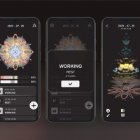
Synapse
-
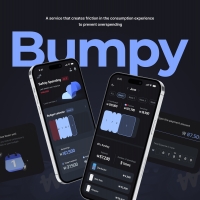
Bumpy Prevent overspending with payment friction
-
fleep
-
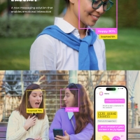
EmoChat
-
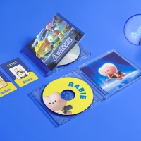
OCEANIX Busan Rebranding
-
A STARZ VISUAL BRANDING
-
BeYou Collagen
-
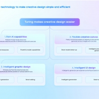
Turing Interface and User Experience Design
-
203 Society Series
-
Healthcare Robot Visual Identity
-
CHINGU BBQ
-
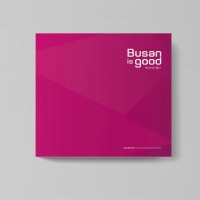
busan is good cityhall promotion booklet
-
Command Plus Plus
-
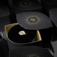
Helena Rubinstein eye cream influencer kit
-
MORA Cure
-
Sage Passing Wisdom to Next Generations
-
The Korean War Abductees Name Book
-
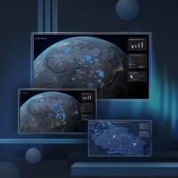
3D Visualization Platform for Energy Operation
-
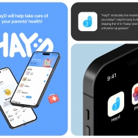
HayD
-
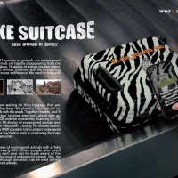
FAKE SUITCASE
-
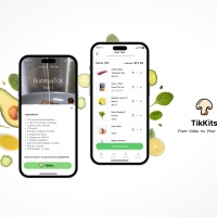
TikKits
-
YoGarden
-
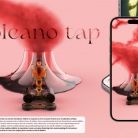
Volcano Tap
-
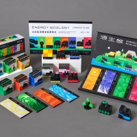
RENEWABLE ECOLOGY


Designed by sketchbooks.co.kr / sketchbook5 board skin