EXHIBITION
Ocean Immersion
| Area | Chinese Taipei |
|---|---|
| Year | 2024 |
| Award | GOLD WINNER |
| Affiliation | HIKOU KUNMING INTERIOR DESIGN Co., Ltd. |
| Designer | Randolph Wang |
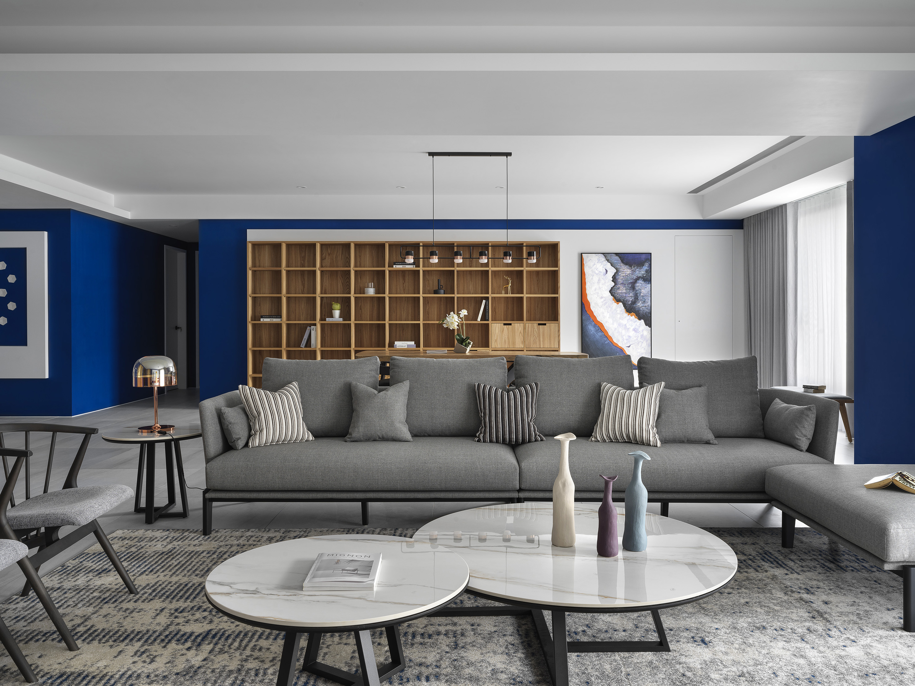
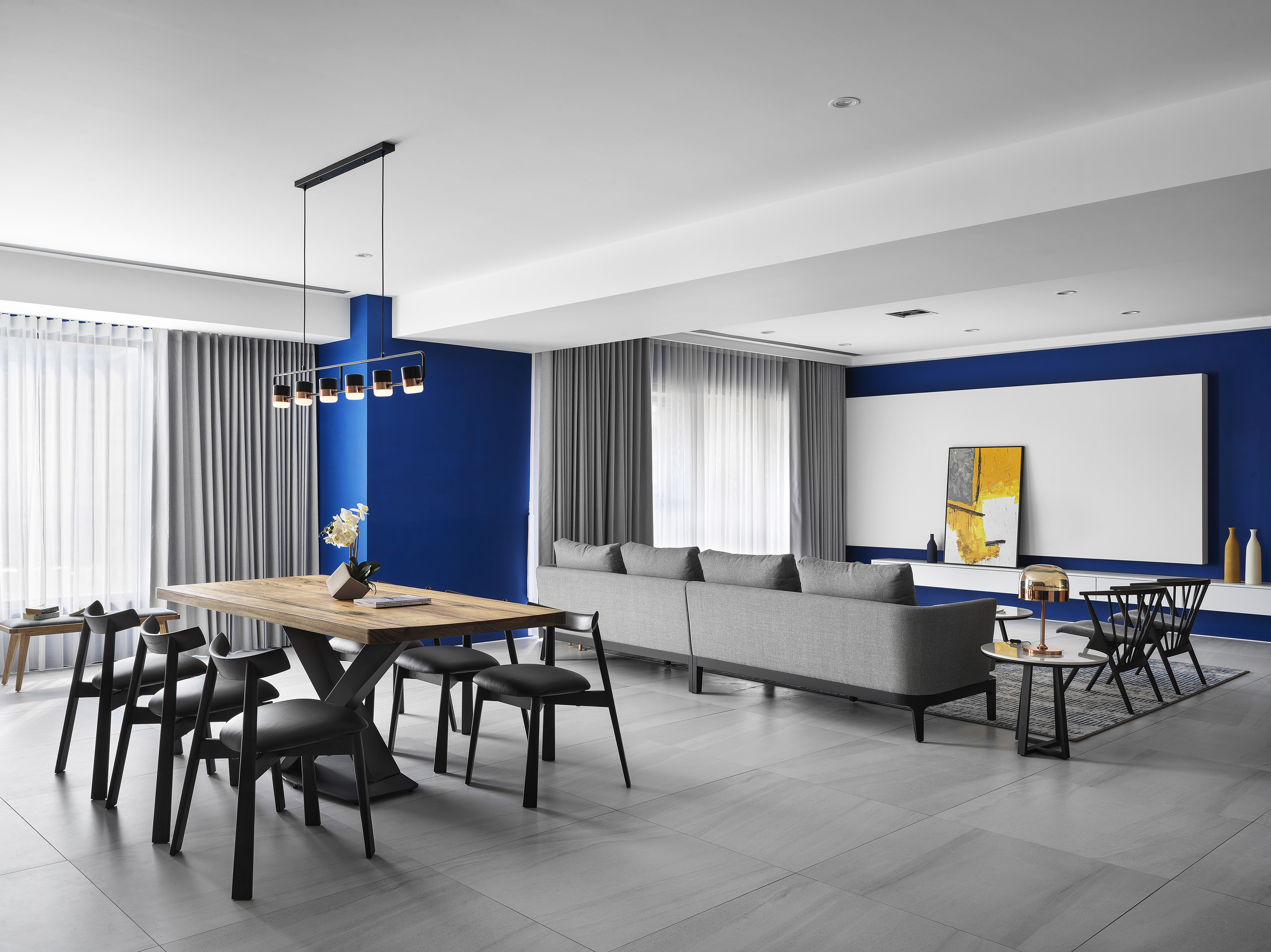
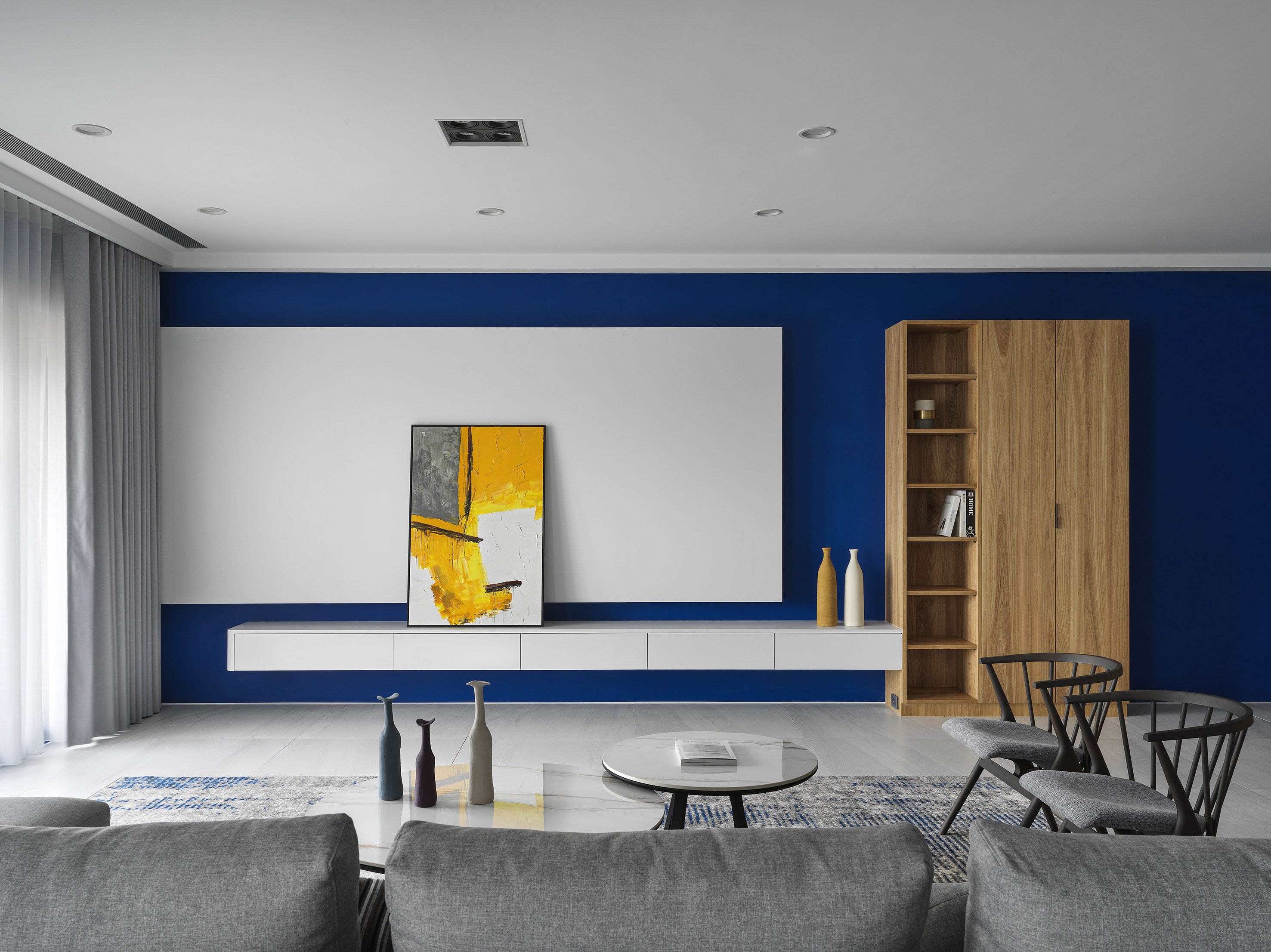
| Description(English) | Based on coloring embellishments, we decorated the project with exquisite furnishings and art pieces and then presented a simple detailing home in a vivid approach. An open floor plan for the child to play, a well-organized bookshelf, and reading nook designs render a sanctuary to the family of three, free lingering with knowledge. Various color schemes distinguish individual rooms and their functionalities. Black and white set off a wood texture to present a Japanese motif. Next, bright yellow and light green penetrate refreshing and dynamic visual delight. In other words, different colors represent the family’s contrast but mutual respect. |
| Description(Native) | 透過巧妙的配色比例,公領域部分壁面施作深藍色,佐搭白牆與紋理分明的橡木櫃體,冷暖質感交融,加上調性溫和的灰調家具和窗簾作為過渡,充分揉合業主夫妻分別鍾愛的繽紛感與沉穩氣息;步入其他房間,男主人的書房以黑白雙色搭配木紋,形塑簡樸靜謐的日式情調,孩童房與客臥則分別選用鮮黃和淺綠,注入清新活潑的視覺效果。善用色彩區分場域用途之餘,更代表每位家人的迥異卻又互補的性格。 除了以各色環保乳膠漆揮灑亮麗畫面,此案不做其他多餘裝潢,將主要空間留給孩子自由活動。在建材選擇方面,淺灰色的石紋地磚鋪設客、餐廳,私領域則轉作溫潤的超耐磨木地坪,吧台、收納櫃等立面也大多使用天然石材與實木,加上業主珍愛的擺飾和畫作作為點綴,展現風格簡約而細節精緻的生活美學。 考量夫妻兩人的職業與興趣皆需大量閱讀,因此規劃許多可自由調整層板的大型書櫃,方便將藏書分門別類、收納整齊;沙發後方的大型餐桌兼具書桌功能,並於一旁採光優良的落地窗前擺放一張長椅,在此既可悠閒地獨自翻閱書籍,也能在桌前指導孩童作業,推開餐廳側牆的隱藏門即可進入書房,讓一家人專心辦公、讀書。 由於業主並無擺放電視的需求,客廳牆面以木工和系統櫃設計出穿插、堆疊效果的白色方塊造型,配上一幅和周圍深藍色對比的橘黃色畫作,為沉穩氛圍注入活潑氣息。 餐廳選用厚實的實木餐桌,延伸後方大型書櫃的木質紋理,牆上的畫作融合了空間中的藍、白主調,另以些許鮮橘做跳色變化;一旁的輕食吧台區,壁面利用花磚簡單裝飾,高腳椅的材質、色彩則與用餐區軟裝遙相呼應,串連兩區內斂沉靜的氛圍。 |
| Website | www.hikou.com.tw |
| Positive Comments |




|
| Judging Comments | This design excels due to its use of color embellishments, incorporating exquisite furnishings and art pieces to create a vividly detailed yet simple home. An open floor plan for the child to play, a well-organized bookshelf, and reading nooks provide a sanctuary for the family of three to enjoy knowledge. Various color schemes distinguish individual rooms and their functionalities, with black and white highlighting wood textures to present a Japanese motif. Bright yellow and light green add a refreshing, dynamic visual appeal, representing the family's contrasts but mutual respect. These qualities have earned the design high praise. |
-
Four Typologies
-
Encounter Zipeng Mountain
-
The Tea Has Turned Red
-
Safety Expiration date Sticker
-
TURF FINGER
-
My Dear After Cancer Honeymoon Promotion Festival
-
Tree education inseitute
-
crocs check
-
Fab
-
Planto
-
FIZZ
-
NEO Palette
-
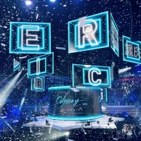
ERIC CHOU Odyssey World Tour
-
HaoWan Print Art Calendar
-
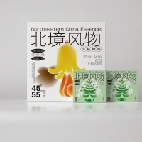
Northeastern China Essence Series
-
EasyGo
-
NATURE AND HAPPINESS
-
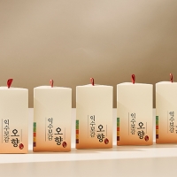
Package design of a herbal food with five aromas
-
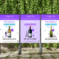
Colorful Club by Wine promotion advertisement
-
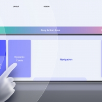
Baidu Driving Design System
-
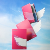
POSTECH Holdings Leaflet
-
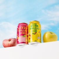
Tealog Sparkling Iced Tea
-
KOBE STORKS Japan pro basketball team
-
ZEXTR
Designed by sketchbooks.co.kr / sketchbook5 board skin

