
EXHIBITION
Redesign a Hakka Temple
| Area | Chinese Taipei |
|---|---|
| Year | 2024 |
| Award | GOLD WINNER |
| Client | Hakka Public Communication Foundation |
| Affiliation | The SELF Ltd. |
| Designer | Weizhen ZHANG |
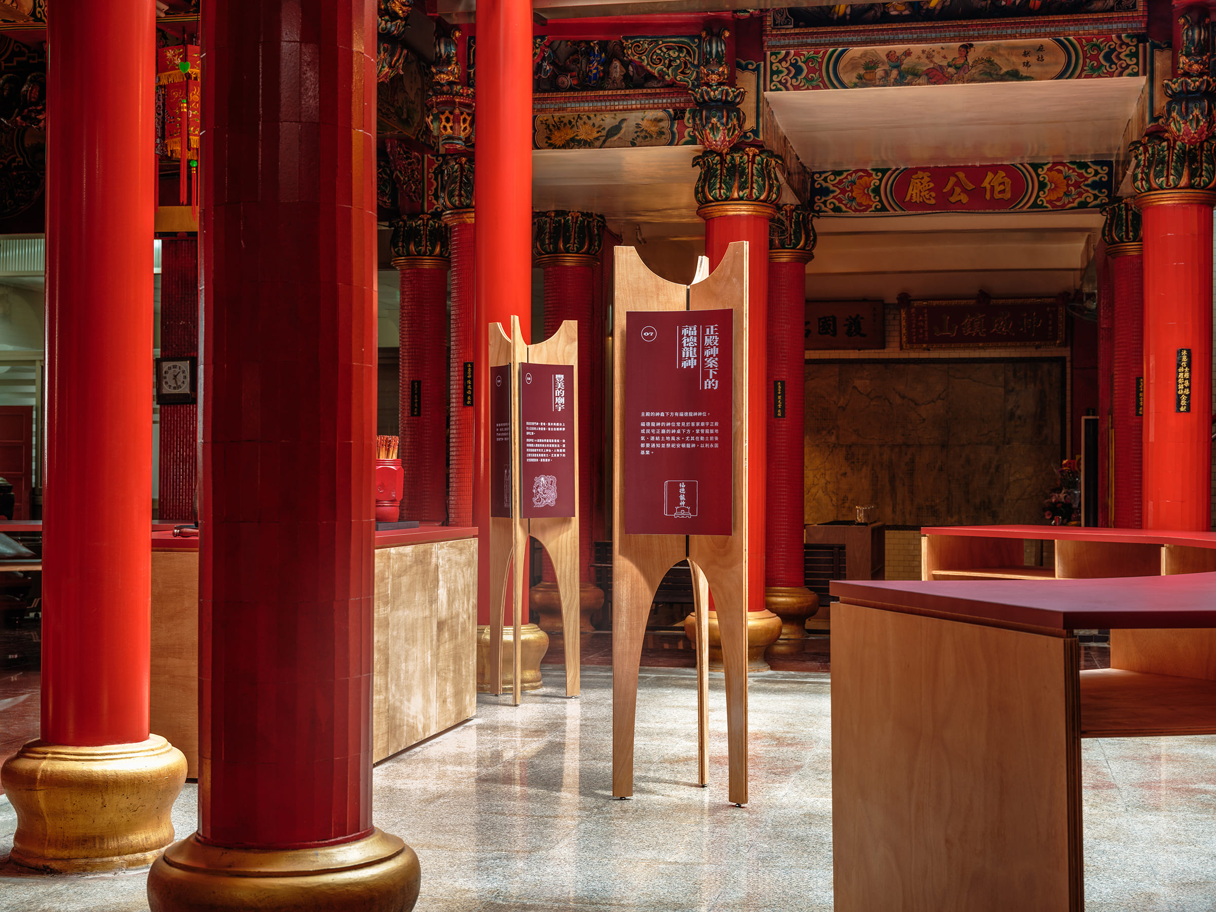
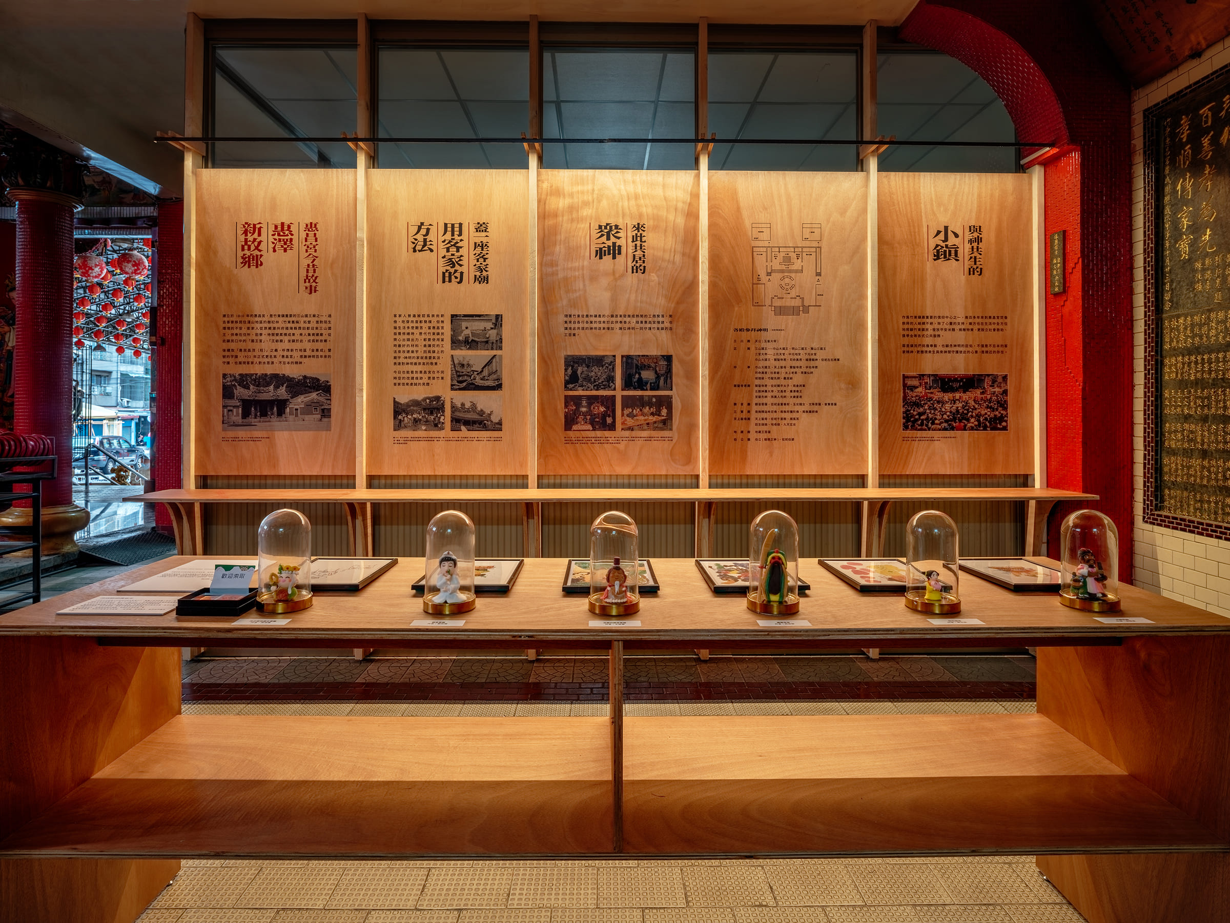
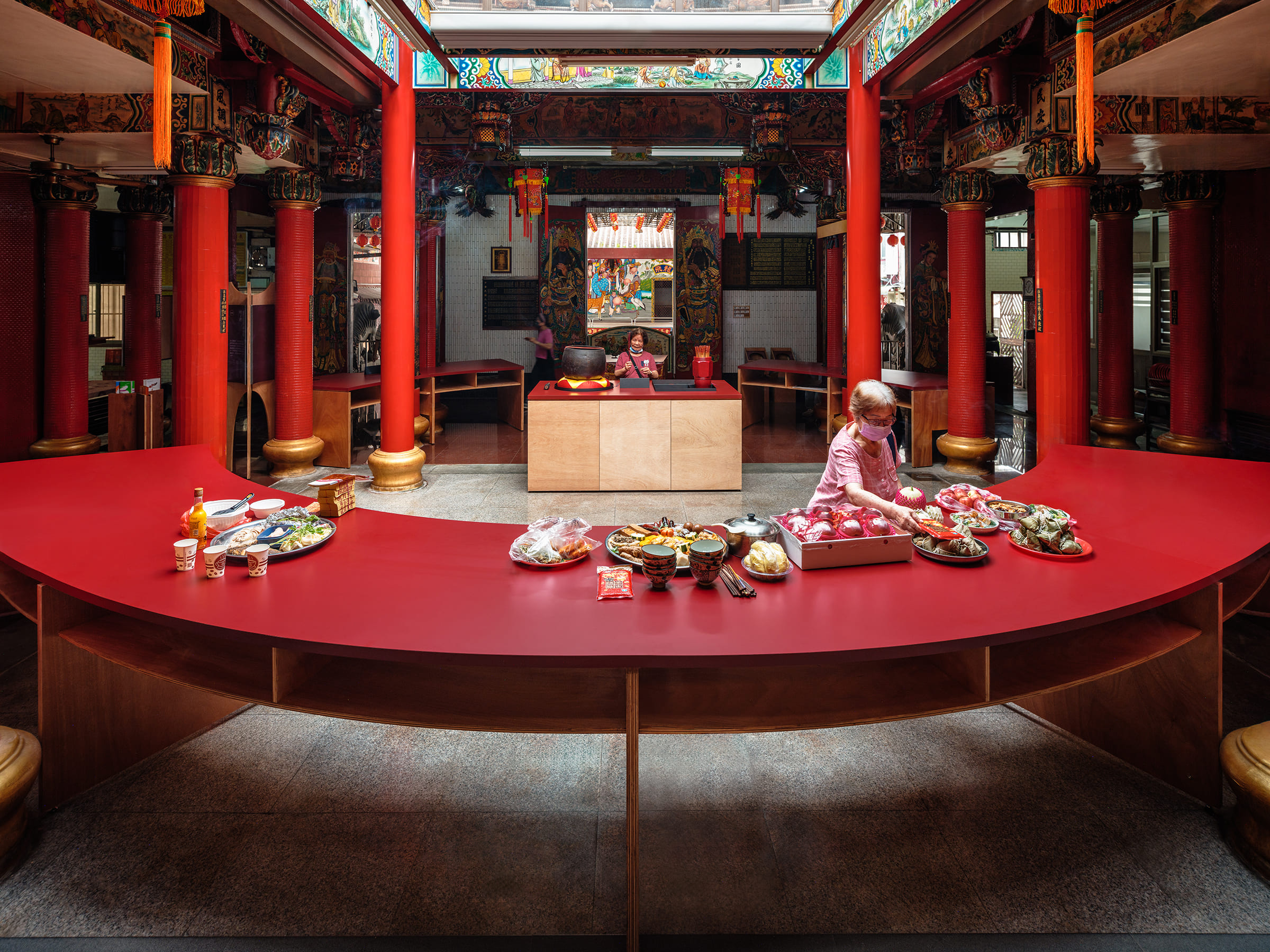
| Description(English) | Huichang Temple is the main religious site for Hakka people. We extensively discusses with the temple operators. Without changing the routines and the traditional red color in a Hakka temple, we redesign and rearrange the tribute tables. There were long parallel metal tribute tables blocking foot traffic and architectural characteristics. While the courtyard introduces sufficient natural light to the interior, tributes get rotten quickly under direct sunlight. The team redesigns and rearranges the tables into circular shape to avoid direct sunlight and improve routes. Worshippers can now stand right in front of deities for their prayers. |
| Description(Native) | 惠昌宮是竹東地區最主要的客家廟宇之一,此次的設計改造由設計團隊與廟方全程共同討論,在維持原本功能與維持傳統色彩的前提下,一起決定改造供桌形狀與排列方式,並增加展示與動線指標,讓惠昌宮成為微型博物館。 經歷四次修建的惠昌宮,廟裡的柱子非常多是它的特色。但白鐵長方形供桌的並排,讓整體參拜動線不易,也阻擋廟宇建築特色。正殿天井提供室內良好的採光,但日光直照供桌容易造成供品腐敗。團隊透過設計,將供桌改造成圓拱形,空出天井下方,既解決直射的問題,也讓動線更寬敞,把最好的空間留給信眾,讓信眾可以正對神明進行祭拜。 惠昌宮是個有細節的廟宇,但不易被注意,透過立體展架與指引系統的設置,引導觀看,讓廟宇可以自己說故事。除了硬體上的改造,團隊邀請在地孩子們來到廟宇,透過孩子們的觀點來解讀惠昌宮、守護竹東百工百業神明,發揮創意將惠昌宮神明介紹給更多人認識,讓惠昌宮成為可閱讀的微型博物館。 |
| Positive Comments |


|
| Judging Comments | The redesign of Huichang Temple's tribute tables is commendable for enhancing both functionality and aesthetics while respecting traditional elements. By transforming long parallel tables into a circular arrangement, the design improves foot traffic, protects tributes from direct sunlight, and allows worshippers closer access to deities. This thoughtful and respectful innovation earned it the Gold Winner title, showcasing a perfect blend of tradition and modernity. |
-
Four Typologies
-
Encounter Zipeng Mountain
-
The Tea Has Turned Red
-
Safety Expiration date Sticker
-
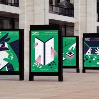
TURF FINGER
-
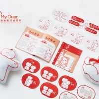
My Dear After Cancer Honeymoon Promotion Festival
-
Tree education inseitute
-
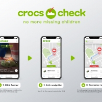
crocs check
-
Fab
-
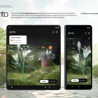
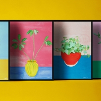
Planto
-
FIZZ
-
NEO Palette
-
ERIC CHOU Odyssey World Tour
-
HaoWan Print Art Calendar
-
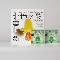
Northeastern China Essence Series
-
EasyGo
-
NATURE AND HAPPINESS
-
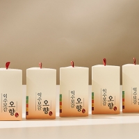
Package design of a herbal food with five aromas
-
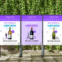
Colorful Club by Wine promotion advertisement
-
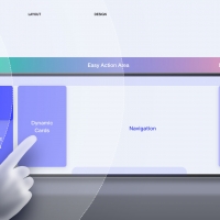
Baidu Driving Design System
-
POSTECH Holdings Leaflet
-
Tealog Sparkling Iced Tea
-
KOBE STORKS Japan pro basketball team
-
ZEXTR


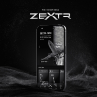
Designed by sketchbooks.co.kr / sketchbook5 board skin