EXHIBITION
Communication
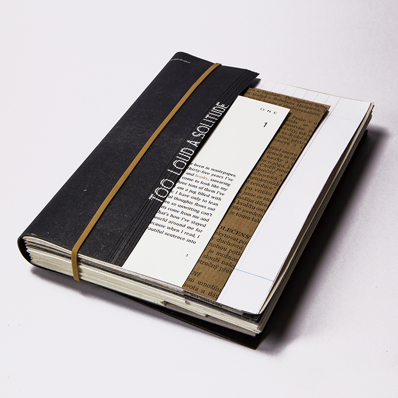
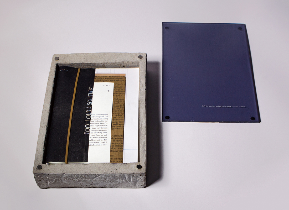
Too Loud A Solitude
| Year | 2015 |
|---|---|
| Award | WINNER |
| Affiliation | University of the Arts London |
| Designer | LITING WANG |
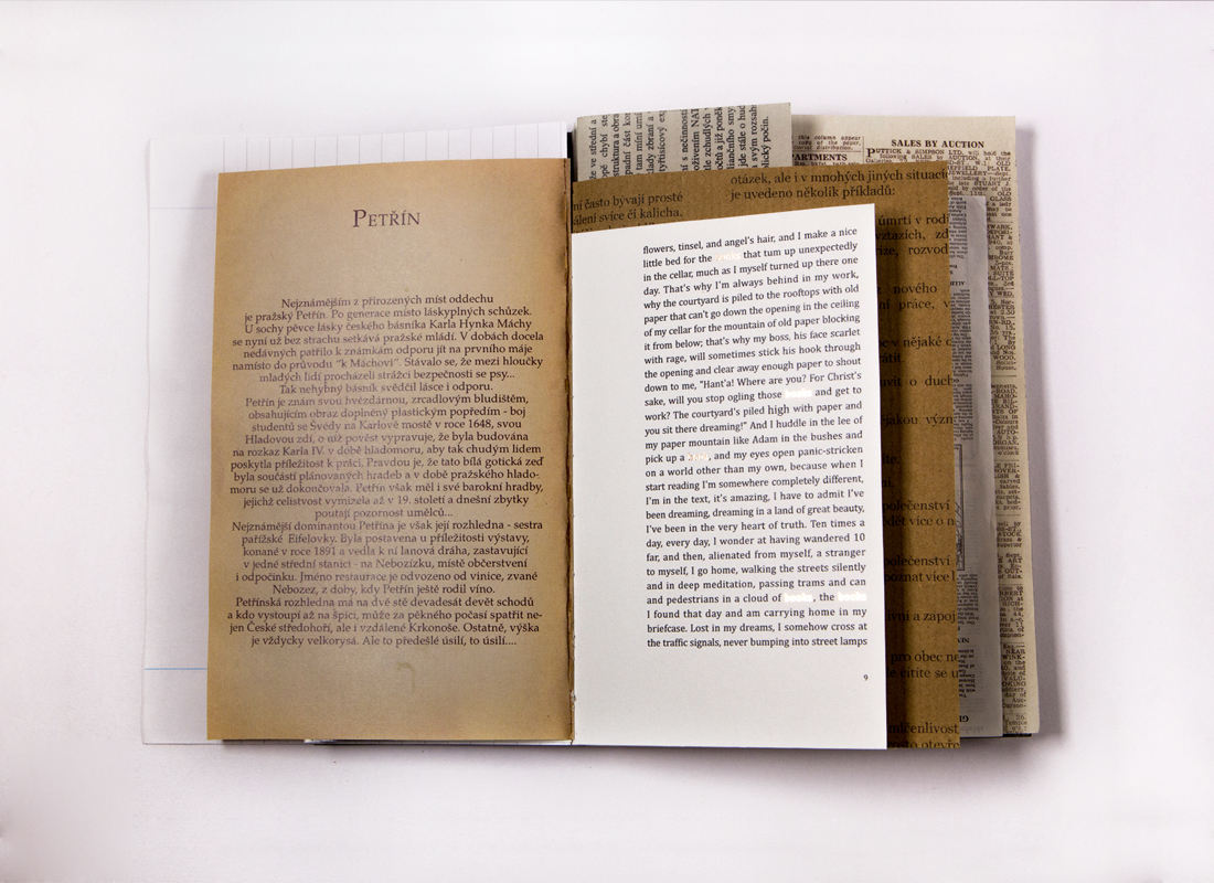
| Description(English) | In a modern life, which is full of visual and auditory sensation, the younger generation has a lower acceptance of reading text-based books than previous generations. When I looked for inspiration for my project I found that those books or magazines, which had more visual elements, attracted people more. By contrast, those that had merely text or less graphic images were easier to be ignored. I feel it is a shame that a book with good content never has a chance to be opened and read. In recent years, some writers or designers have been trying to introduce visual elements into the text of fictions - such as photography, typography, illustration etc. And the phenomenon has proved that there are still some possibilities with unconventional novels. Therefore, I began to think that a book is composed of not only the cover and the pages but also the spine, fore-edge and the binding etc. It is a three-dimensional object and so, if all the elements that make up a book are taken into consideration when doing a book design for a novel, is it possible to achieve better results? The question leads me to conduct this project. |
-
Retro Modern
-
Health and Wellness Shelter
-
The Rising Dawn
-
Room With A View
Designed by sketchbooks.co.kr / sketchbook5 board skin

