English

EXHIBITION
Communication
PRORIL Brand Design
| Area | Chinese Taipei |
|---|---|
| Year | 2017 |
| Award | BRONZE WINNER |
| Client | PRORIL PUMPS CORPORATION |
| Affiliation | Process Brand Evolution |
| Designer | Xinhong Yeh |
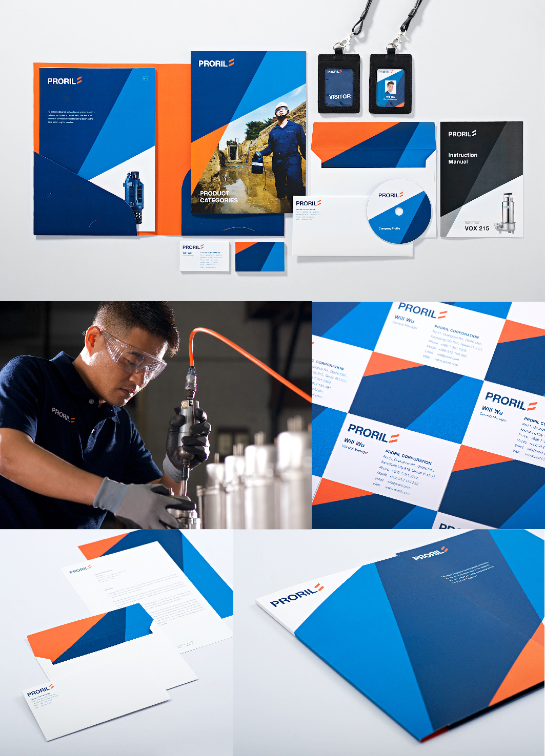
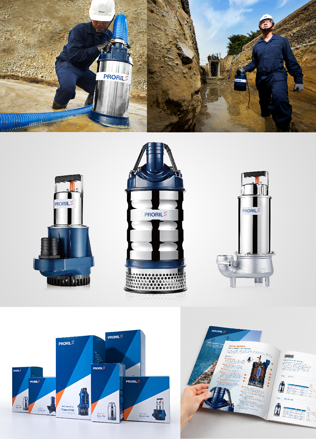
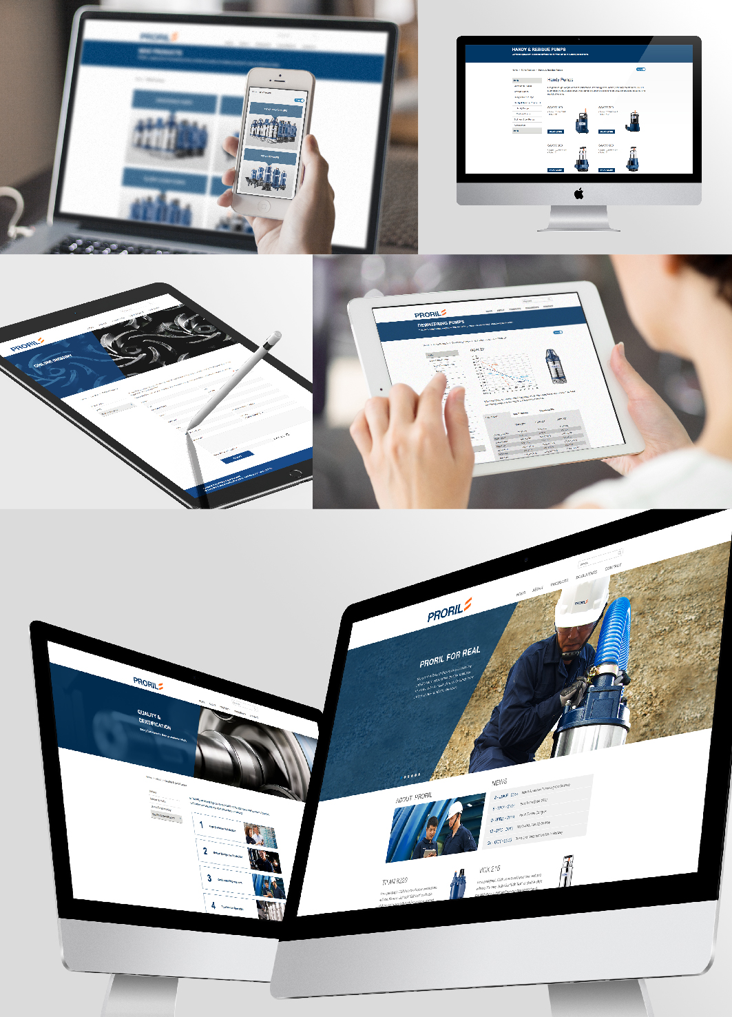
| Description(English) | PRORIL transited from OEM pump to establishing its own brand for the international market. A new brand identity and English naming are developed for PRORIL along with a series of brand communication materials which creates a dynamic and professional brand image. The design concept of brand identity came from the theory of pumping which water flows up. Using such unique dynamic element to making it visually separated from its competitors, the representation of brand is variational yet consistent with its brand character. |
| Description(Native) | PRORIL從傳統幫浦代工轉型,建立自有品牌,面向國際市場。從中英文命名、品牌識別的建立開始,PRORIL透過一系列品牌設計製作物,打造出活力與專業的品牌形象。 品牌識別以幫浦抽水過程中水流向上旋轉之概念並簡化而形成。在設計應用上以獨特識別元素組構的動態視覺,與其他競爭品牌做出對比,視覺表現具變化性,卻又有一致的品牌特色。 |
| Website | http://process-group.com/zh-tw/ |
-
KUMA
-
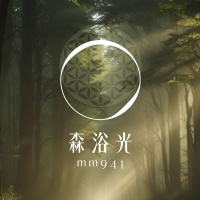
mm941
-
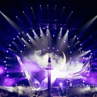
Accusefive 2024 Super Live Tour
-
Buyeo County Font
-
YUNJAC ALPHANAX
-
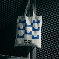
HUBFUN
-
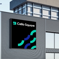
Key Visual development Samsung SDS Cello Square
-
MORA Vu
-
Carla Pan
-
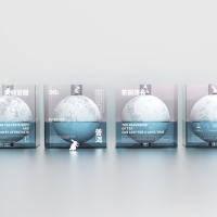
MidAutumn full moon
-
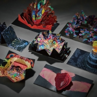
Sin is a pleasure
-
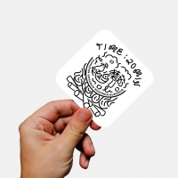
HUHUDUN
-
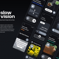
Slow Vision
-
BACK OF GYEONGBOKGUNG
-
TUTORO
-
Maple Rewind Interactive picture book App
-
Headcount
-
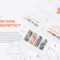
Are Disasters Democratic
-
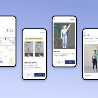
Habit Fitness Brand Identity Design Renewal
-
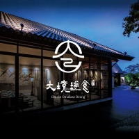
DaJing Omakase
-
Fly Head of Texture


Designed by sketchbooks.co.kr / sketchbook5 board skin