English

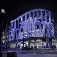
EXHIBITION
Communication
Zero Zero Brand Design
| Area | Chinese Taipei |
|---|---|
| Year | 2017 |
| Award | SILVER WINNER |
| Client | Da Fon Environmental Technology |
| Affiliation | Process Brand Evolution |
| Designer | Xinhong Yeh, Julie Chiang |
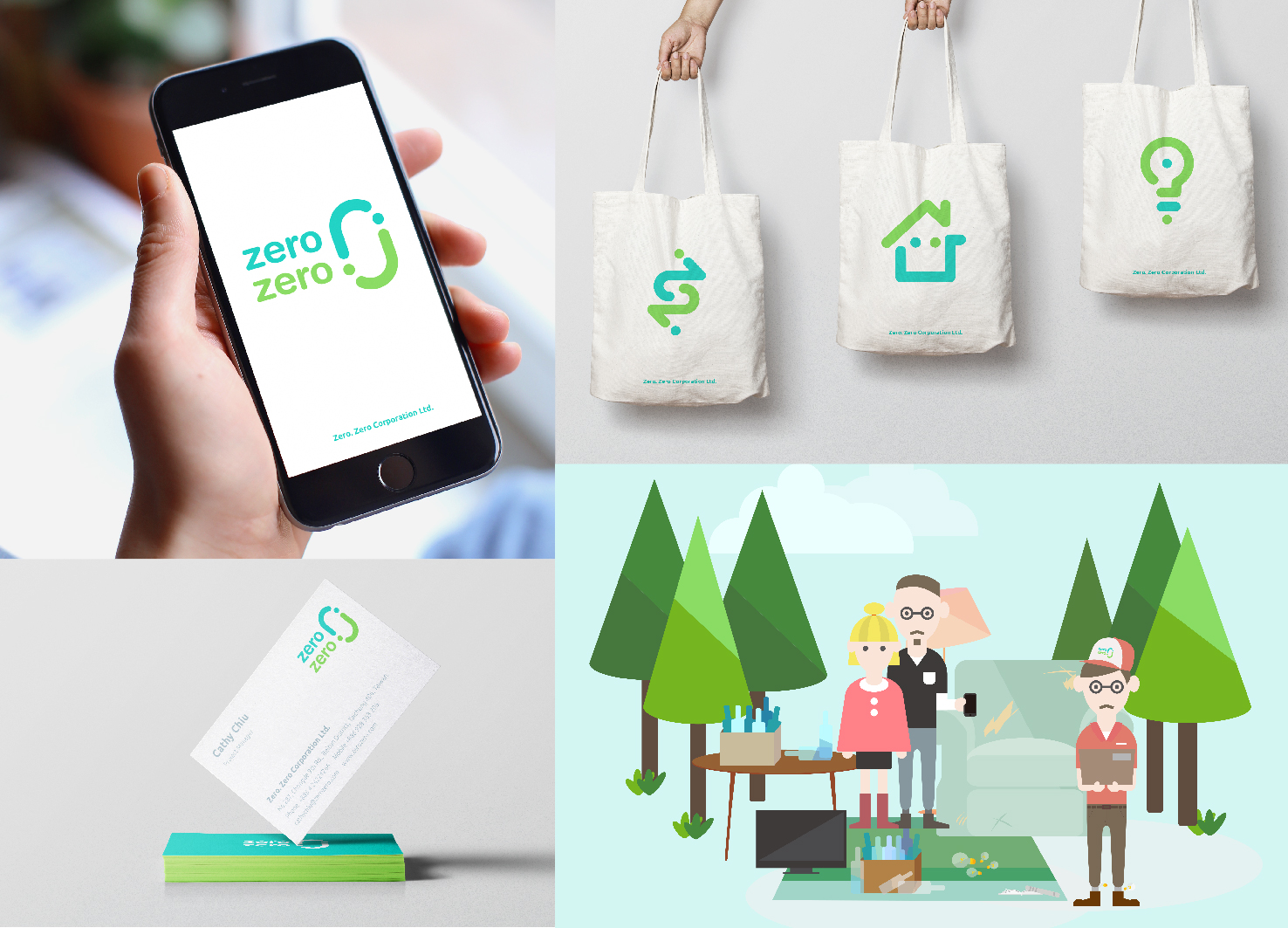
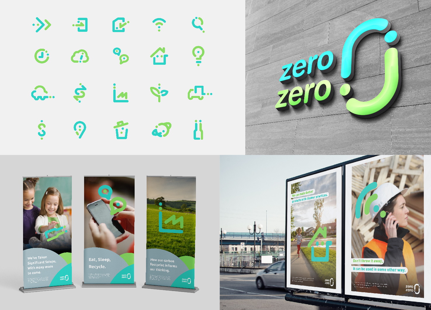
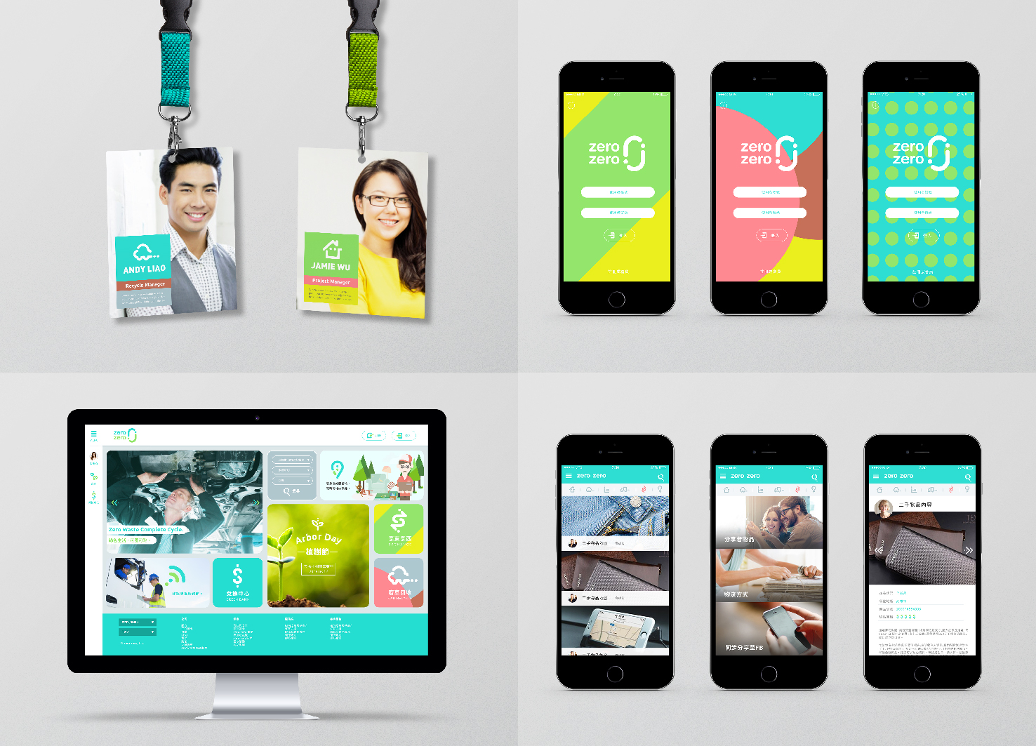
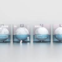
| Description(English) | zerozero is created by Taiwan's resource recycling companies which is an online multi-functional platform that integrates a variety of recycling services to provide consumers with the most convenient living function and is committed to contributing to non-waste of resources. Bright two green colors as a brand color with a smile-like curve showing its friendly character to the environment and human beings. In order to increase the brand's lively personality and the use of the fun, multiple, flexible and recycle are took as principles to create a series of consistent design application elements. |
| Description(Native) | zerozero是由台灣的資源回收公司創建的多功能線上平台,整合了各種回收服務,為消費者提供最方便的生活機能,並致力於達成零廢棄的友善環境。 以鮮明的兩種綠色作為品牌識別色,並以微笑的曲線呈現其標誌的型態,象徵對環境和人類友好的品牌性格。 另外,為了增加品牌的活潑個性和使用上的樂趣,更以多元,彈性和循環作為設計原則,延伸出一系列具有一致性的設計應用元素。 |
| Website | http://process-group.com/zh-tw/ |
-
KUMA
-
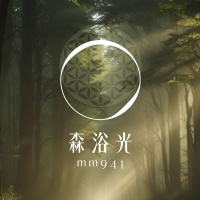
mm941
-
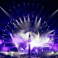
Accusefive 2024 Super Live Tour
-
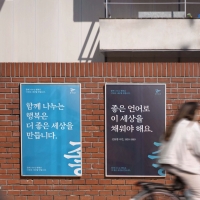
Buyeo County Font
-
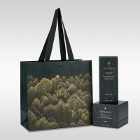
YUNJAC ALPHANAX
-
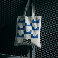
HUBFUN
-
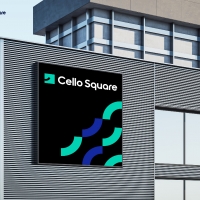
Key Visual development Samsung SDS Cello Square
-
MORA Vu
-
Carla Pan
-
MidAutumn full moon
-
Sin is a pleasure
-
HUHUDUN
-
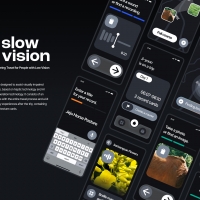
Slow Vision
-
BACK OF GYEONGBOKGUNG
-
TUTORO
-
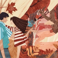
Maple Rewind Interactive picture book App
-
Headcount
-
Are Disasters Democratic
-
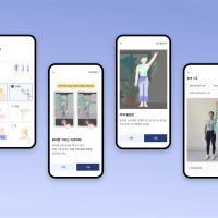
Habit Fitness Brand Identity Design Renewal
-
DaJing Omakase
-
Fly Head of Texture
Designed by sketchbooks.co.kr / sketchbook5 board skin