English

EXHIBITION
Communication
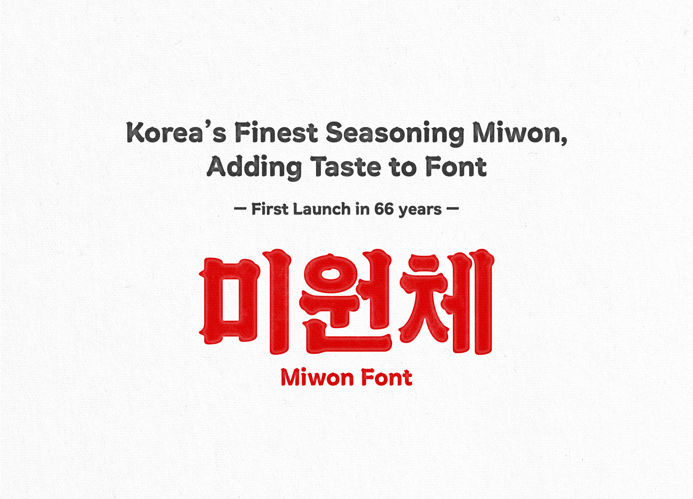
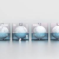
Miwon Font An old letter tastes better
| Area | Korea |
|---|---|
| Year | 2023 |
| Award | WINNER |
| Client | DAESANG |
| Affiliation | STUDIOK110 |
| Designer | STUDIOK110, Leedotype |
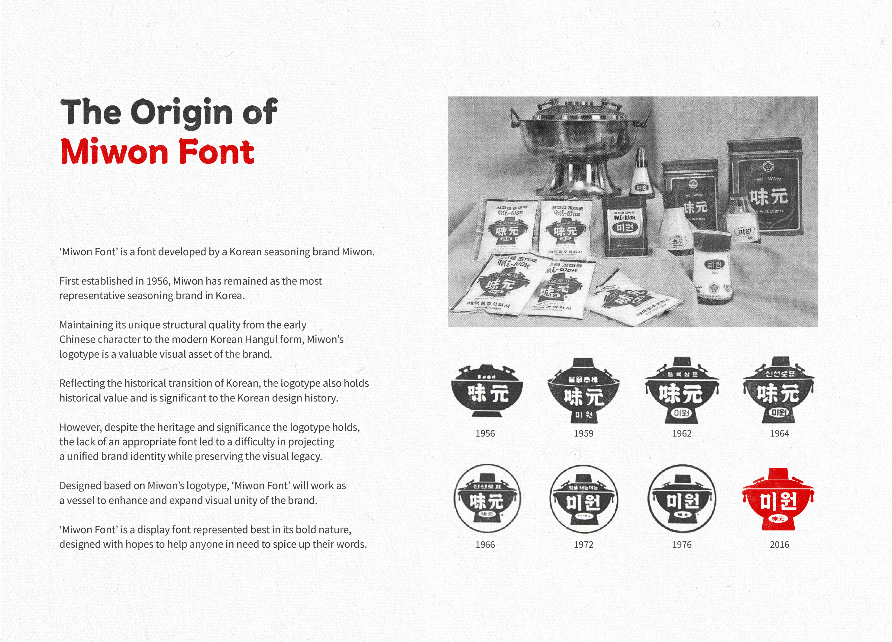
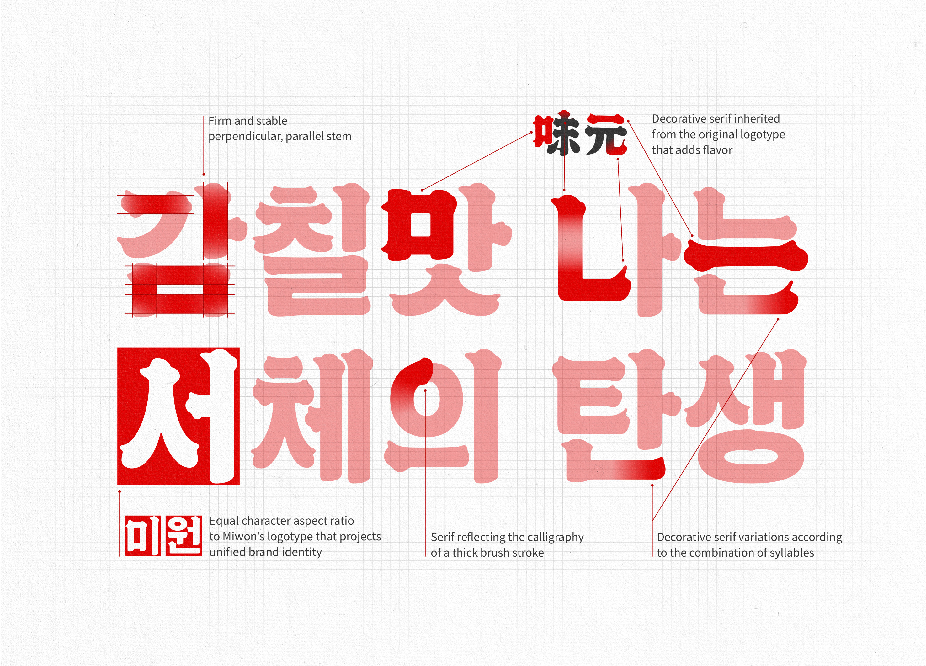
| Description(English) | ‘Miwon Font’ is a font developed by Korea’s most representative seasoning brand Miwon. Miwon has created and maintained a logotype with a unique structural quality that helped position the brand since 1956; however, with the lack of an appropriate font, there was a difficulty in projecting a unified brand identity while preserving the visual legacy throughout. Designed based on Miwon’s logotype, ‘Miwon Font’ will work as a vessel to enhance and expand visual unity of the brand. The font was distributed free of cost so that anyone in need could have access to the font just as anyone could use Miwon seasoning on any food. |
| Description(Native) | 미원체는 한국의 대표적인 조미료 브랜드인 미원의 브랜드 폰트입니다. 미원은 1956년부터 현재까지 형태적 특징이 꾸준히 유지된 로고를 보유하고 있지만, 이런 시각적 자산를 보조해줄 수 있는 적절한 서체를 가지고 있지 않아 일관된 브랜드 아이덴티티를 보여주는 것에 어려움이 있었습니다. 미원체는 미원의 로고를 모티브로 제작해 브랜드 아이덴티티의 일관성을 강화하고, 확장하는 재료로 사용될 수 있습니다. 또한 누구나, 어느 요리에든, 쉽게 맛을 낼 수 있도록 하는 미원의 컨셉처럼 미원체 역시 누구나 쉽게 사용할 수 있도록 무료로 배포되었습니다. 많은 사람들이 미원체를 사용할수록, 그들에게 미원 브랜드의 이미지 역시 긍정적으로 자리잡을 것입니다. |
| Website | www.studiok110.com |
| Positive Comments |


|
-
KUMA
-
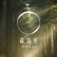
mm941
-
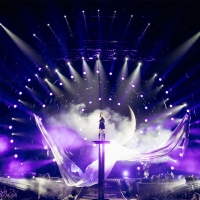
Accusefive 2024 Super Live Tour
-
Buyeo County Font
-
YUNJAC ALPHANAX
-
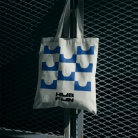
HUBFUN
-
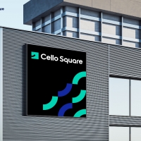
Key Visual development Samsung SDS Cello Square
-
MORA Vu
-
Carla Pan
-
MidAutumn full moon
-
Sin is a pleasure
-
HUHUDUN
-
Slow Vision
-
BACK OF GYEONGBOKGUNG
-
TUTORO
-
Maple Rewind Interactive picture book App
-
Headcount
-
Are Disasters Democratic
-
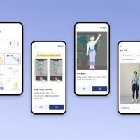
Habit Fitness Brand Identity Design Renewal
-
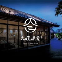
DaJing Omakase
-
Fly Head of Texture


Designed by sketchbooks.co.kr / sketchbook5 board skin