English

EXHIBITION
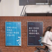
Communication
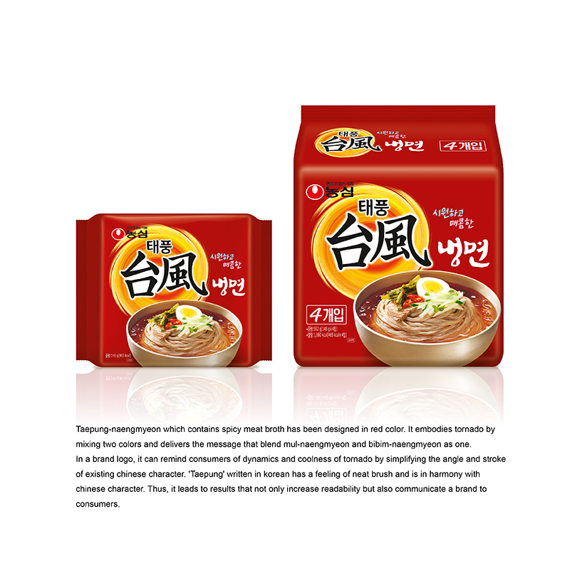
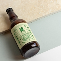
TAEPUNG-NAENGMYEON
| Year | 2015 |
|---|---|
| Award | BRONZE WINNER |
| Affiliation | NONGSHIM COMMUNICATIONS |
| Designer | SANGHEE BAK, YOUNHYUNG KIM |
| Description(English) | Taepung-naengmyeon which contains spicy meat broth has been designed in red color. It embodies tornado by mixing two colors and delivers the message that blend mul-naengmyeon and bibim-naengmyeon as one. In a brand logo, it can remind consumers of dynamics and coolness of tornado by simplifying the angle and stroke of existing Chinese character. 'Taepung' written in Korean has a feeling of neat brush and is in harmony with chinese character. Thus, it leads to results that not only increase readability but also communicate a brand to consumers. |
| Website | http://nscom.co.kr |
-
KUMA
-
mm941
-
Accusefive 2024 Super Live Tour
-
Buyeo County Font
-
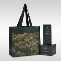
YUNJAC ALPHANAX
-
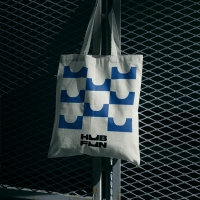
HUBFUN
-
Key Visual development Samsung SDS Cello Square
-
MORA Vu
-
Carla Pan
-
MidAutumn full moon
-
Sin is a pleasure
-
HUHUDUN
-
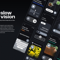
Slow Vision
-
BACK OF GYEONGBOKGUNG
-
TUTORO
-
Maple Rewind Interactive picture book App
-
Headcount
-
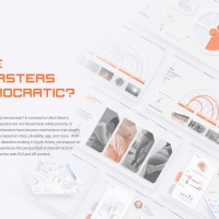
Are Disasters Democratic
-
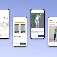
Habit Fitness Brand Identity Design Renewal
-
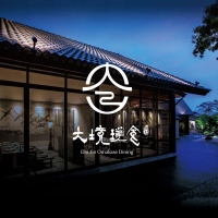
DaJing Omakase
-
Fly Head of Texture


Designed by sketchbooks.co.kr / sketchbook5 board skin