English

EXHIBITION
Communication
KUMA
| Area | Chinese Taipei |
|---|---|
| Year | 2025 |
| Award | WINNER |
| Client | Kuma Co., Ltd. |
| Affiliation | Existence Design Co., Ltd. |
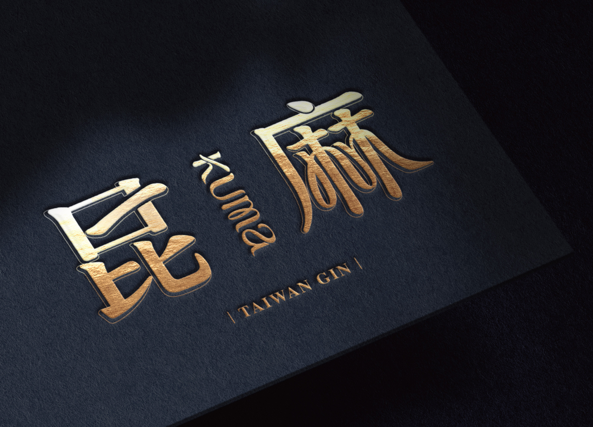
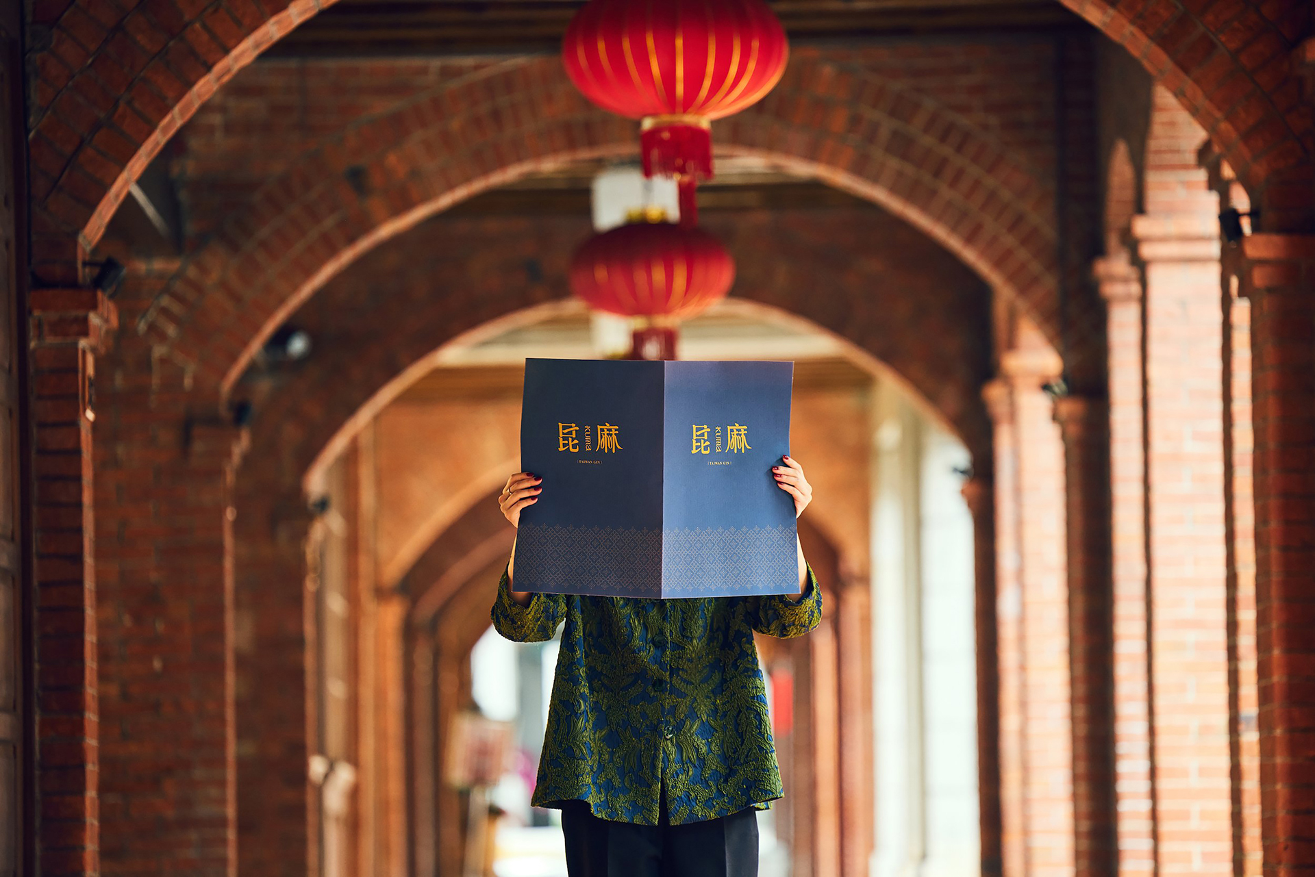
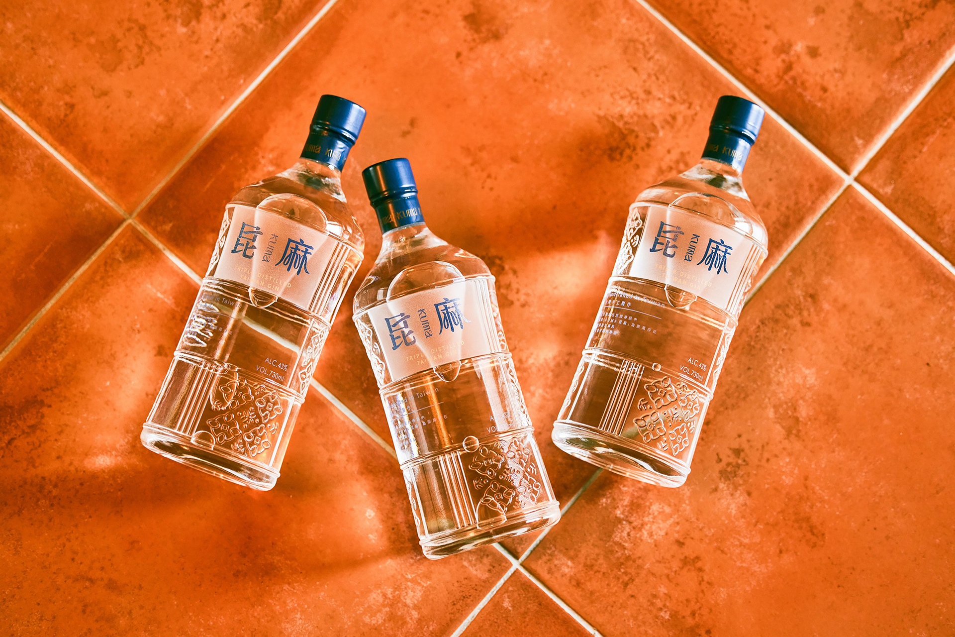
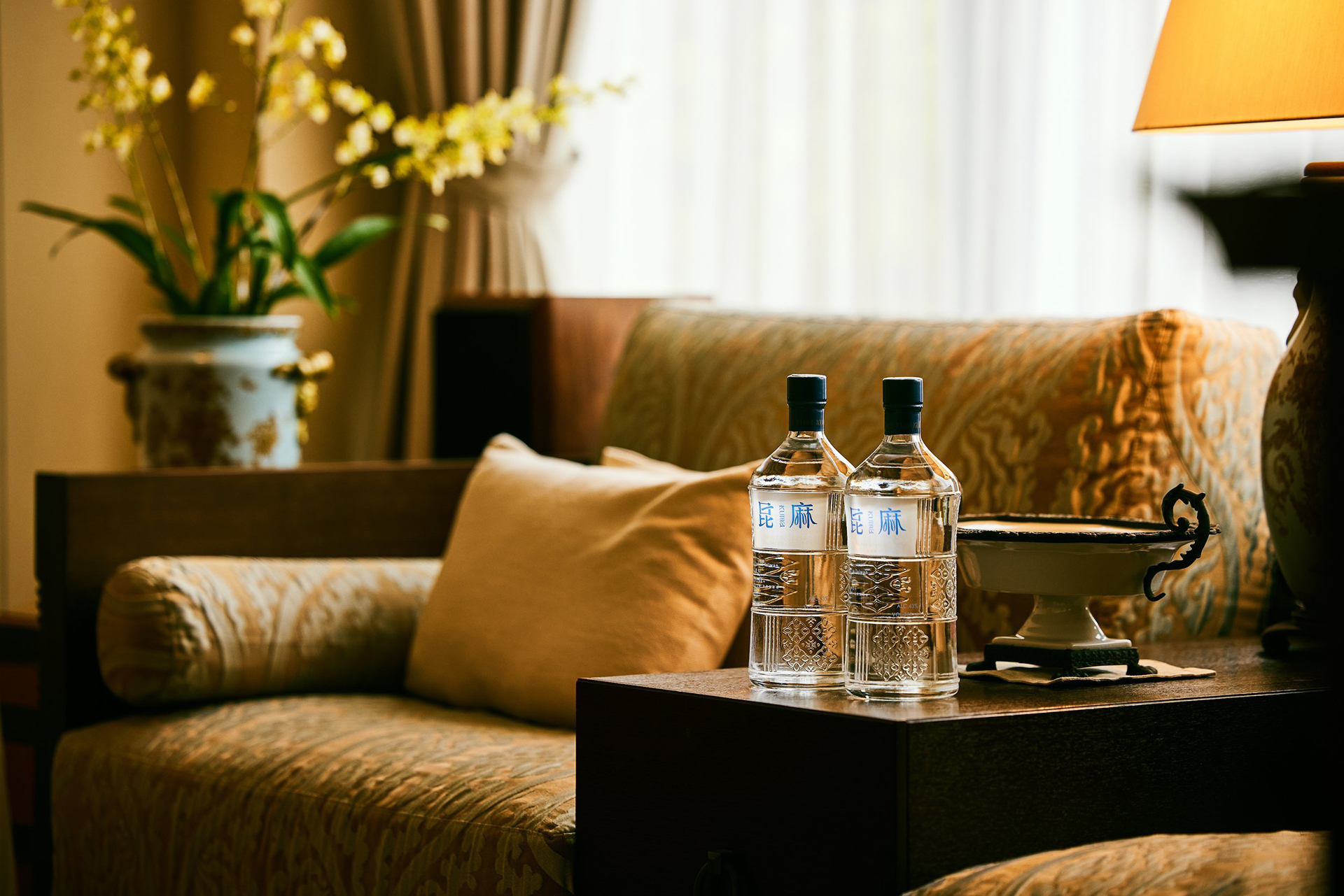
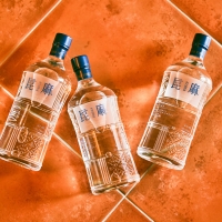
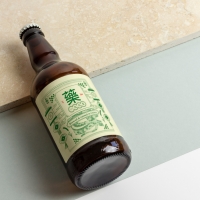
| Description(English) | Kuma is inspired by indigenous Taiwanese mythology, with the black bear symbolizing guardianship and the bond between people and nature. Committed to local production, from identity design to distillation and bottling, the brand promotes Taiwanese culture and supports the local economy. The design blends traditional calligraphy, window lattice graphics, and 1980s illustrations, incorporating local ingredients used in gin production as visual elements to showcase Taiwan’s unique features. The colors blue, red, purple, and green represent time, land, humanity, and the beauty of plants. Kuma brings Taiwan’s story to the world. |
| Description(Native) | 昆麻 Kuma 的靈感來自台灣原住民族神話中象徵守護與契約的黑熊(Kuma)。品牌致力於傳遞台灣土地的美好,向台灣的大自然與文化致敬。 1. 核心精神:台灣故事,世界共鳴 昆麻堅守台灣的起源,從品牌識別、玻璃瓶設計到原料、生產、蒸餾與裝瓶,全程支持在地生產。每一瓶昆麻琴酒展現卓越品質,除了推廣台灣文化故事,也促進在地經濟,並將台灣獨特魅力帶向國際。 2. 品牌識別設計:展現台灣特色 品牌設計以傳統楷體字體、融合天然原料與窗花特色的圖形,以及描繪80年代文化背景的插畫,構築專屬於 Kuma 的視覺語言,表達對台灣的熱情與傳承。此外,品牌設計還運用了製作琴酒的台灣在地原料,如台農57號地瓜、刺蔥、文旦、烏龍茶等,將這些精選原物料轉化為視覺元素,並應用於輔助圖形的設計中,展現台灣在地食材的精華與文化底蘊。 3. 色彩計劃:人、時、地、物 藍色象徵時間、紅色代表土地、紫色表達人性智慧、綠色體現天然植物之美,色彩傳遞品牌與土地的連結。 昆麻的整體設計風格,展現了台灣1980年代自由與新文化崛起的鮮明個性。這份設計語言與品牌精神相輔相成,希望透過琴酒這一載體,將台灣的故事推向世界更多的角落。 |
| Website | www.existence.com.tw |
| Positive Comments |


|
| Judging Comments | Kuma is a gin brand inspired by Taiwanese indigenous mythology, with the black bear as a symbol of protection and harmony with nature. From identity design to distillation, all processes are locally produced, supporting both culture and economy. The design integrates calligraphy, window lattice patterns, 1980s-style illustrations, and local gin ingredients, while the colors blue, red, purple, and green symbolize time, land, humanity, and plants. It was praised for blending tradition and modernity to share Taiwan’s story globally. |
-
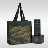
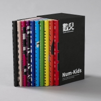
KUMA
-
mm941
-
Accusefive 2024 Super Live Tour
-
Buyeo County Font
-
YUNJAC ALPHANAX
-
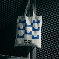
HUBFUN
-
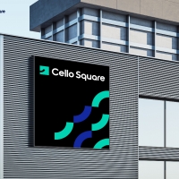
Key Visual development Samsung SDS Cello Square
-
MORA Vu
-
Carla Pan
-
MidAutumn full moon
-
Sin is a pleasure
-
HUHUDUN
-
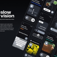
Slow Vision
-
BACK OF GYEONGBOKGUNG
-
TUTORO
-
Maple Rewind Interactive picture book App
-
Headcount
-
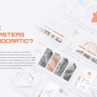
Are Disasters Democratic
-
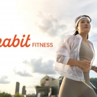
Habit Fitness Brand Identity Design Renewal
-
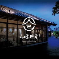
DaJing Omakase
-
Fly Head of Texture
Designed by sketchbooks.co.kr / sketchbook5 board skin