English

EXHIBITION
Communication
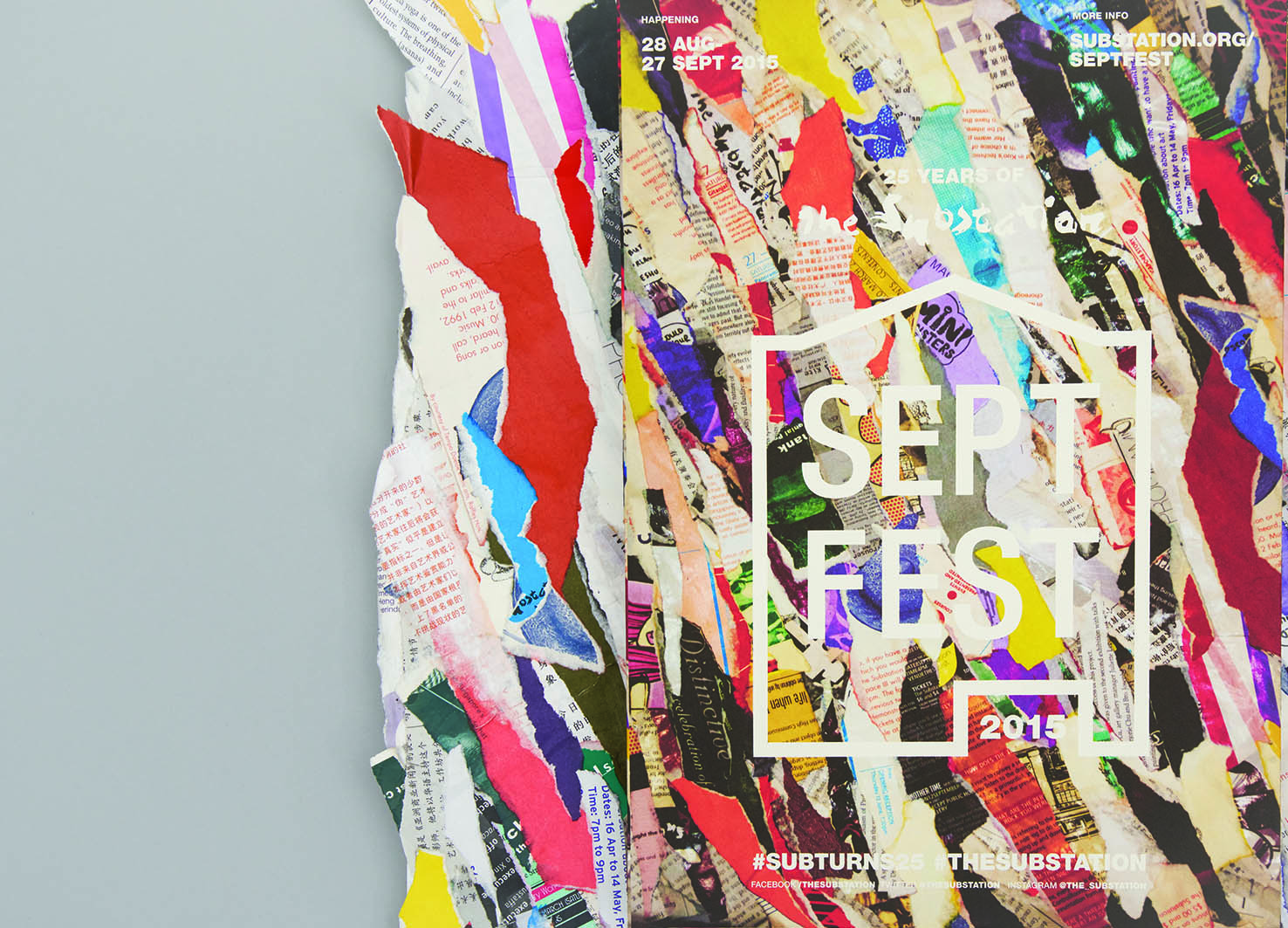
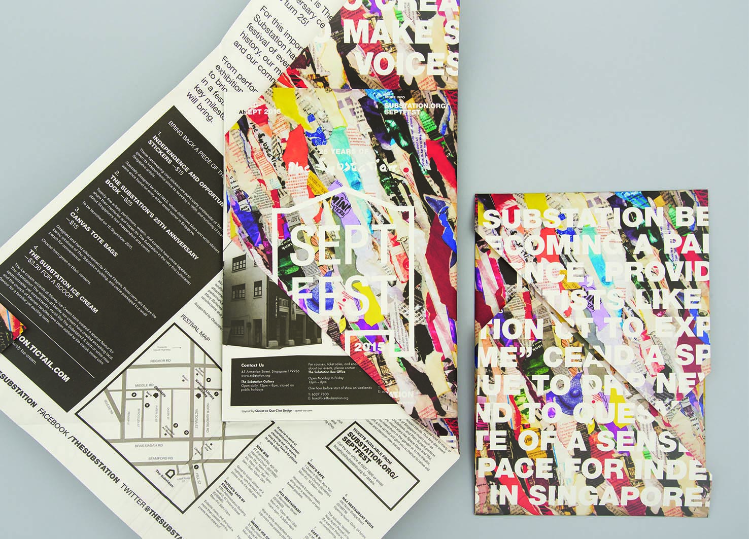
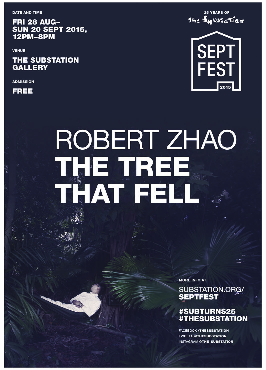
‘SeptFest 2015’ identity and publicity materials
| Year | 2016 |
|---|---|
| Award | WINNER |
| Affiliation | qu'est-ce que c'est design |
| Designer | Bryan Angelo Lim, May Lim, Victoria Lee |
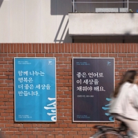
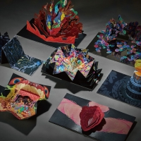
| Description(English) | The identity for Septfest, The Substation’s anniversary celebration, was developed out of the idea “reconstituting the past for the future”. The papier-mâché key visual that was made out of their old printed collaterals was inspired by peeling layers of posters plastered over each other on a wall, which is a visual metaphor for the critical role that the contemporary arts centre has played for emerging artists in Singapore through its programmes for the past 25 years. For its silver jubilee, the organisation was “peeling away its layers” to find its place in the years to come. The logo mark takes reference from handbills and wheat paste graphic posters. |
| Website | http://quest-ce.com |
-
KUMA
-
mm941
-
Accusefive 2024 Super Live Tour
-
Buyeo County Font
-
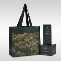
YUNJAC ALPHANAX
-
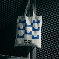
HUBFUN
-
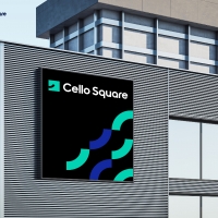
Key Visual development Samsung SDS Cello Square
-
MORA Vu
-
Carla Pan
-
MidAutumn full moon
-
Sin is a pleasure
-
HUHUDUN
-
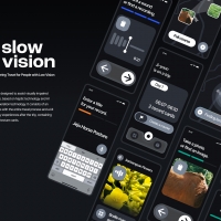
Slow Vision
-
BACK OF GYEONGBOKGUNG
-
TUTORO
-
Maple Rewind Interactive picture book App
-
Headcount
-
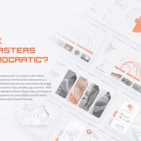
Are Disasters Democratic
-
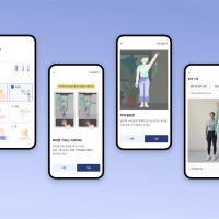
Habit Fitness Brand Identity Design Renewal
-
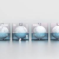
DaJing Omakase
-
Fly Head of Texture


Designed by sketchbooks.co.kr / sketchbook5 board skin