EXHIBITION
Cang Inn
| Country | China |
|---|---|
| Year | 2017 |
| Award | WINNER |
| Affiliation | Zhejiang Fashion Institute of Technology |
| Designer | Ming Mao, Dabin Yao |
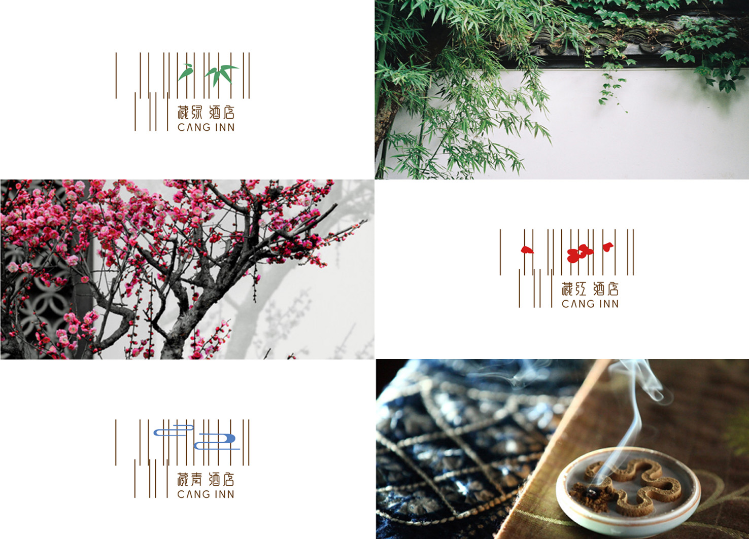
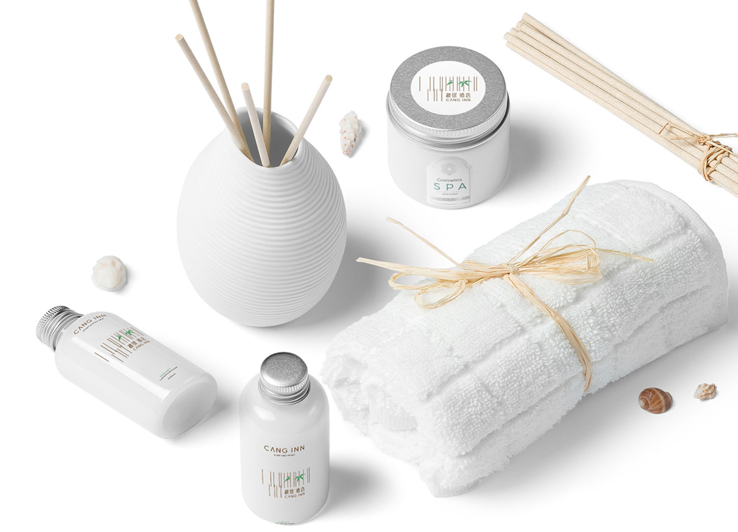
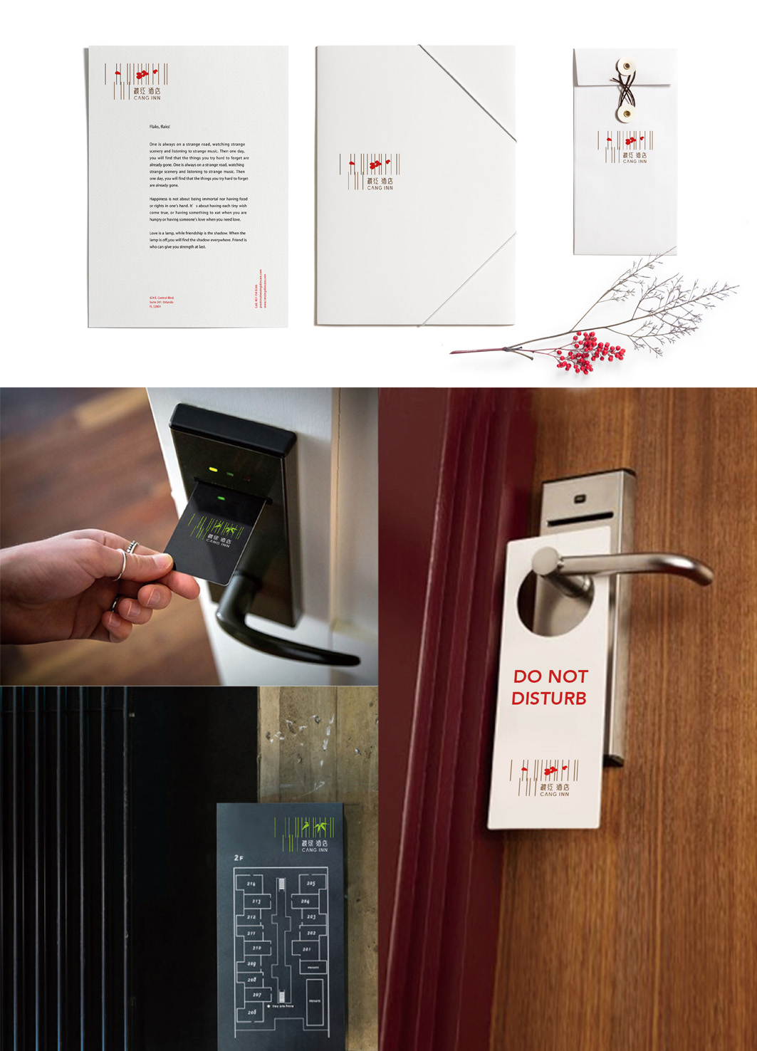
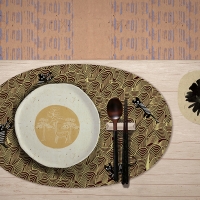
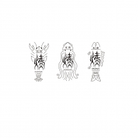
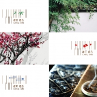
| Description(English) | This theme Inn consists of three different parts : These are named respectively as 'Cang Cyan', 'Cang Green' and 'Cang Red'. The word 'Cang', which originates from chinese ancient poetry, has the meaning of 'collection' and 'ensconce' here in the design.In the Logo design, the vertical line represents abstract architectural structure, while the thin line forms a simple shape in a manner of extending from the window. And the image of the water wave is used in design for 'Cang Cyan', so as the bamboo for 'Cang Green' and the plum flower for 'Cang Red', to present a soft and veiled eastern beauty, a visual fashion endowed with the idea of Zen. |
| Description(Native) | 客栈分为“奢侈、豪华、舒适”三个档次,分别用“藏青”、“藏绿”、“藏红”三个名字命名。“藏”在这里意思是“收藏”“隐藏”,名字取自中国古诗。“藏”系列带有浪漫的东方古典主义情怀,设计定位为客栈的“闹中取静”,“城市中一处隐居之地”的含义。 标志设计用竖线表示的抽象的建筑结构,从这样的抽象细线上浮出的简练的图形,就像是从窗内中延伸出来一样。在“藏青”这个标志中,用 “水纹”的形象设计。在“藏绿”这个标志中,用 “竹”的形象进行设计。在“藏红”这个标志中,用 “梅花”的形象进行设计。标志充满着东方半遮半掩的美感,视觉感受时尚,充满东方禅意。 |
-
Tor Manish Brand Design
-
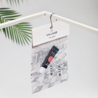
Village11factory Makeup Packaging
-
A corporate brochure for a web solutions company
-
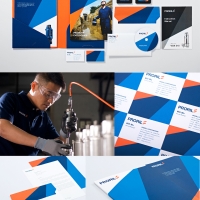
PRORIL Brand Design
-
Severance Han Implant Clinic
-
the beginning of Korean Celebration, Society M
-
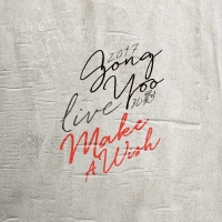
2017 Gong Yoo Live 'Make A Wish' Concert Poster
-
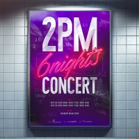
2PM CONCERT '6Nights'
-
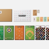
workshop boardgames
-
Nebula
-
Kia Niro App
-
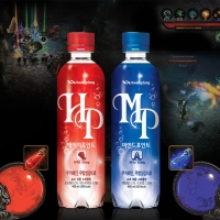
H-Point (HP) and Mind Point (MP)
-
Isn’t it great to be Alive!
-
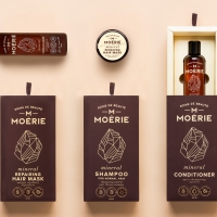
Moérie - Beauty Care
-
Promes Brand Design
-
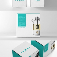
China Tea Branding & Packaging Design
-
Holly II Restaurant Brand Identity
-
Brand Identity Younghi Pagh-Paan International Composition Prize
-
Eogiya diyeocha
-
Frame in Winter
-
From scratch-the design of the exhibition
-
Hidden Cliff Hotel & Nature Brand Design & Identity
-
KAOHUO Logo
-
Malaysian Festive Packaging Collection
-
Parents-Kids Storytelling Handwash Bottle
-
SounAD FAN
-
the eyes
-
Cang Inn
Designed by sketchbooks.co.kr / sketchbook5 board skin

