English

EXHIBITION
Communication
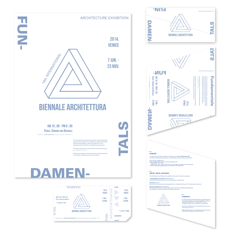
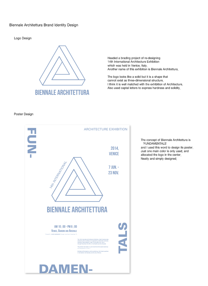
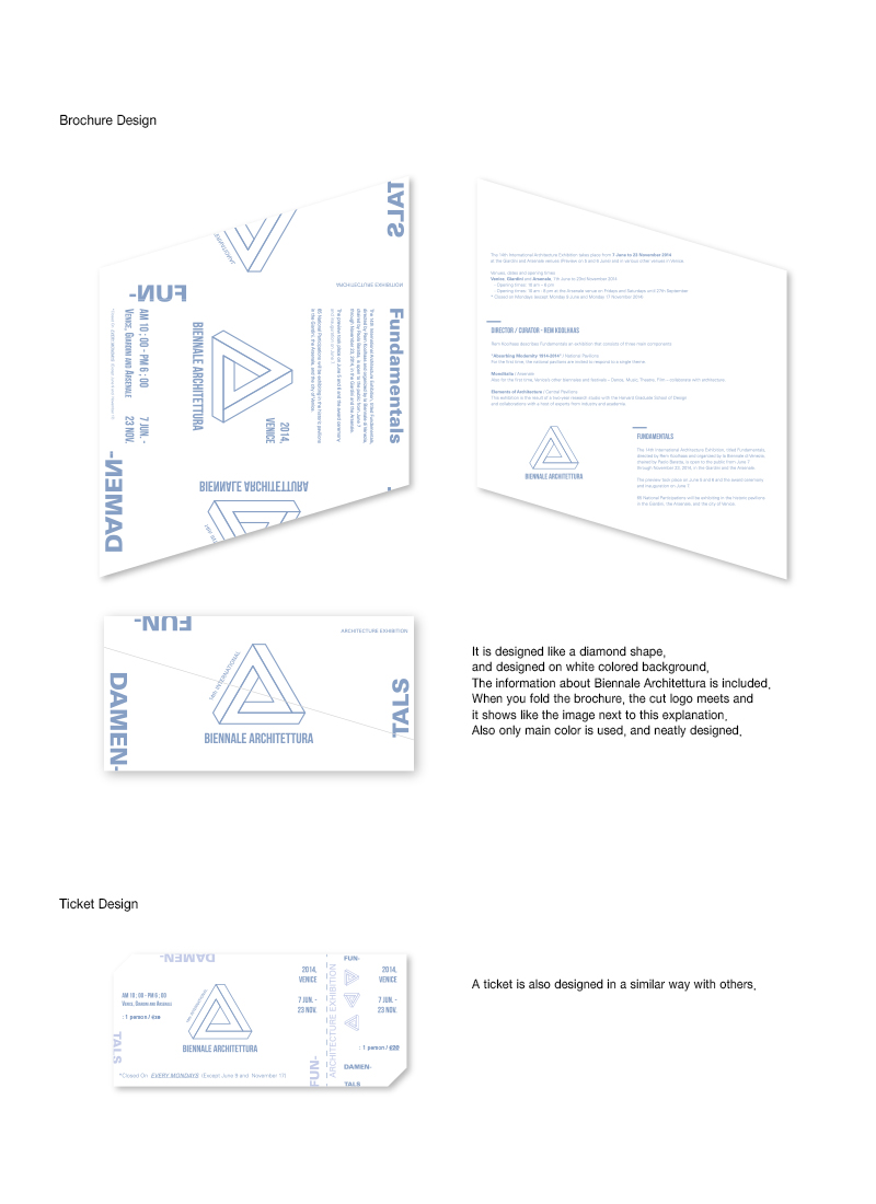
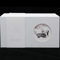
Biennale Architettura Brand Identity Design
| Country | Korea |
|---|---|
| Year | 2015 |
| Award | WINNER |
| Affiliation | Sungshin Women's University |
| Designer | JIYUN PARK |
| Description(English) | Headed a brading project of re-designing 14th International Architecture Exhibition which was held in Venice, Italy. Another name of this exhibition is Biennale Architettura. The logo looks like a solid but it is a shape that cannot exist as three-dimensional structure. I think it is well matched with the exhibition of Architecture. Also used captal letters to express hardness and solidity. Re-designed a logo, a poster, a brochure and a ticket. Used only one main color and white colored background for the neat design. A new logo is allocated in the center of every single design. |
-
Yu Zhong Bu Tong Brand Identity
-
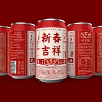
Ji Shi Dao Herbal Tea Packaging Design
-
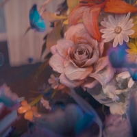
Still Life Still LIves
-
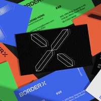
BorderX Rebranding
-
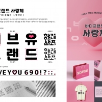
BODYFRIEND Key Value Font Pack
-
Midea smart blue
-
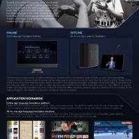
Xiling AI Sign Language Platform
-
Suofeiya home collection Visual Identity
-
Columbia 75 degree incline in Package
-
443 GARDEN Art Pattern
-
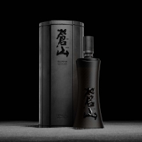
Bamboo Slips Liquor
-
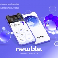
NEWBLE Watch balanced world
-
Korea 195 Grapefruit Biscuit Packaging Design
-
NYGDESIGN Brand Design Upgrade
-
Moon Cake Box
-
Post Morden Life


Designed by sketchbooks.co.kr / sketchbook5 board skin