EXHIBITION
Maguro
| Area | China Hong Kong |
|---|---|
| Year | 2022 |
| Award | WINNER |
| Affiliation | MOI Interior Design |
| Designer | Frank Lo |
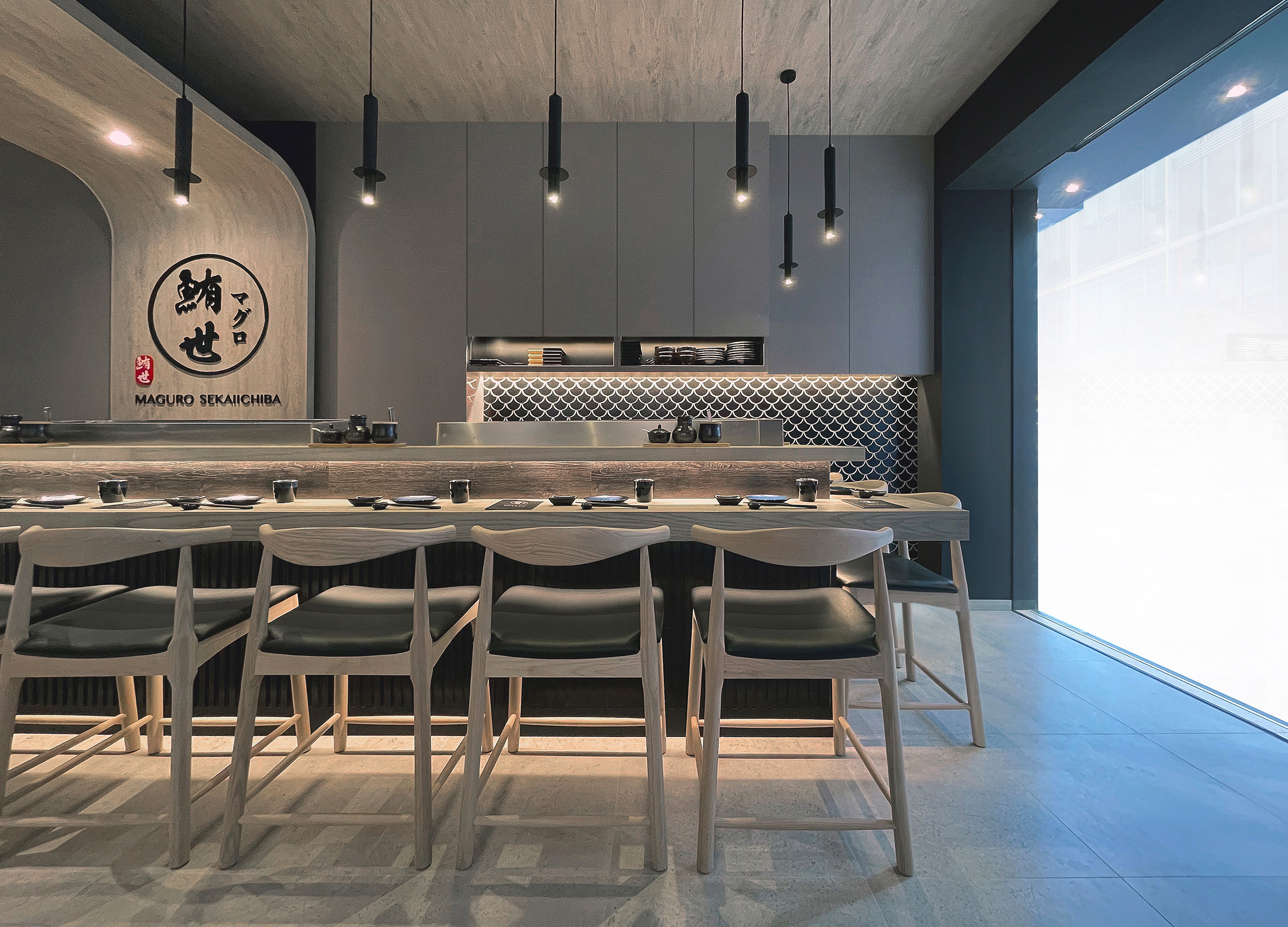
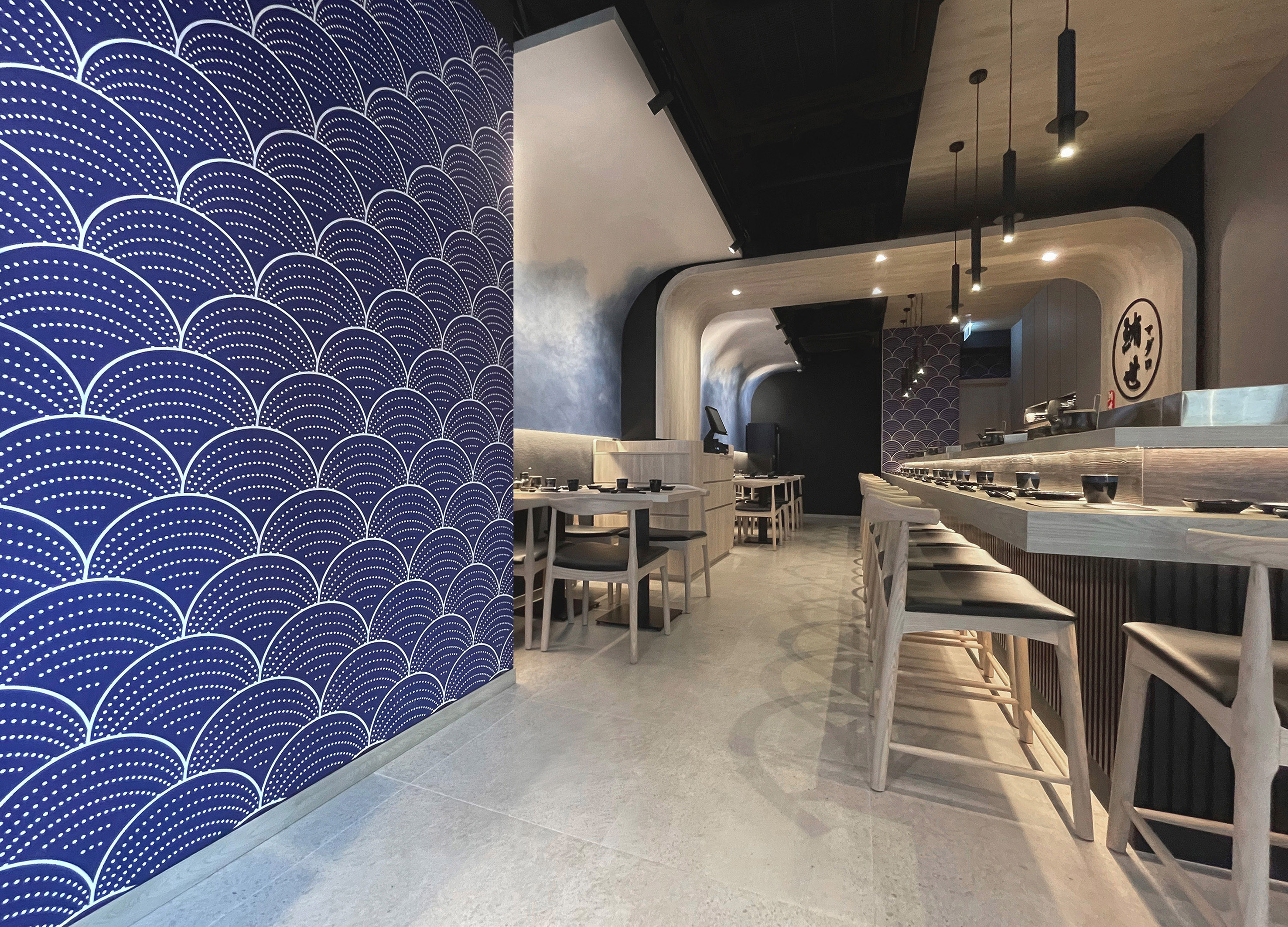
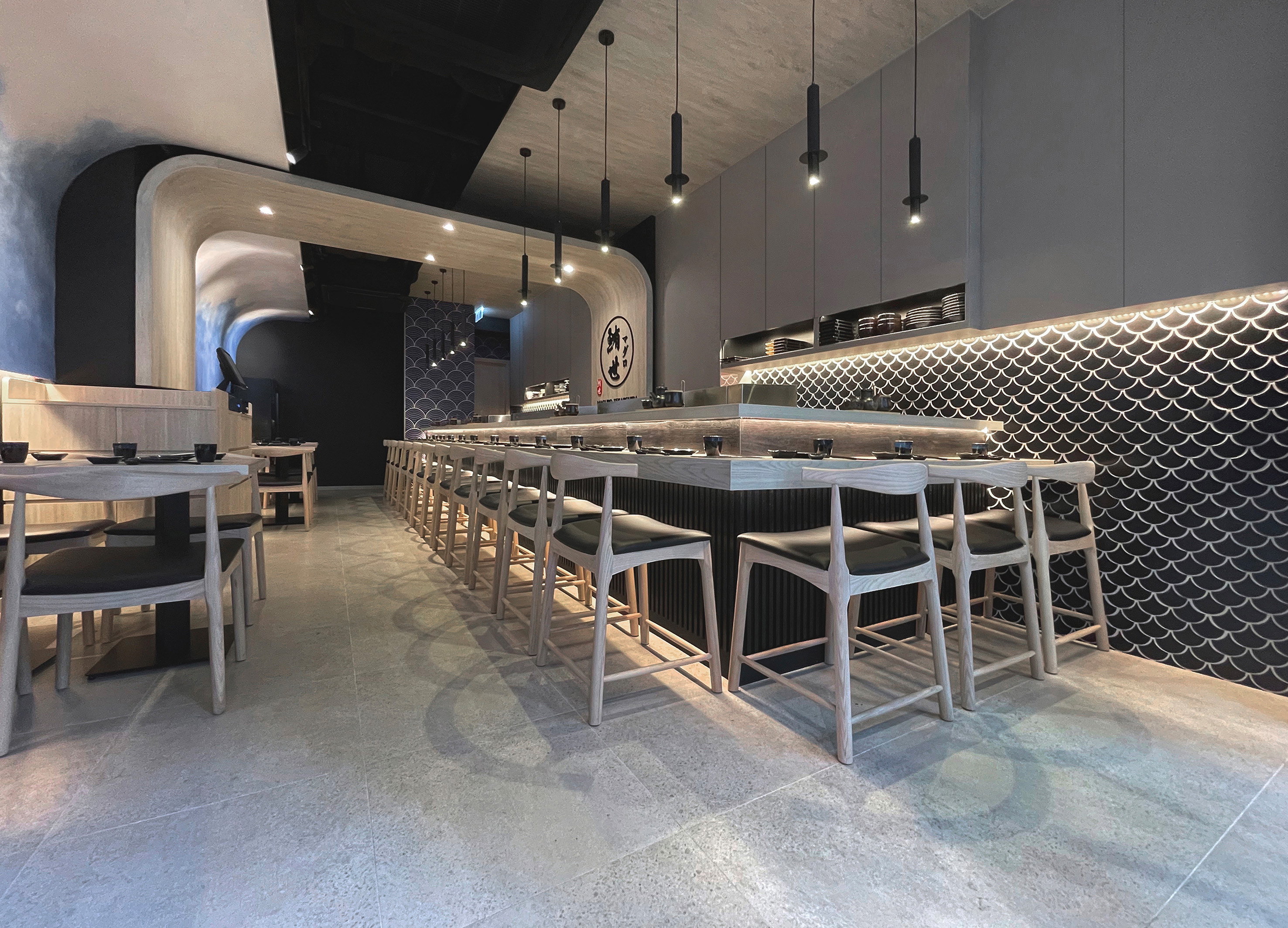
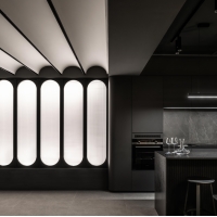
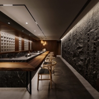
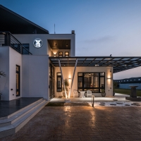
| Description(English) | The dining area features an eight-meter-long wall designed to look like a wave and impress diners from the moment they enter. Wave-like effects are caused by the gradual blurring of blue and white areas in Italian art paint. A curved false ceiling that appears like waves was also created by extending the wall to the ceiling. Its decor is inspired by the sea, providing patrons with the sense that they are near the ocean and surrounded by fresh seafood. In addition, the designer also designed the cabinets in the bar area in the shape of a kimono, which appears to embrace the bar area with open arms. |
| Description(Native) | 用餐區有另一道長達八米的特色牆,以"湧浪"作為意念,令到食客一甫進店內,便感受到全店焦點所在,留下深刻印象。 這道牆採用了意大利藝術漆,從藍色部分逐漸暈染散開至白色部分,呈現海浪的形態。 而且,設計師還把特色牆延伸至天花板,形成弧形的假天花,感覺就像真實的海浪那樣,把餐廳覆蓋起來,讓人彷彿置身海邊一樣,更能夠感受到海鮮食材的鮮 魚鱗特色牆寓意生意向上 櫥櫃設計蘊含匠人精神,牆身鋪砌了黑色魚鱗磁磚,與吧台的黑色木條子飾面互相襯托,層次更為突出,同時提升了餐廳的格調。其中,魚鱗磁磚的排列方式表示著魚身向上,象徵餐廳的生意能夠蒸蒸日上,顯得更有特色。 除此之外,設計師也特別把吧台區的櫥櫃設計成和服的外形,看似就如張開雙臂一樣,把吧台區擁抱其中。 平時壽司師傅站在櫥櫃的中間位置製作料理,以背後的這組櫥櫃作襯托,感覺就像向客人展示自己寄託於料理之中的誠意,讓客人更感受到匠人的精神,表達壽司師傅以"心"製作 。 另外,餐廳的中段有一條結構柱,把餐廳一分為二,設計師在此加設了一組拱形大木框,透過淺木色和弧形線條,把兩邊的區域重新連繫起來,這個位置也就是全店的核心“鮪Maguro”。 |
| Website | www.moi-interiordesign.com, https://www.facebook.com/media/set/?set=a.5425811010794660&type=3 |
| Positive Comments |


|
-
Mine Shade
-
Gathered Pieces
-
Miwon Font An old letter tastes better
-
Overall hidden button sports water cup
-
Outdoor travel cutlery box
-
mosery
-
LIVE BEFORE MARRIAGE Visual Branding
-
Made Lim
-
Eye Care Stick
-
mini washer and dryer
-
Bank of Taiwan
-
Mancave
-
Magma Hot Pot
-
MaruMaru Lash
-
Tealog
-
Immersion in light and shadow
-
Just Right
-
ROMANMEAL Whole Grain Breads
-
Feastia
-
STAGE
-
SIDANDA KIDS Baby Shape Pillow
-
Baby professional anti colic bottle set
-
CXN
-
Silver Snow in the Afternoon
Designed by sketchbooks.co.kr / sketchbook5 board skin

