
EXHIBITION
‘SeptFest 2015’ identity and publicity materials
| Year | 2016 |
|---|---|
| Award | WINNER |
| Affiliation | qu'est-ce que c'est design |
| Designer | Bryan Angelo Lim, May Lim, Victoria Lee |
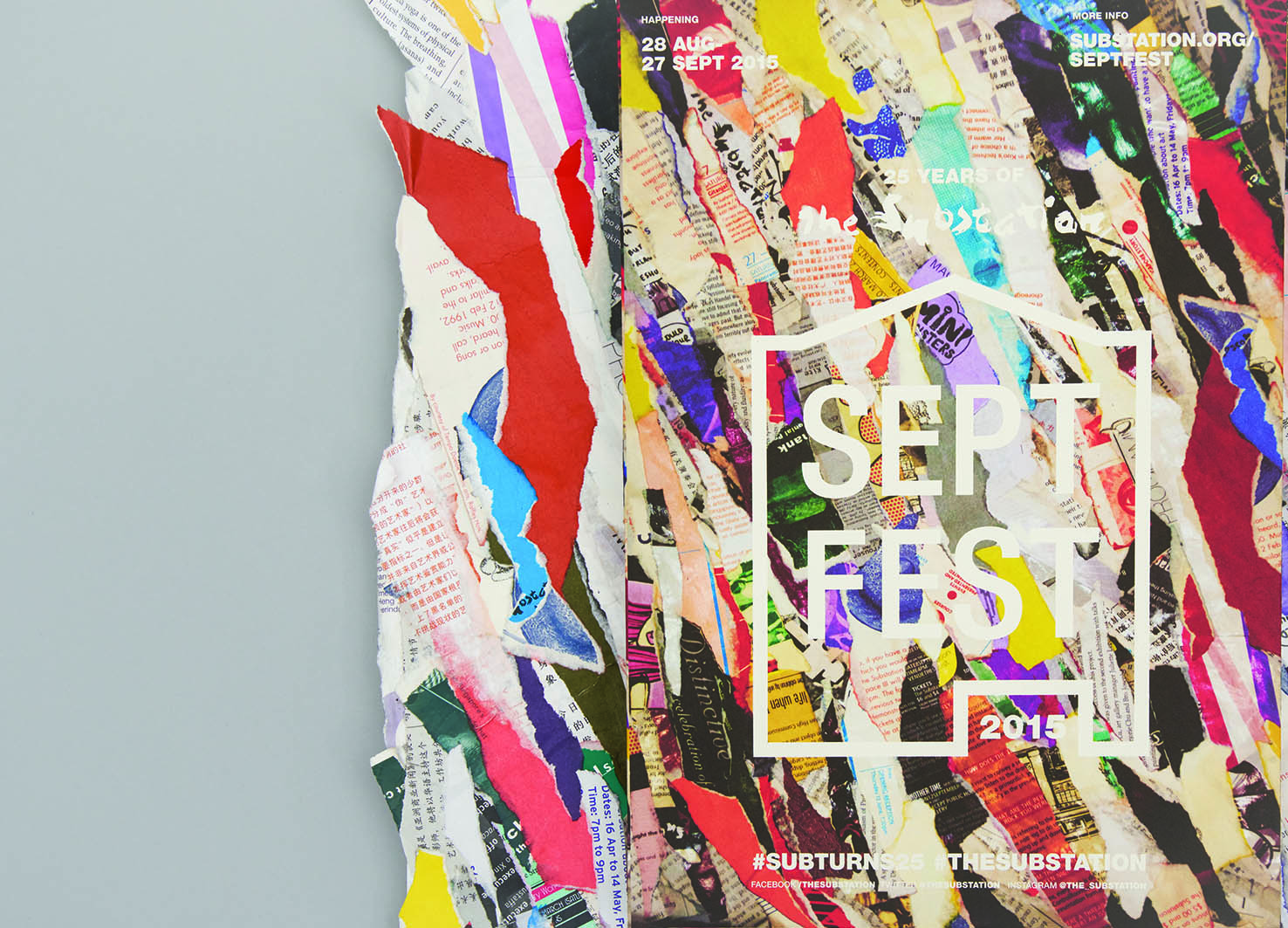
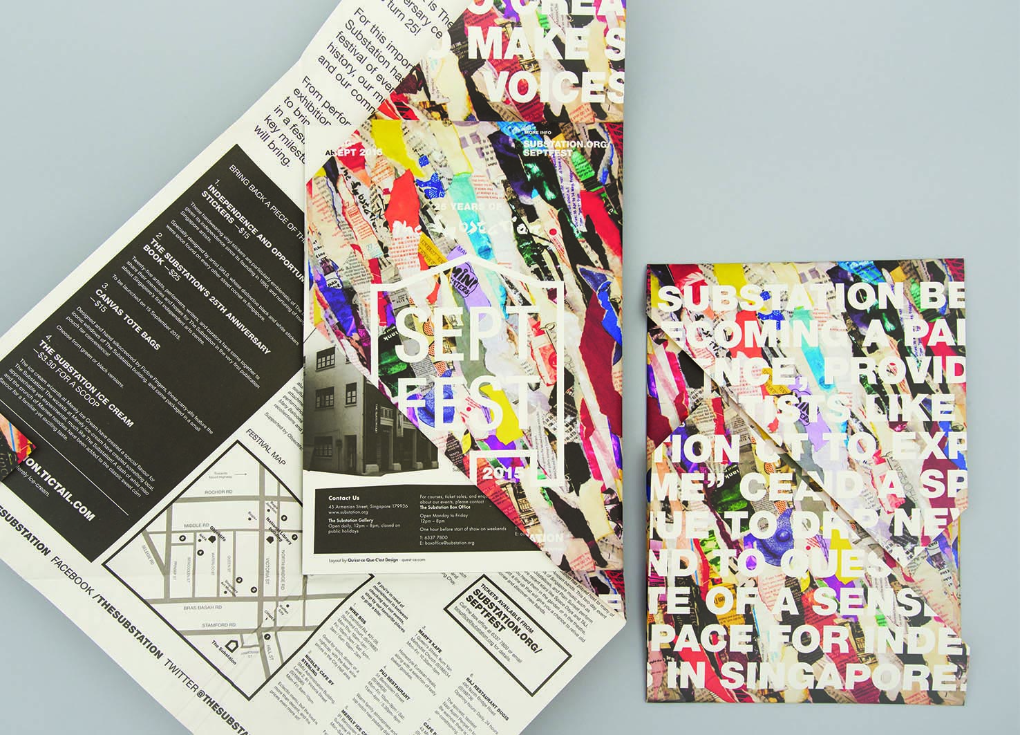
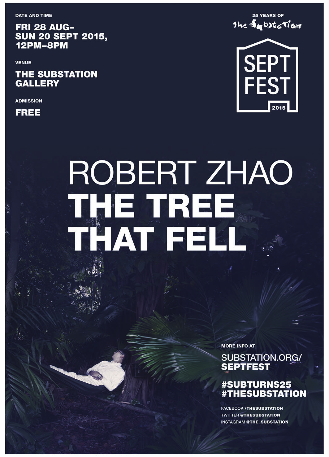
| Description(English) | The identity for Septfest, The Substation’s anniversary celebration, was developed out of the idea “reconstituting the past for the future”. The papier-mâché key visual that was made out of their old printed collaterals was inspired by peeling layers of posters plastered over each other on a wall, which is a visual metaphor for the critical role that the contemporary arts centre has played for emerging artists in Singapore through its programmes for the past 25 years. For its silver jubilee, the organisation was “peeling away its layers” to find its place in the years to come. The logo mark takes reference from handbills and wheat paste graphic posters. |
| Website | http://quest-ce.com |
-
Star studded Cup Haers Fall and Winter series
-
FALCON
-
FAMILIE
-
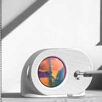
CYCLOID Magnetic Powerbank
-
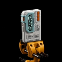
Attentive Defender V81
-
OASIS
-
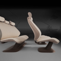
Full range kinetic adaptive car seat design
-
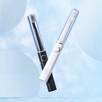
Littli L1 Portable Electric Toothbrush
-
Water bottle for consumer and save earth
-
ATLAS
-
Combining tactile learning tool
-
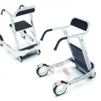
SPORT WALKER
-
Grow with you
-
Virtual fitting room
-
Millo
-
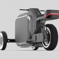
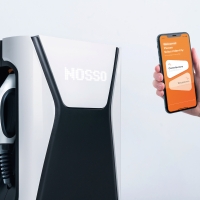
NOSSO Electric Car Charging Service
-
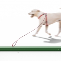
DogRail
-
Halcon Extreme sports protective gear
-
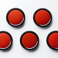
japanese pattern ink pad
-
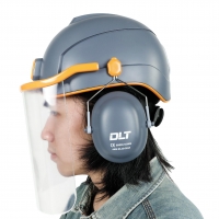
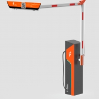
DLT Construction Site Safety System
-
GORI
-
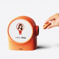
Stork
-
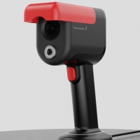
Edge device with RGB thermal imaging camera
-
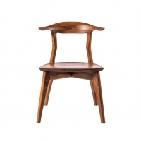
sui arm chair
-
Ebiu Anti Occupying Vehicle Charger
-
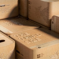
The Third Size Tissue box made from straw
-
Animal Musician


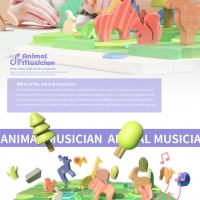
Designed by sketchbooks.co.kr / sketchbook5 board skin