English

EXHIBITION
Communication
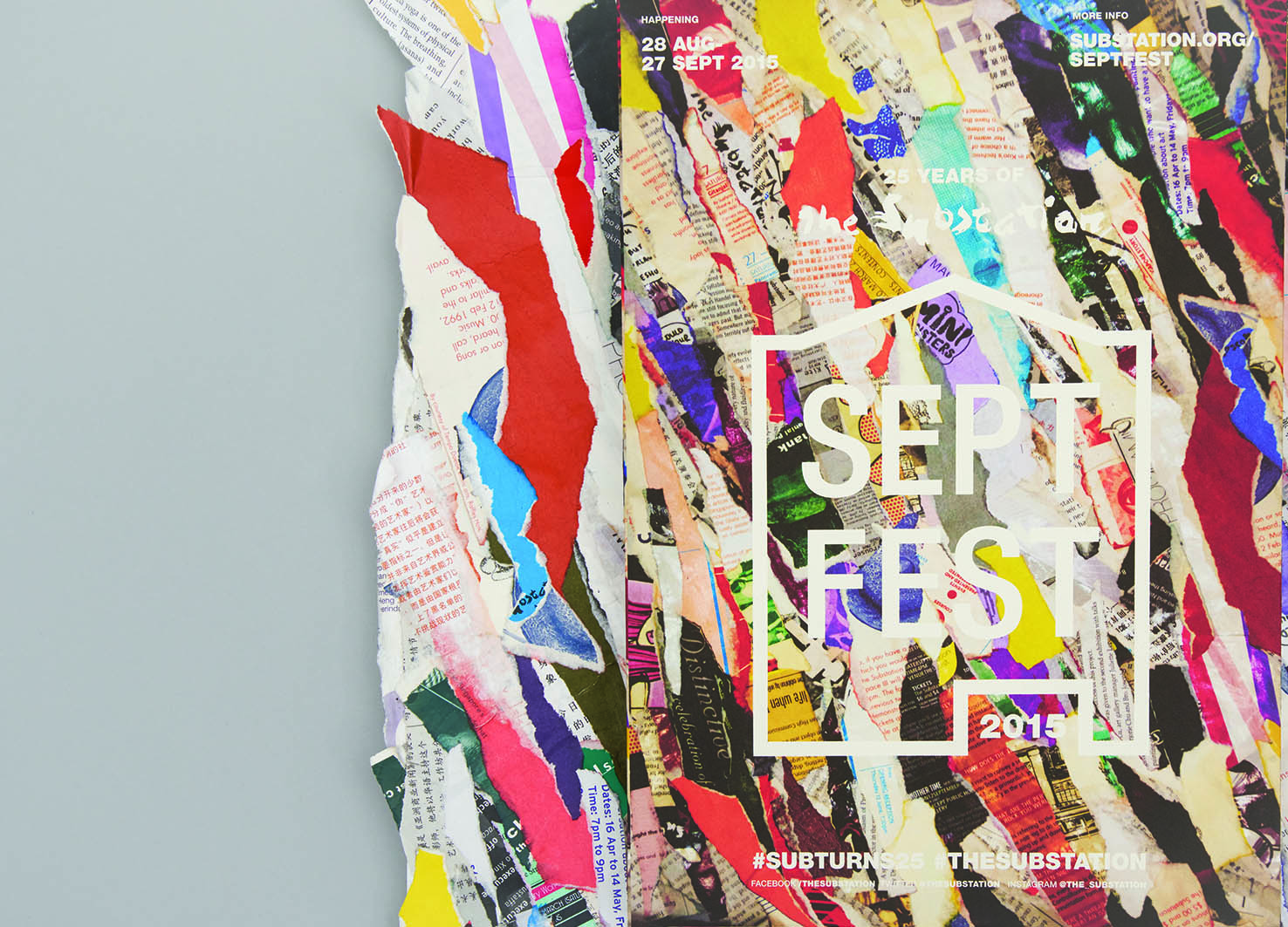
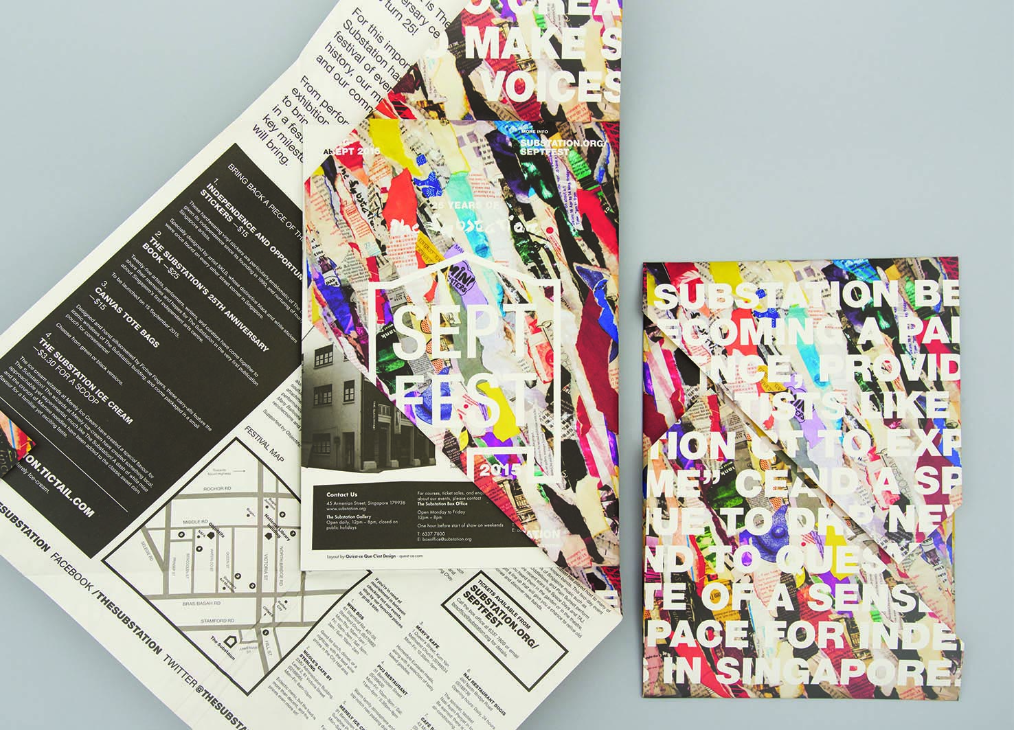
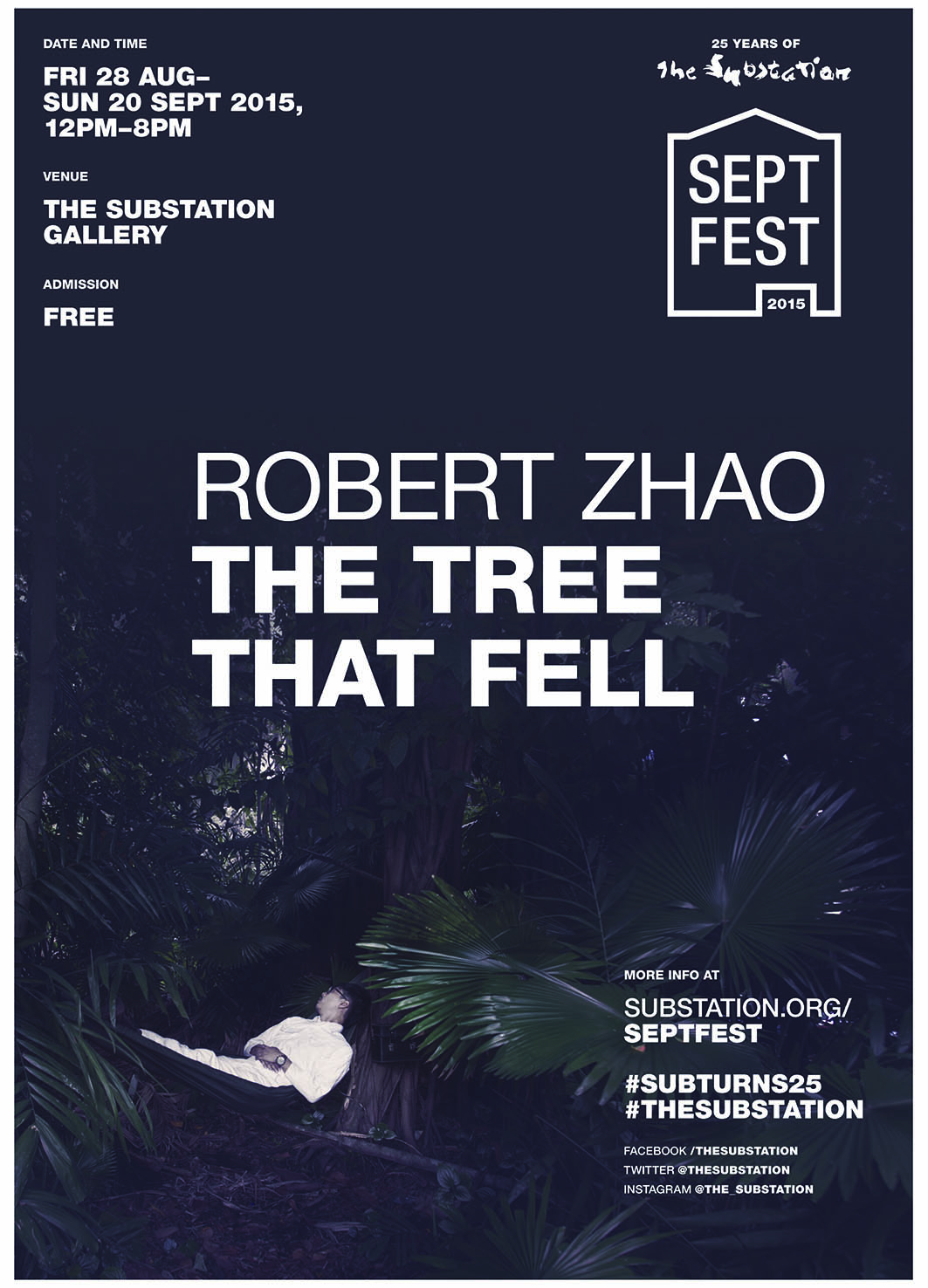
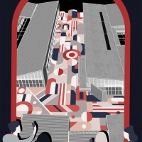
‘SeptFest 2015’ identity and publicity materials
| Year | 2016 |
|---|---|
| Award | WINNER |
| Affiliation | qu'est-ce que c'est design |
| Designer | Bryan Angelo Lim, May Lim, Victoria Lee |
| Description(English) | The identity for Septfest, The Substation’s anniversary celebration, was developed out of the idea “reconstituting the past for the future”. The papier-mâché key visual that was made out of their old printed collaterals was inspired by peeling layers of posters plastered over each other on a wall, which is a visual metaphor for the critical role that the contemporary arts centre has played for emerging artists in Singapore through its programmes for the past 25 years. For its silver jubilee, the organisation was “peeling away its layers” to find its place in the years to come. The logo mark takes reference from handbills and wheat paste graphic posters. |
| Website | http://quest-ce.com |
-
Yu Zhong Bu Tong Brand Identity
-
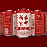
Ji Shi Dao Herbal Tea Packaging Design
-
Still Life Still LIves
-
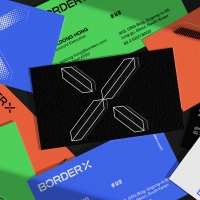
BorderX Rebranding
-
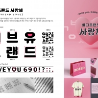
BODYFRIEND Key Value Font Pack
-
Midea smart blue
-
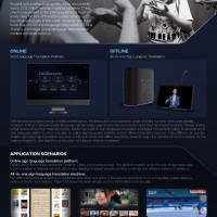
Xiling AI Sign Language Platform
-
Suofeiya home collection Visual Identity
-
Columbia 75 degree incline in Package
-
443 GARDEN Art Pattern
-
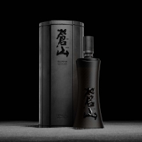
Bamboo Slips Liquor
-
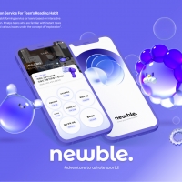
NEWBLE Watch balanced world
-
Korea 195 Grapefruit Biscuit Packaging Design
-
NYGDESIGN Brand Design Upgrade
-
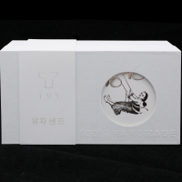
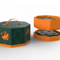
Moon Cake Box
-
Post Morden Life


Designed by sketchbooks.co.kr / sketchbook5 board skin