
EXHIBITION
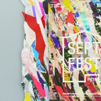
‘SeptFest 2015’ identity and publicity materials
| Year | 2016 |
|---|---|
| Award | WINNER |
| Affiliation | qu'est-ce que c'est design |
| Designer | Bryan Angelo Lim, May Lim, Victoria Lee |
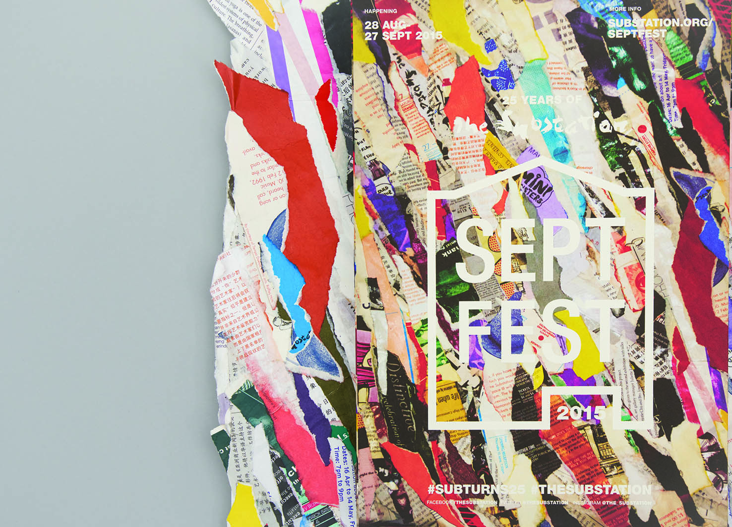
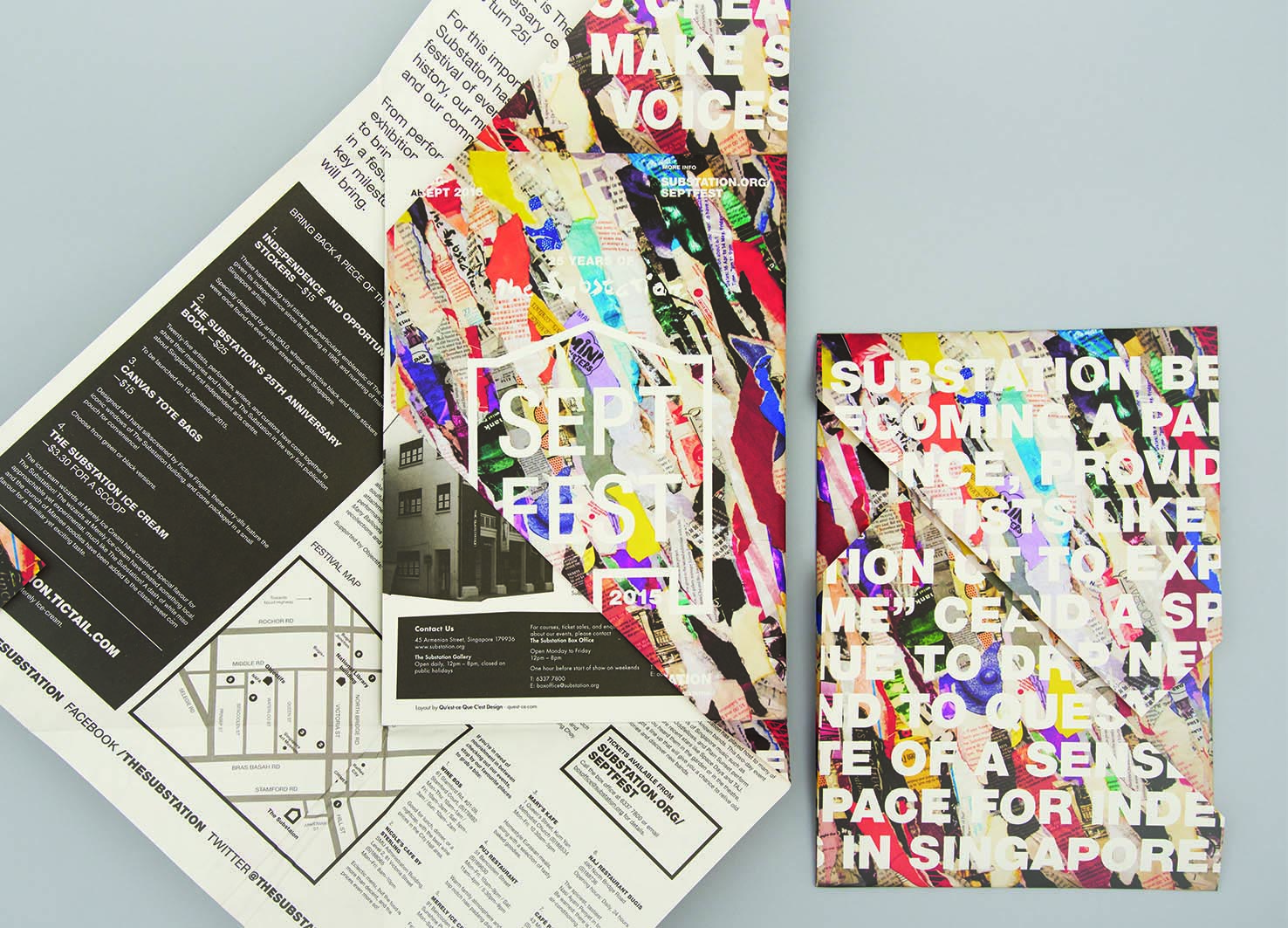
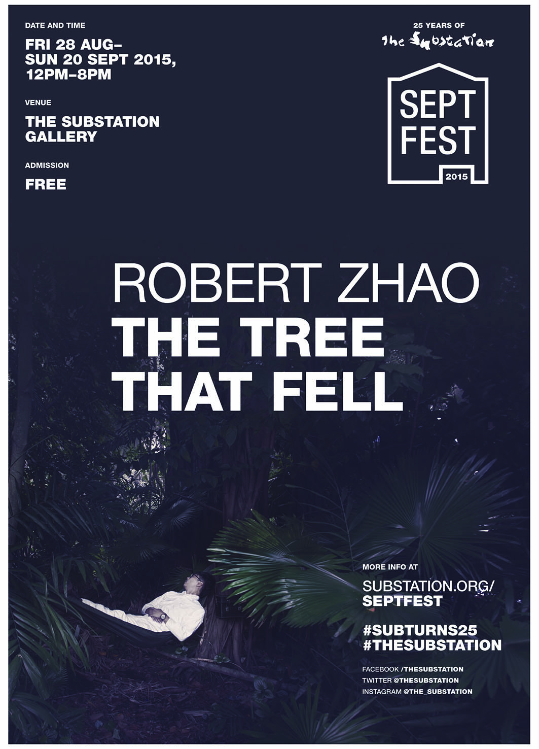
| Description(English) | The identity for Septfest, The Substation’s anniversary celebration, was developed out of the idea “reconstituting the past for the future”. The papier-mâché key visual that was made out of their old printed collaterals was inspired by peeling layers of posters plastered over each other on a wall, which is a visual metaphor for the critical role that the contemporary arts centre has played for emerging artists in Singapore through its programmes for the past 25 years. For its silver jubilee, the organisation was “peeling away its layers” to find its place in the years to come. The logo mark takes reference from handbills and wheat paste graphic posters. |
| Website | http://quest-ce.com |
-
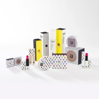
Hanbul Cosmetics E NATURE Packaging
-
L.POINT Brand Design
-
Made For IPTV
-
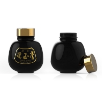
KYUNGOKGO
-
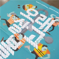
Safety Culture Magazine <You should live a long life.>
-
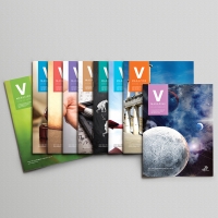
VISANG Education <V Magazine>
-
'betterfly ; Hang Wing For A Better Life' Brand Design
-
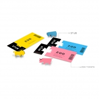
Origami animal tickets
-
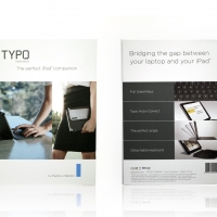
TYPO Keyboard for iPad Air package
-
SingCook
-
Korea On-air Cosmetic “RUE”
-
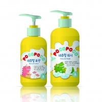
POCOPOCO SKIN CARE
-
HEART
-
Innovation leads to a Better Earth
-
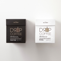
December Drip Coffee
-
Curling Iron Package
-
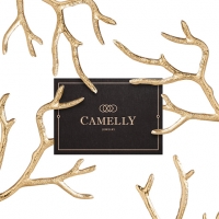
Camelly - Jewelry
-
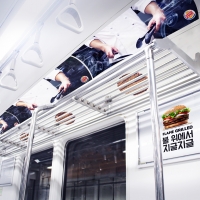
THE SUBWAY GRILL SHELF
-
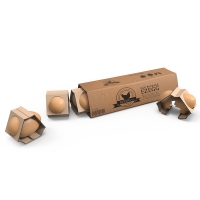
EZEGG
-
Swing Tour
-
Everlasting Moments
-
‘SeptFest 2015’ identity and publicity materials
-
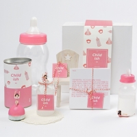
Child-ish Beer Packaging
-
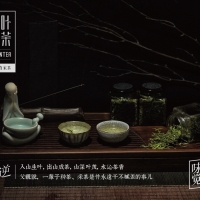
Moni Longjing TEA-MOUNTEA
-
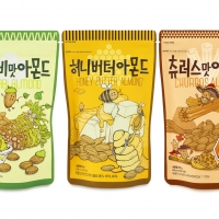
Nuts Snack Series
-
LIFEASE Brand Identity
-
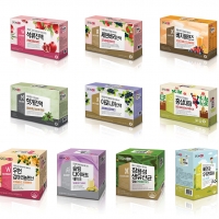
SFUN BOX


Designed by sketchbooks.co.kr / sketchbook5 board skin