English

EXHIBITION
Communication
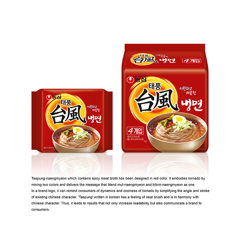
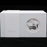
TAEPUNG-NAENGMYEON
| Year | 2015 |
|---|---|
| Award | BRONZE WINNER |
| Affiliation | NONGSHIM COMMUNICATIONS |
| Designer | SANGHEE BAK, YOUNHYUNG KIM |
| Description(English) | Taepung-naengmyeon which contains spicy meat broth has been designed in red color. It embodies tornado by mixing two colors and delivers the message that blend mul-naengmyeon and bibim-naengmyeon as one. In a brand logo, it can remind consumers of dynamics and coolness of tornado by simplifying the angle and stroke of existing Chinese character. 'Taepung' written in Korean has a feeling of neat brush and is in harmony with chinese character. Thus, it leads to results that not only increase readability but also communicate a brand to consumers. |
| Website | http://nscom.co.kr |
-
Yu Zhong Bu Tong Brand Identity
-
Ji Shi Dao Herbal Tea Packaging Design
-
Still Life Still LIves
-
BorderX Rebranding
-
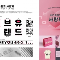
BODYFRIEND Key Value Font Pack
-
Midea smart blue
-
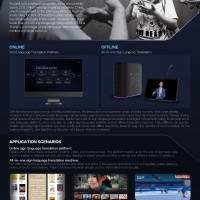
Xiling AI Sign Language Platform
-
Suofeiya home collection Visual Identity
-
Columbia 75 degree incline in Package
-
443 GARDEN Art Pattern
-
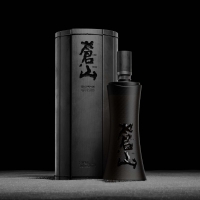
Bamboo Slips Liquor
-
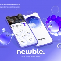
NEWBLE Watch balanced world
-
Korea 195 Grapefruit Biscuit Packaging Design
-
NYGDESIGN Brand Design Upgrade
-
Moon Cake Box
-
Post Morden Life


Designed by sketchbooks.co.kr / sketchbook5 board skin