
EXHIBITION
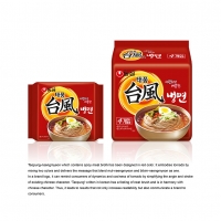
TAEPUNG-NAENGMYEON

| Year | 2015 |
|---|---|
| Award | BRONZE WINNER |
| Affiliation | NONGSHIM COMMUNICATIONS |
| Designer | SANGHEE BAK, YOUNHYUNG KIM |
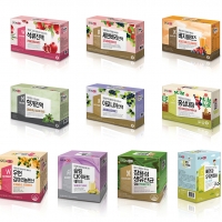
| Description(English) | Taepung-naengmyeon which contains spicy meat broth has been designed in red color. It embodies tornado by mixing two colors and delivers the message that blend mul-naengmyeon and bibim-naengmyeon as one. In a brand logo, it can remind consumers of dynamics and coolness of tornado by simplifying the angle and stroke of existing Chinese character. 'Taepung' written in Korean has a feeling of neat brush and is in harmony with chinese character. Thus, it leads to results that not only increase readability but also communicate a brand to consumers. |
| Website | http://nscom.co.kr |
-
Switch Bucket
-
Water to Wind
-
Batter board
-
Warning triangle capsule
-
Warm Love
-
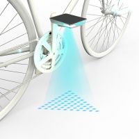
Bounce Signal Pedal
-
Rolling Fan
-
Interiority bangle
-
Swing Door lock
-
Drawer
-
SFUN BOX
-
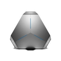
Alienware Area 51
-
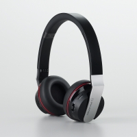
BT 330 NC
-
U+tvG 4K UHD
-
Free Measurement
-
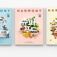
Company Magazine of LOTTE FOODS
-
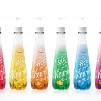
ViewFit Sparkling
-
Carved bowls
-
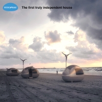
Ecocapsule
-
Linear Floor
-
Farm Direct
-
The new Sorento
-
TAEPUNG-NAENGMYEON
-
<Love Village>, E-book Project about Sex Education
-
The footprints of love
-
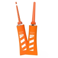
Anti-blocking Glue
-
STROKE
-
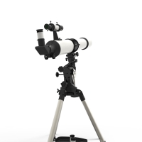
planetary exploration


Designed by sketchbooks.co.kr / sketchbook5 board skin