EXHIBITION
Coffee Time
| Area | China |
|---|---|
| Year | 2021 |
| Award | GOLD WINNER |
| Client | ZHENRO GROUP Co. |
| Affiliation | Shanghai Face Decoration Design Engineering |
| Designer | Zhang Li, Gan Yaoyun, Wu Ziyan |
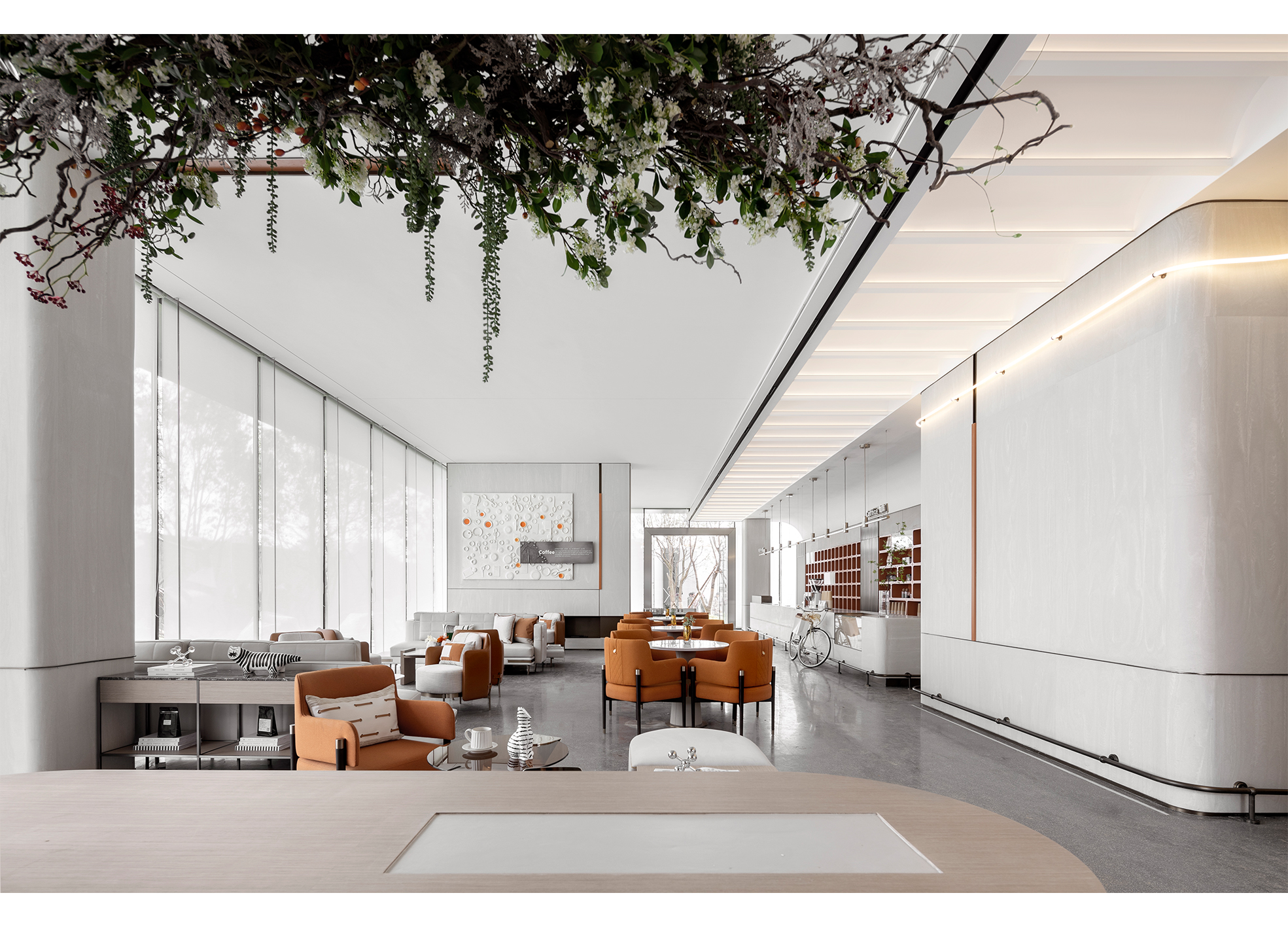
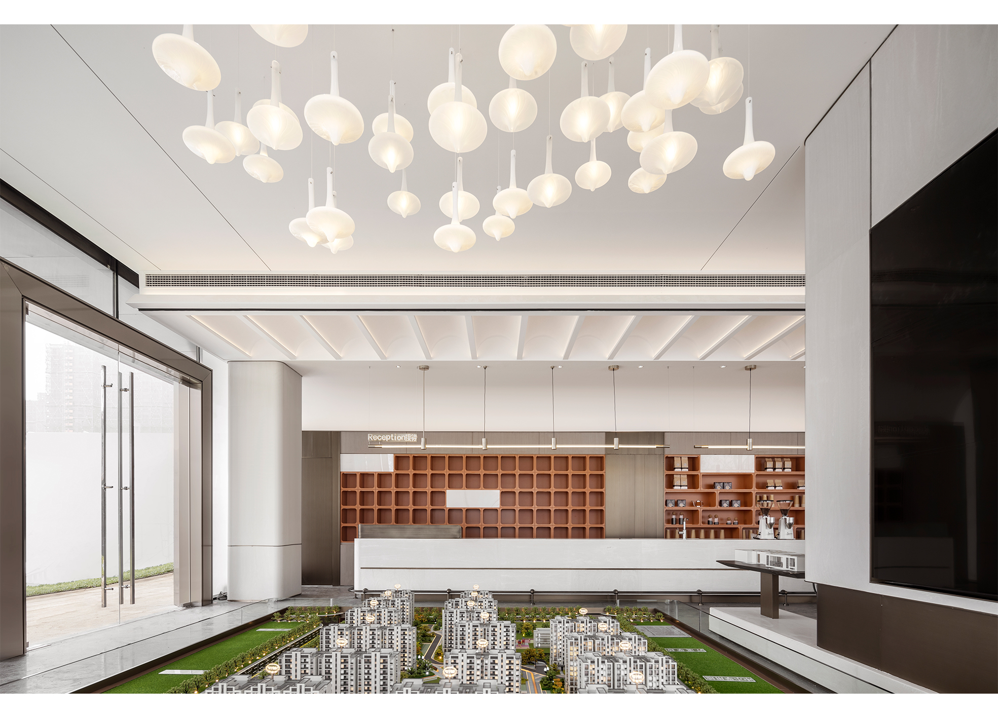
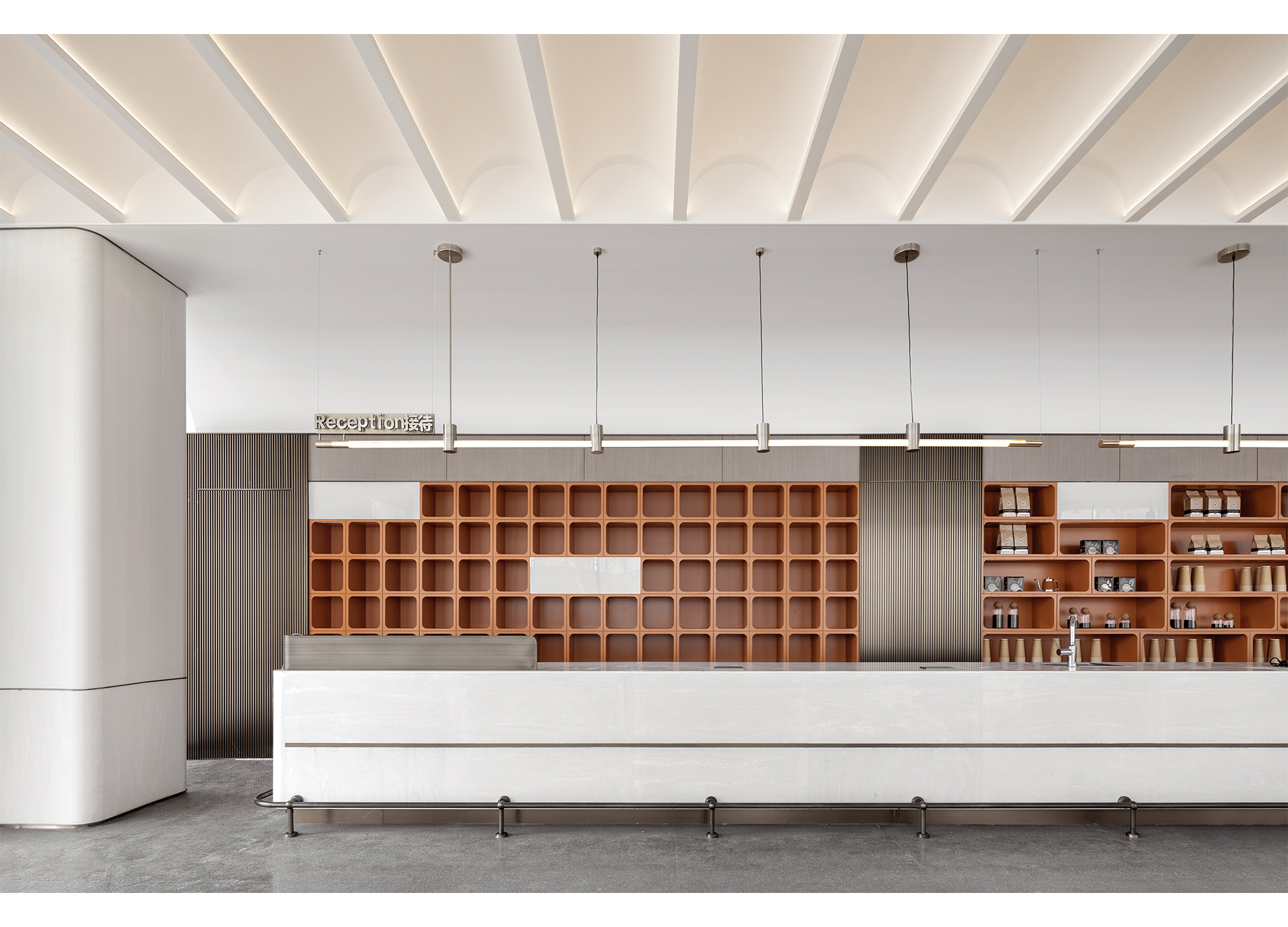
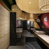
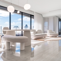
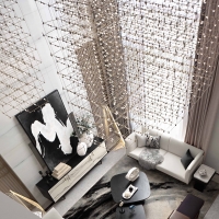
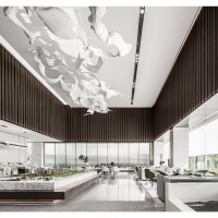
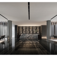
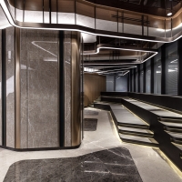
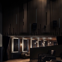
| Description(English) | Rational planning of the flow of space and visual lines are the highlights of this design. The proportions of the room are evenly balanced, allowing the discussion area, the walkways and the coffee counter all to be both spacious and evenly distributed. The design avoids distinct divisions between areas, allowing the multifunctional interactive area and discussion area to blend together. The square pillars are slim as to not compete with the space, and corners are designed with low-key arcs. |
| Description(Native) | 合理的動線規劃與視覺停留是本案的設計亮點。室內空間的比例分配均勻,使洽談區、走道與吧台的空間平均分配並且保持寬敞。室內設計避免明顯的區隔,多功能互動區與洽談區彼此交融,四方的柱子體積縮小不與空間爭豔,邊角設計為低調的圓弧。走道首尾貫徹沒有任何遮蔽,而咖啡的香濃能夠遊走各個區域,呼應空間一目瞭然的整體性與主題的一致性。 洽談區與沙盒模型展示區以牆面設計的柱子做分隔,彼此互不干擾,均衡的視覺劃分卻又能互相貫通。室內與室外以寬闊的玻璃區隔,讓室內的洽談區沐浴陽光。透明的隔間沒有讓內外的人分離,反而讓彼此的視線可以互動,行動上卻又不會互相干擾,室內與室外的人都能享有放慢腳步的舒適空間。 一個文藝的空間少不了一杯咖啡的輕鬆小品。本案的出發點為「舒適洽談,品文嚐藝」,以簡單的設計突顯靜謐的步調。主色系為濃而清新的白色基底,與亮橘的咖啡色,營造一個讓人能與大街喧囂隔離並且停下腳步獲得安寧的時光,內心卻又能彼此相連的溫暖空間,好比是馬克杯中的咖啡與濃厚的奶精互相交融。本案均衡規劃空間的使用,使室內的各個功能區彼此不干擾卻又能互相連通。色調上選擇濃厚的白色,搭配橘褐色的座椅與木櫃呼應咖啡的特色,給人能夠遠離喧囂放慢腳步的溫暖空間。 |
| Website | www.facedesign.cn |
| Positive Comments |


|
-
Coffee Time
-
Scarlet Umami
-
Aureole Sky Castle
-
Functional system for wound care
-
IM600 Campus Visual Identity
-
Typography for Chinese Traditional Houses
-
Jun Lin Da Yuan Villa
-
Tibry O
-
Sleeping aroma therapy brand Slumber
-
HAIS
-
WSWS SPACE
-
Natasha
-
Seafood Delivery Package
-
Bottle Uilization
-
FAB LAB REBRANDING
-
ILSANGJEONGONE
-
Wind Crystals
-
Tranquil
-
Portable shampoo
-
Butterfly GO
-
Hall of Life aesthetic
-
Eternal beauty
-
The Origin of a Creation
-
K11 Art House_Cozy Cottage
Designed by sketchbooks.co.kr / sketchbook5 board skin

