EXHIBITION
Balance
| Country | China Hong Kong |
|---|---|
| Year | 2023 |
| Award | WINNER |
| Affiliation | MOI Interior Design |
| Designer | Frank Lo |
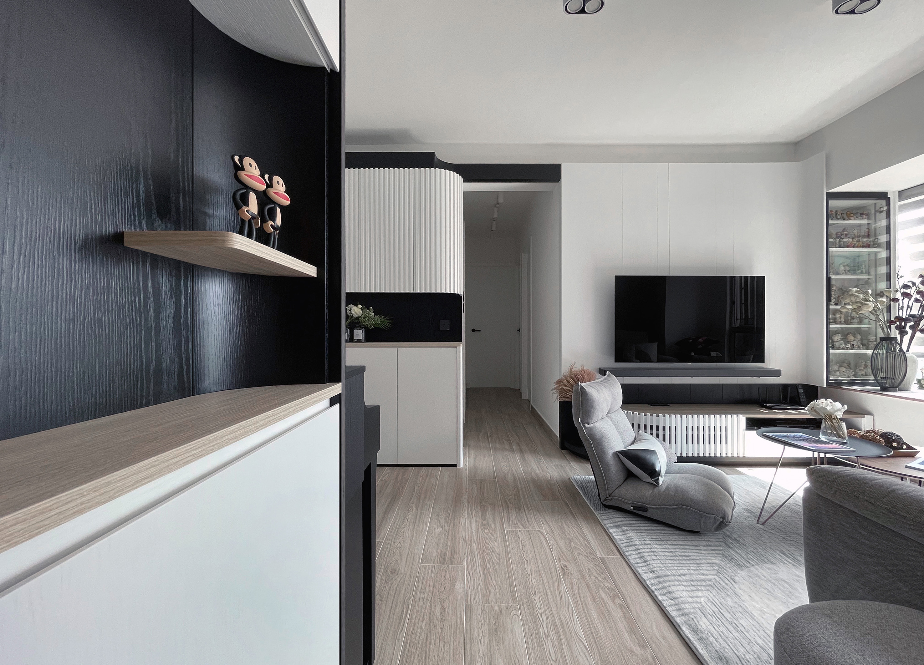
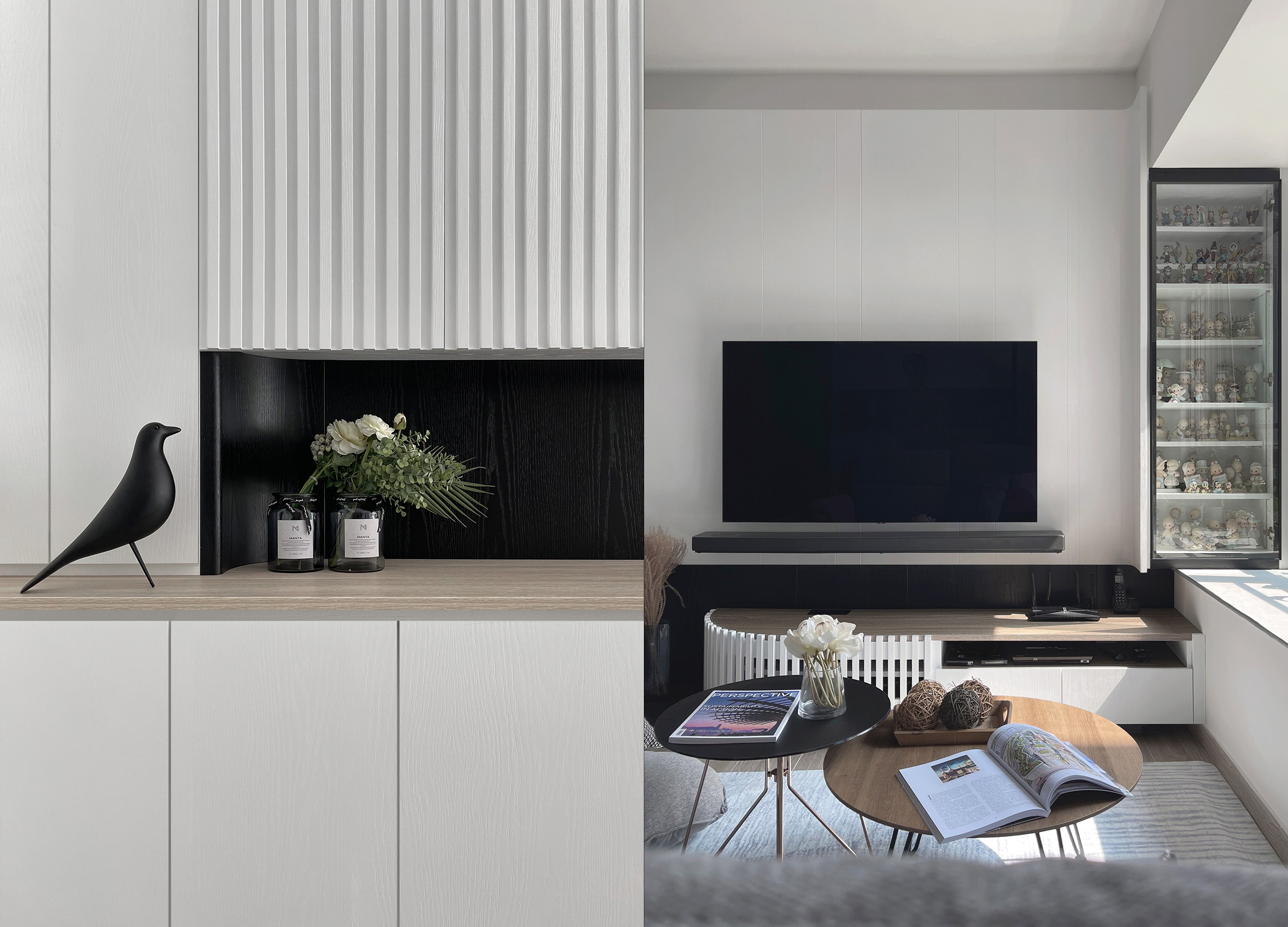
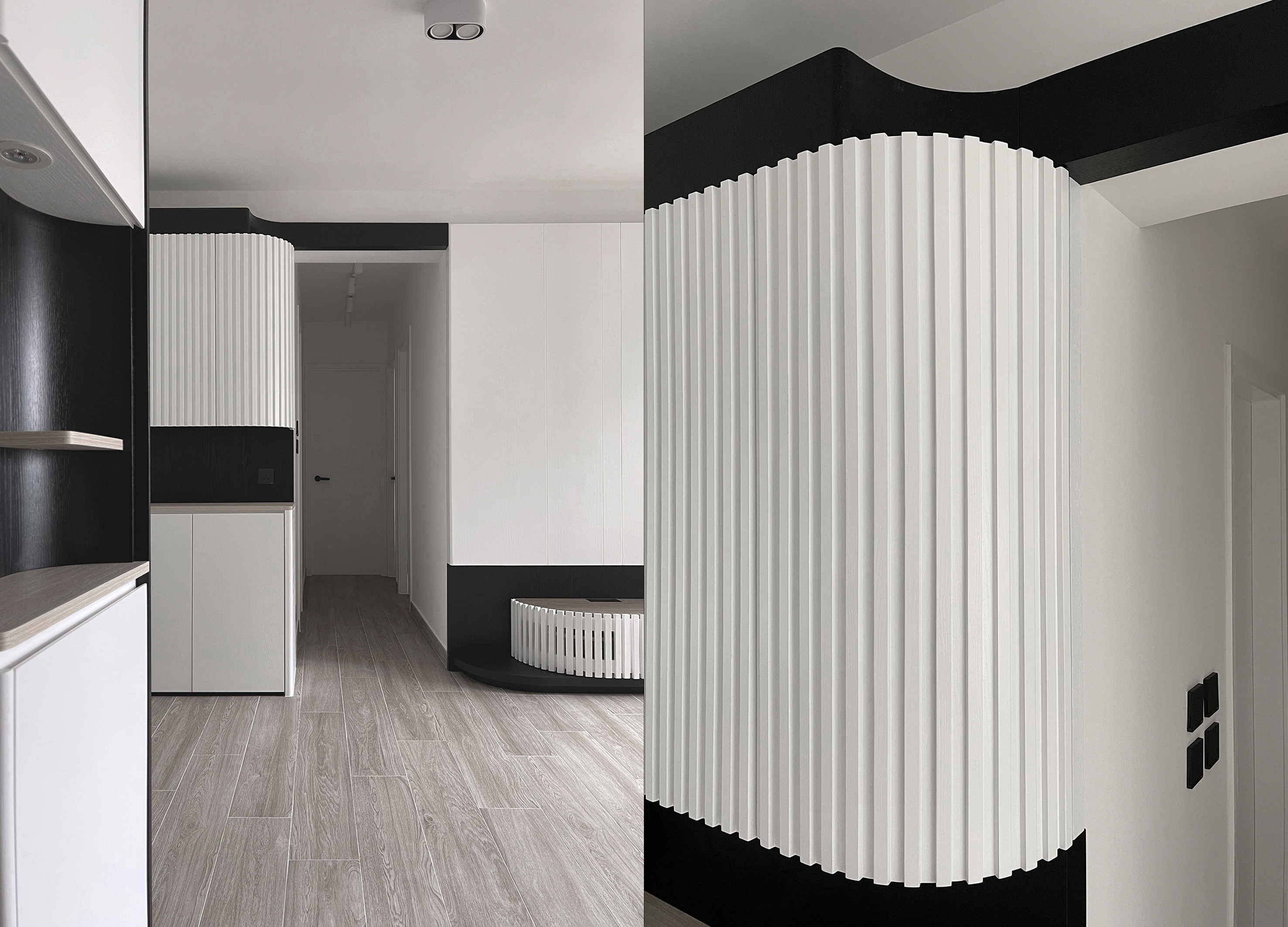
| Description(English) | In terms of the colours and materials, the three sets of cabinets speak the same language despite their differences in layout. This arc is intended to evoke the "space-age era of the 1960s"/the "century of the 1960s". Since the design is always related to the residential project, the material used cannot be plastic and glossy surfaces because the maintenance problem needs to be considered, so common wood is used to create the unique look. |
| Description(Native) | 用色黑,白,木為主,三組櫃用了同一"語言",但不一樣的佈局所構思,達至無形間互相呼應。 設計概念上用了弧形作引子,營造"60s space age"/”60年代太空世紀的 風格,但始總繫住宅項目,用料上不能單以塑膠及光面來製作,因要顧及保養問題,以常用的木材來製作,出來的效果別樹一格。 設計概念上用了弧形作引子,營造"60s space age"/”60年代太空世紀的 風格,但始總繫住宅項目,用料上不能單以塑膠及光面來製作,因要顧及保養問題,以常用的木材來製作,出來的效果別樹一格。 黑,白顏色的分佈以及弧形結構的安排 《"意"由圓為本,"形"以弧呈現,乃此消彼長,如相互轉化,則變化無窮》 帶出萬事有得必有失,相互抵消, 方能達至平衡之境。 |
| Website | www.moi-interiordesign.com |
| Positive Comments |




|
-
Take you up the mountain to see the ocean
-
GO ON
-
Kakao Taxi Dashboard
-
13th Golden Indie Music Awards Nominees Video
-
Gyeongsangnamdo Volunteer Center Visual Identity
-
Elevator VR Simulator Platform
-
The Project collaborated by Samlip and Knoted
-
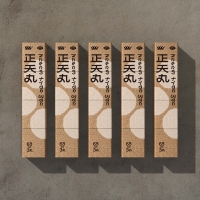
zheng tian wan
-
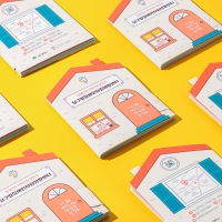
Leaflet for Dalgubul Center for Independent Living
-
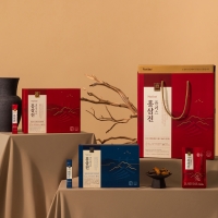
HONGSAMJIN
-
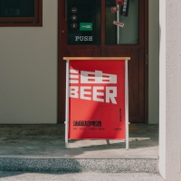
Yoo Beer
-
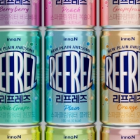
REFREZ
-
DOGYAM
-
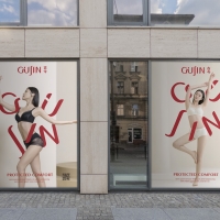
Gujin Rebranding
-
ChildFund Internal Branding Graphic Motif
-
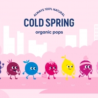
Cold Spring Organic
-
gotin
-
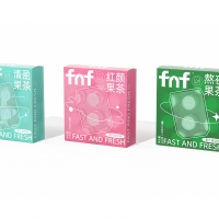
fnf Functional Tea
-
HijosdeRivera
-
Tan Cha
-
Space Beer
-
Two faced rabbit crossing the virtual and real
-
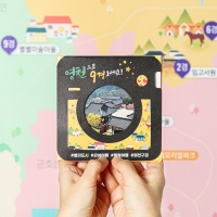
Leaflet for the 9 scenic spots of Yeongcheon
-
vanguard wine merchants
-
Qingque Interview
-
TASTY1 Highway Service Station Branding
-
4Paradigm Sage HyperCycle ML
-
UVFree
Designed by sketchbooks.co.kr / sketchbook5 board skin

