EXHIBITION
Communication
FReNCHIE FReNCHIE
| Area | Chinese Taipei |
|---|---|
| Year | 2022 |
| Award | WINNER |
| Client | FReNCHIE FReNCHIE |
| Affiliation | Existence Design Co., Ltd. |
| Designer | YU TING HUANG |
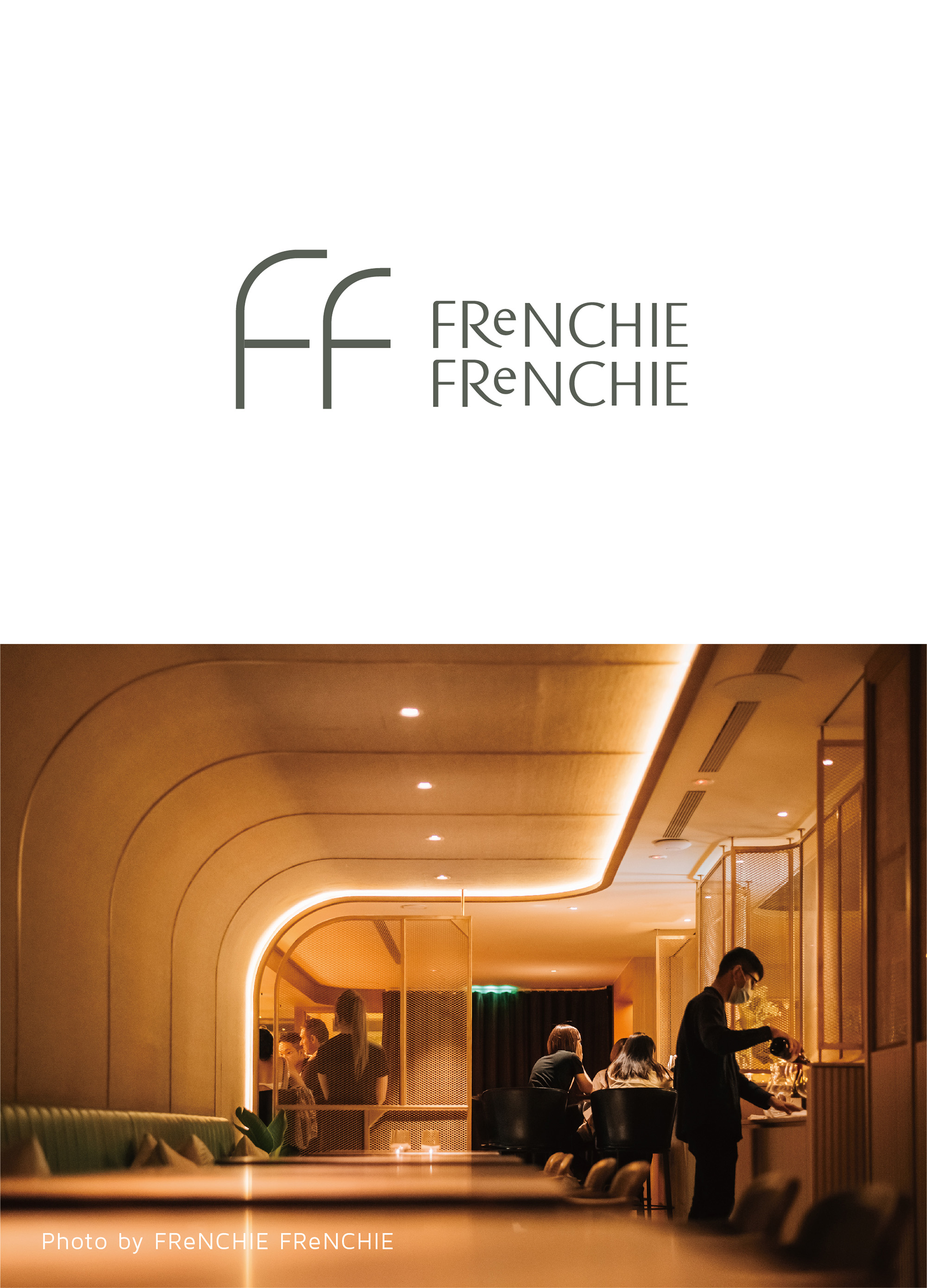
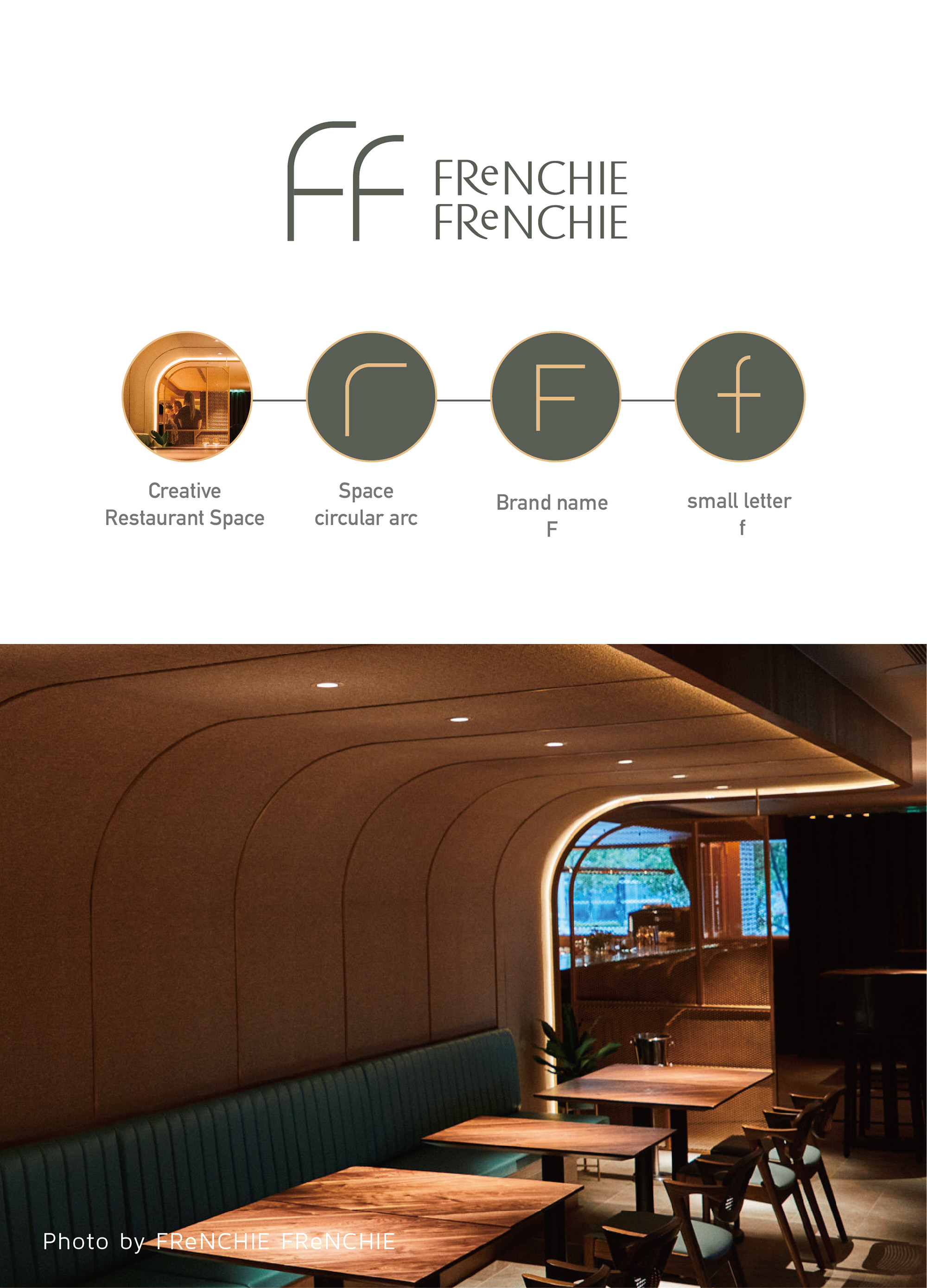
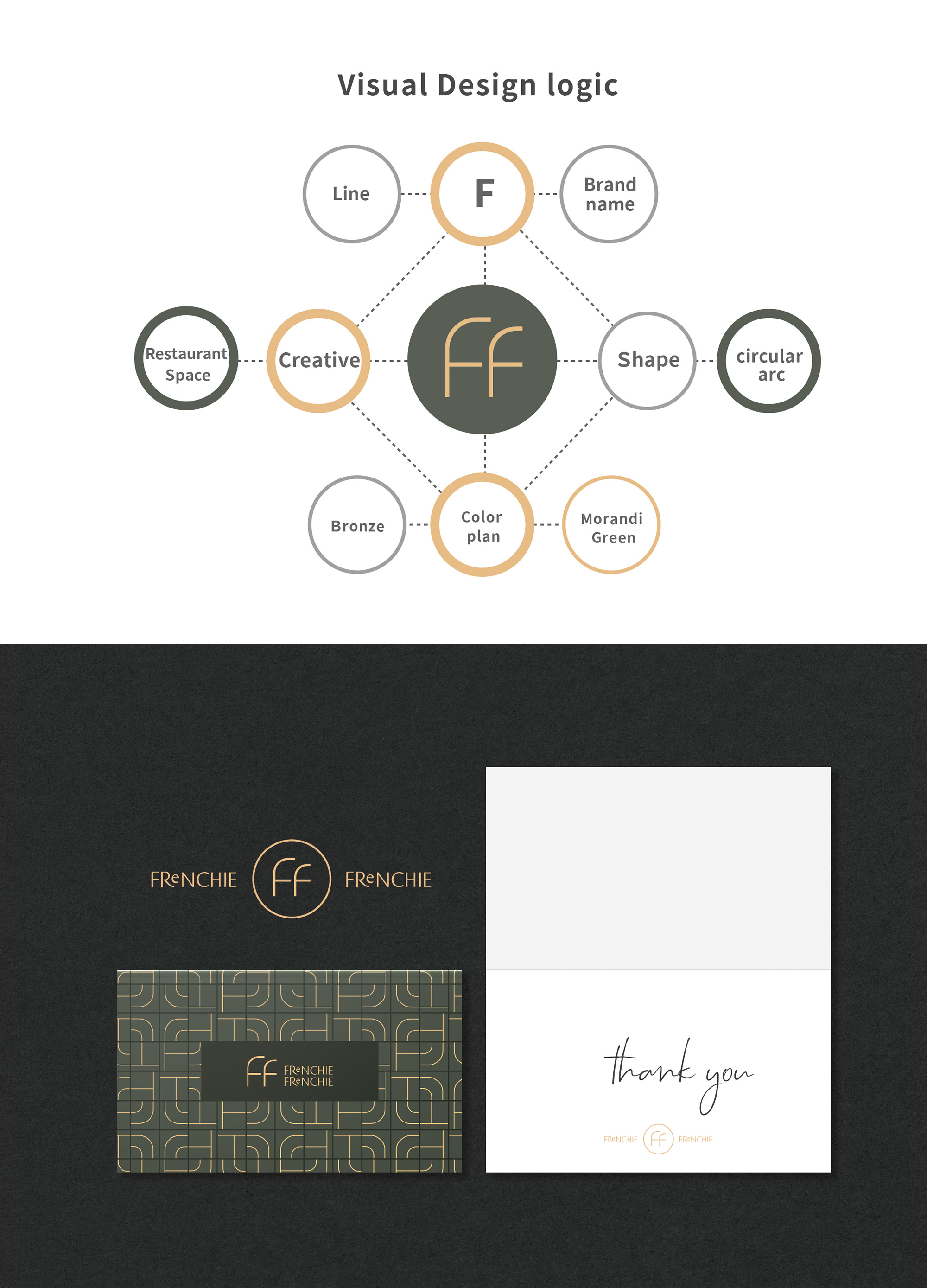
| Description(English) | We deconstruct the linear components of the interior design and integrate its visual features to create a simple minimalist style logo. In the design of the standard lettering, we presented the first E in lowercase with the rest of the letters in uppercase to create a graphic image of Re which has the meaning of re-creation, recycle, replay, sustainable, continuity, and so on. The idea is perfectly coherent with the founding concept, respecting natural ingredients, hoping to construct a positive and sustainable cycle. What we did was to turn the concept into an image and help the brand name deliver its core concept and spirit. |
| Description(Native) | Logo圖像設計:Logo靈感發想取自餐酒館內充滿直線與弧線的空間轉角設計,而品牌名由2個「F」開頭的字組成。我們解構室內空間運用的線條元素,取其視覺特點與標誌融合,透過2條弧線與1條直線簡約構成。Logo迷人的弧線猶如我們記憶裡法式優雅的氣質,透過設計營造,巧妙詮釋雙F的視覺層次,呼應空間設計特色,讓品牌視覺設計與餐館的空間感受更能完美融合。 品牌字體設計:FReNCHIE FReNCHIE標準字以粗細相間的羅馬體為結構基礎,同樣保留Logo的視覺節奏和餐館空間裡的弧線特色在字體中,透過設計結構調整,讓整組標準字在法式經典與現代優雅中,構成巧妙的視覺平衡。 此外,我們更在標準字的識別中將E以小寫字體設計,使e與R合併,讓其視覺呈現「Re」之意。Re開頭的文字意思有「餐廳Restaurants」、「尊重Respect」、「真實Real」等相關名詞,更有重新再造、循環、永續、不斷播放(Recycle、Replay....)等語意,此概念完全吻合FReNCHIE FReNCHIE餐酒館的創辦理念:「尊重自然食材、尊重客人、並且期盼美食帶來永續循環的意象。」。而我們將其理念轉化成視覺,協助品牌向外傳遞其核心理念與精神。 |
| Website | www.a-adesign.com.tw |
| Positive Comments |



|
-
OFFBEAT
-
JEPETO
-
The Monday Burger Club
-
cuchen Pause Gift Box
-
Sustainable Rivers
-
FOREST SOUL
-
HandYourName
-
Success and happiness
-
Shell More Fun
-
ISLAND HIDEAWAY
-
The Worldly
-
GQ LAB Brand Identity and Packaging Design
-
Muse of Monet Immersive Media Art Exhibiton
-
Hot Spring city asan symbol integrated brand
-
DOWNFALL OF WHO LET IN SOMETHING NOT ALLOWED
-
Dragon Tiles
-
Animism
-
JoyPer
-
Xi You Ji Wuxi folk theme board game design
-
Soundstellar Aural Motion Interaction APP
Designed by sketchbooks.co.kr / sketchbook5 board skin

