English

EXHIBITION
Communication
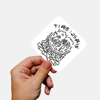
Branding of Mechanic
| Area | Japan |
|---|---|
| Year | 2019 |
| Award | WINNER |
| Client | WIM |
| Affiliation | BEAR BRANDING INC. |
| Designer | YUKI |
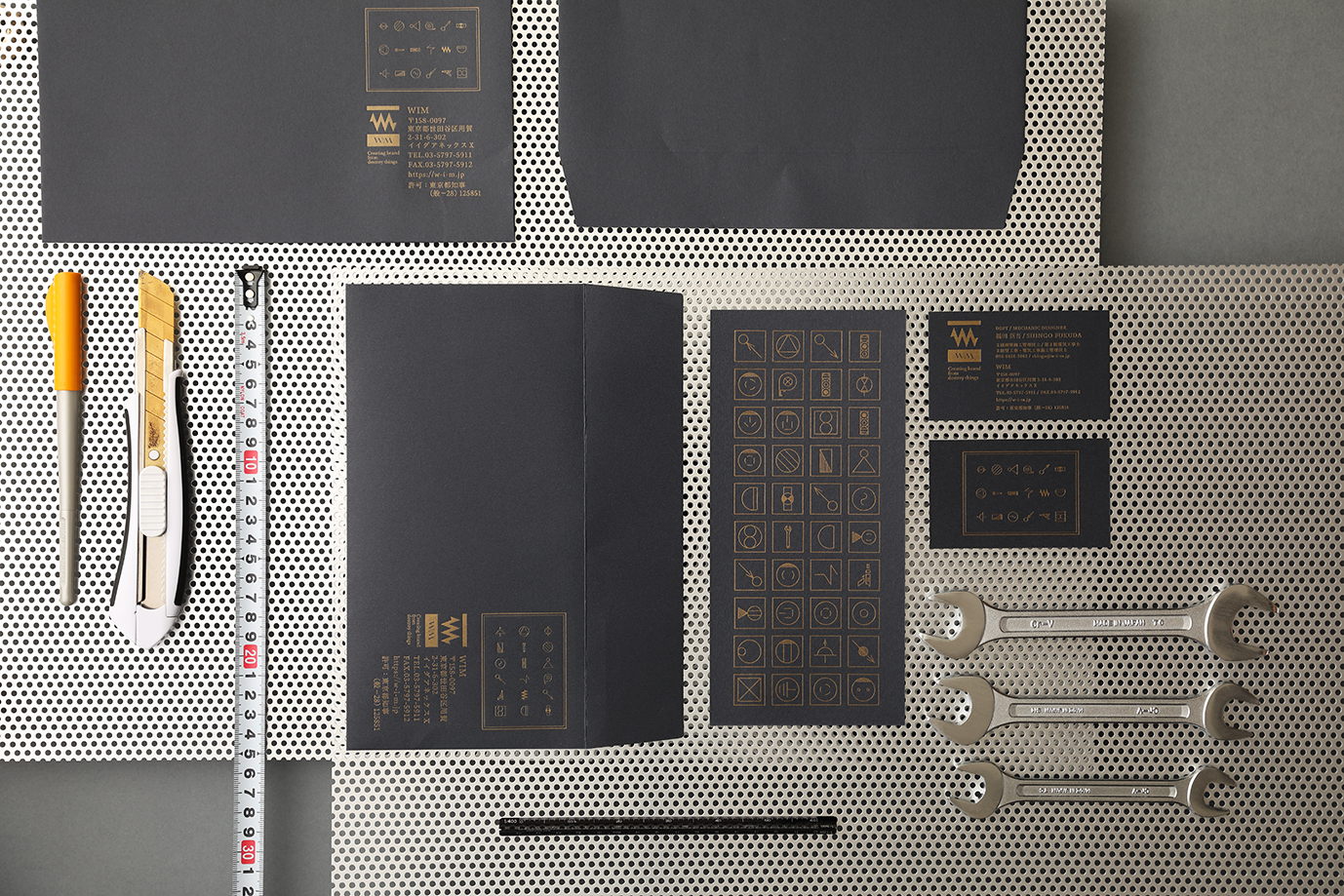
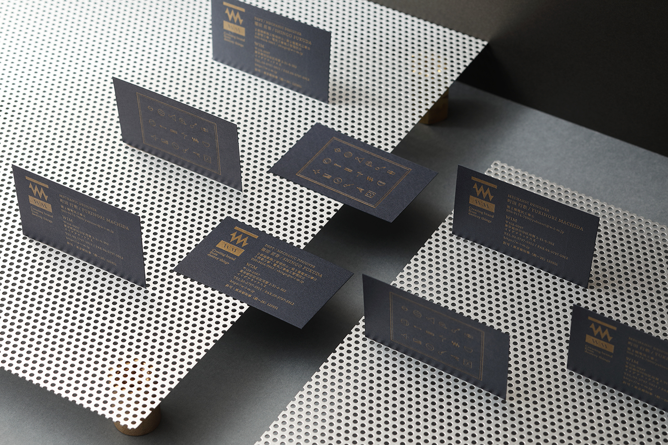
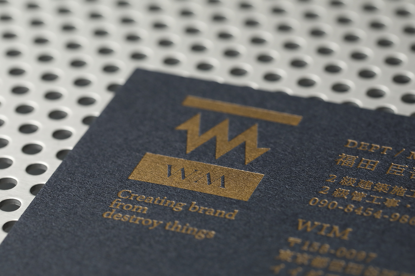
| Description(English) | Because I think it's a good idea to strengthen the story of WIM's past 20 years of experience in demolition & facility design, I decided to brand the company using the word "Mechanic". I designed the W & M to look like an electrical schematic of a resistor. This represents two concepts: 1, we'll no longer be bound by the past rules of the construction industry: &, 2, that we'll step forward on a new path. This symbolizes where we've come from & where we're headed. Moreover, we used images and symbols from electrical schematics and construction tools on the card, etc. to show the brand’s creativity & express the brand identity of Mechanic. |
| Description(Native) | 私はWIMが20年以上携わってきた、「解体工事」や「設備設計」というストーリーを強みにしていくことがいいと考え、「Mechanic」をブランドアイデンティティにブランディングを行いました。ロゴマークは、ブランド名の前後にある「W」と 「M」を、電気回路図のマークである「抵抗器」に見立ててデザインしました。これは、「これまでの建設業界のイメージを覆していく」という想いと、「次の一歩へ踏み出していく」というブランドの想いを表現しています。また、名刺や封筒、パンフレット、WEBデザインには、電気回路図や現場で使用する道具をモチーフとしたアイコンを多く施すことで、ブランドアイデンティティである「Mechanic」をイメージさせるとともに、ブランドの「ものづくり」に対する専門性の高さを表現しています。 |
| Website | bear-branding.co.jp |
| Positive Comments |


|
-
KUMA
-
mm941
-
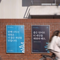
Accusefive 2024 Super Live Tour
-
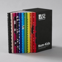
Buyeo County Font
-
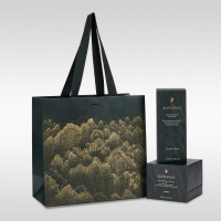
YUNJAC ALPHANAX
-
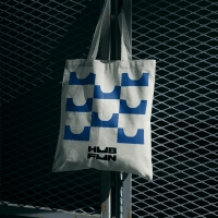
HUBFUN
-
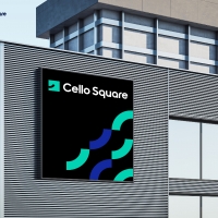
Key Visual development Samsung SDS Cello Square
-
MORA Vu
-
Carla Pan
-
MidAutumn full moon
-
Sin is a pleasure
-
HUHUDUN
-
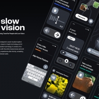
Slow Vision
-
BACK OF GYEONGBOKGUNG
-
TUTORO
-
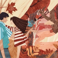
Maple Rewind Interactive picture book App
-
Headcount
-
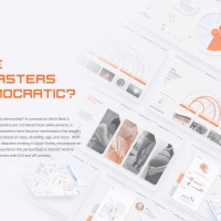
Are Disasters Democratic
-
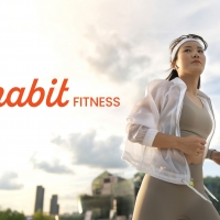
Habit Fitness Brand Identity Design Renewal
-
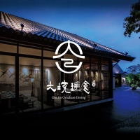
DaJing Omakase
-
Fly Head of Texture
Designed by sketchbooks.co.kr / sketchbook5 board skin