English

EXHIBITION
Communication
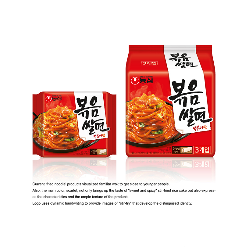
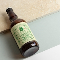
Fried noodle, BOK-UM-SAL-MEON
| Year | 2015 |
|---|---|
| Award | WINNER |
| Affiliation | NONGSHIM COMMUNICATIONS |
| Designer | SANGHEE BAK, YOUNHYUNG KIM |
| Description(English) | NONGSHIM bok-um-sal-meon. Current 'fried noodle' products visualized familiar wok to get close to younger people. Also, the main color, scarlet, not only brings up the taste of "sweet and spicy" stir-fried rice cake but also expresses the characteristics and the ample texture of the products. Logo uses dynamic handwriting to provide images of "stir-fry" that develop the distinguised identity. |
| Website | http://nscom.co.kr |
-
KUMA
-
mm941
-
Accusefive 2024 Super Live Tour
-
Buyeo County Font
-
YUNJAC ALPHANAX
-
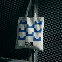
HUBFUN
-
Key Visual development Samsung SDS Cello Square
-
MORA Vu
-
Carla Pan
-
MidAutumn full moon
-
Sin is a pleasure
-
HUHUDUN
-
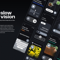
Slow Vision
-
BACK OF GYEONGBOKGUNG
-
TUTORO
-
Maple Rewind Interactive picture book App
-
Headcount
-
Are Disasters Democratic
-
Habit Fitness Brand Identity Design Renewal
-
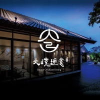
DaJing Omakase
-
Fly Head of Texture


Designed by sketchbooks.co.kr / sketchbook5 board skin