
EXHIBITION
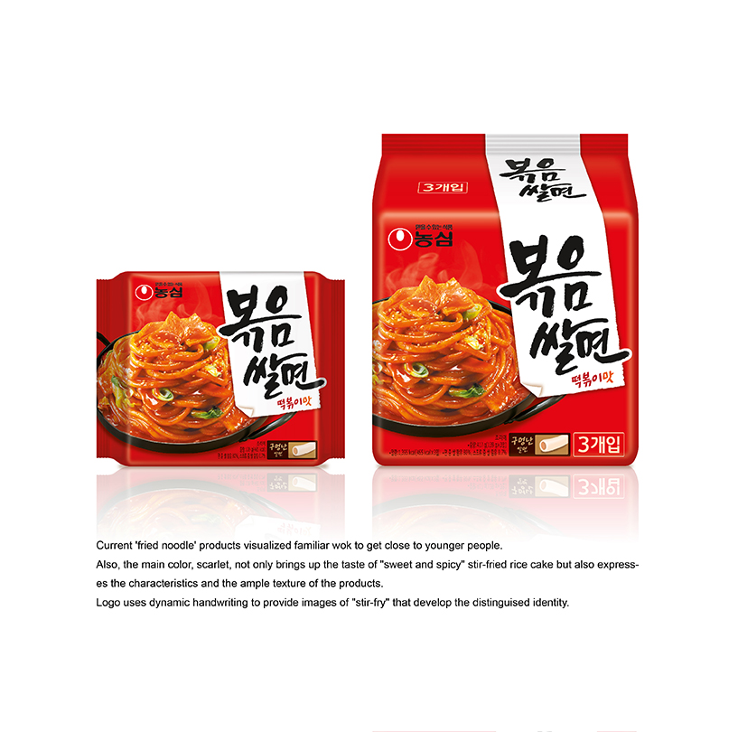
Fried noodle, BOK-UM-SAL-MEON
| Year | 2015 |
|---|---|
| Award | WINNER |
| Affiliation | NONGSHIM COMMUNICATIONS |
| Designer | SANGHEE BAK, YOUNHYUNG KIM |
| Description(English) | NONGSHIM bok-um-sal-meon. Current 'fried noodle' products visualized familiar wok to get close to younger people. Also, the main color, scarlet, not only brings up the taste of "sweet and spicy" stir-fried rice cake but also expresses the characteristics and the ample texture of the products. Logo uses dynamic handwriting to provide images of "stir-fry" that develop the distinguised identity. |
| Website | http://nscom.co.kr |
-
Fried noodle, BOK-UM-SAL-MEON
-
U Spoon
-
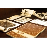
2015 WINNER - Recollection
-
Biennale Architettura Brand Identity Design
-
The Revenge of Environment
-
Goat Coffee Branding & Identity Design
-
Architectural Services Department Online Sustainability Report 2014
-
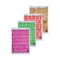
50s News-Gift Paper
-
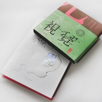
Visual / Senses
-
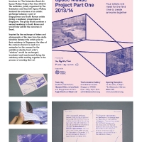
‘The Substation Seoul Art Space Mullae Project’ poster and brochure
-
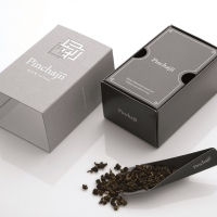
Pinchajii Tea House
-
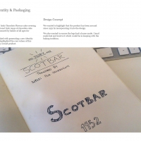
Scotbar Identity & Packaging
-
AFR Brand Design and Identity
-
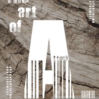
BARCODE-THE ART
-
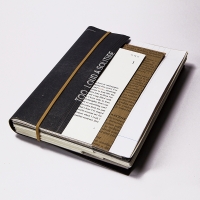
Too Loud A Solitude
-
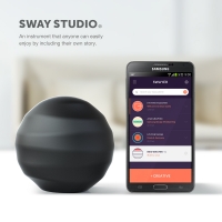
SWAY STUDIO
-
The Alchemist
-
Hong Kong Public Housing
-
At Will
-
column
-
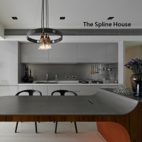
The Spline House
-
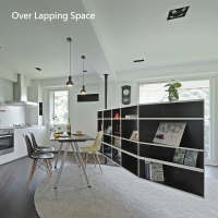
Over Lapping Space
-
Ganna Studio
-
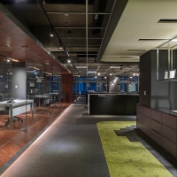
Ally Logistic Property (ALP) Office


Designed by sketchbooks.co.kr / sketchbook5 board skin