English

EXHIBITION
Communication
STUDIO X Plus U Branding
| Area | Korea |
|---|---|
| Year | 2025 |
| Award | WINNER |
| Affiliation | LG Uplus Corp. |
| Designer | Shin Ki Jung, Kim Sun Jin |
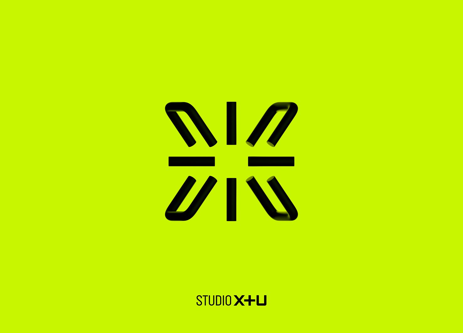
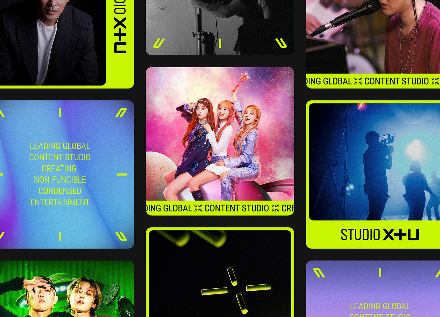
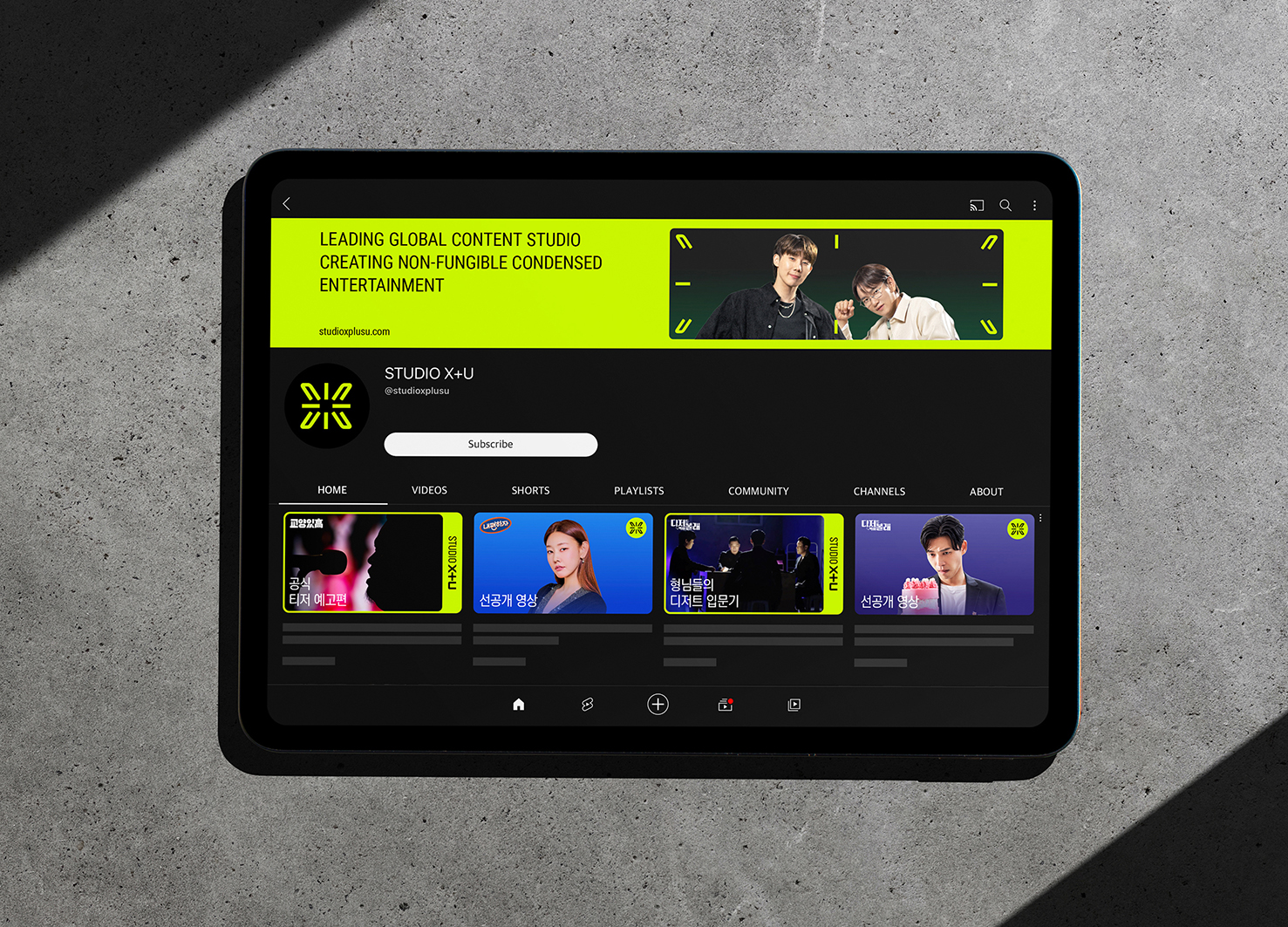
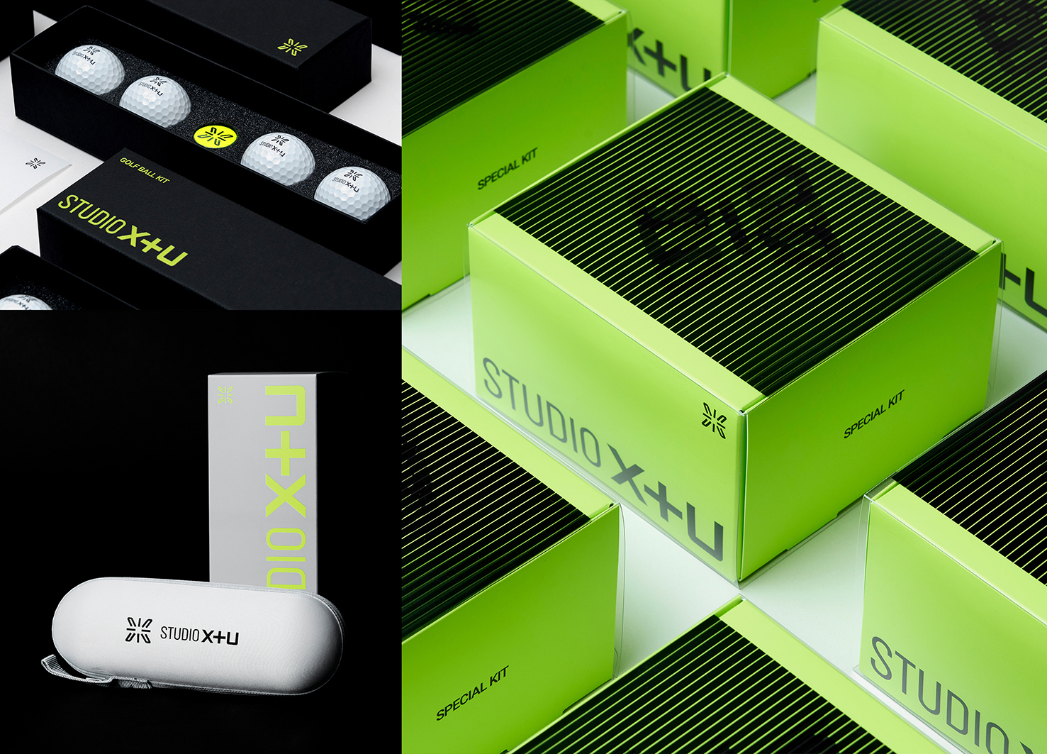
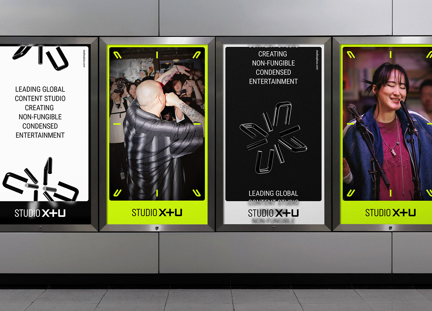
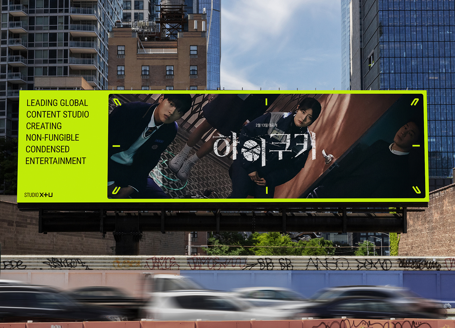
| Description(English) | The symbol of STUDIO X+U combines the brand name's 'X', '+', and 'U' in a three-dimensional form, representing the addition(+) of unique enjoyable content experiences(eXperience) for the user(U) and illuminating the consumer’s daily life(Starlight). The symbol transforms three-dimensionally into various forms, representing the STUDIO’s commitment to continually providing new content. It can be easily used as a large graphic or in smaller areas, and elements can be disassembled and utilized as frames. The solid logotype signifies robust and systematic content, while the vivid colors accentuate the innovative aspects of the content. |
| Description(Native) | STUDIO X+U의 심벌은 브랜드 명칭의 ‘X’, ‘+’, ‘U’가 입체적으로 조합된 형태로 사용자(U)에게 차별화된 즐거운 콘텐츠 경험(eXperience)을 더하여(+), 사용자의 일상을 밝게 비춰주는 (Starlight) 모습을 의미합니다. 또한, 심벌은 입체적으로 변형되어 다양한 형태를 만들어 내며 연속적인 움직임은 늘 새로운 콘텐츠를 제공하는 STUDIO 브랜드의 속성을 담고 있습니다. 심벌 자체를 큰 그래픽으로 활용하거나 작은 영역에 적용하기에 용이하고, 각 요소를 해체하여 콘텐츠 프레임으로 활용할 수 있습니다. 단단한 형태를 가진 로고 타입은 견고하고 체계적인 콘텐츠를 상징하며, 비비드 컬러는 새로운 속성의 콘텐츠를 더욱 강조합니다. 이러한 새로운 디자인 시스템은 고정된 로고를 넘어 유연하게 확장할 수 있는 형태로 개발하여, 콘텐츠 업계에서 시각적 경쟁력을 확보하고, STUDIO X+U만의 콘텐츠 톤 앤 매너를 꾸준히 드러냄으로써 콘텐츠 충성도를 높입니다. |
| Website | www.studioxplusu.com |
| Positive Comments |


|
| Judging Comments | The STUDIO X+U symbol merges ‘X,’ ‘+,’ and ‘U’ into a dynamic three-dimensional form, expressing the idea of adding unique and enjoyable content experiences for the user while illuminating daily life like starlight. Its transformable structure reflects the brand’s commitment to delivering fresh content, adaptable as both bold visuals and subtle elements, even breaking down into frames. The solid logotype conveys robust, systematic content, while vivid colors highlight the studio’s innovative spirit—earning recognition for its versatility and strong visual identity. |
-
Chengdu Grand Tianfu
-
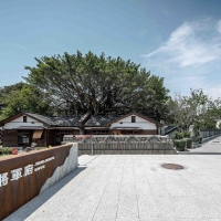
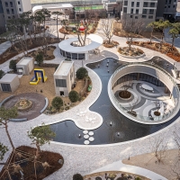
Lintianshan Forestry Culture Park
-
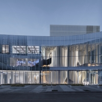
The Veil City Lounge
-
Cloud of Luster
-
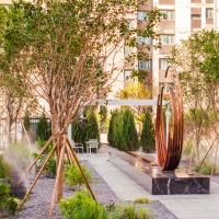
Terra Cascade
-
Xiangcheng Paradise Walk
-
The PolyCuboid
-
Hualien General Mansion 1936
-
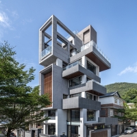
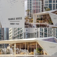
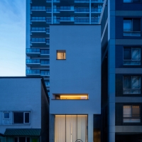
TRIANGLE HOUSE
-
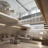
HabiTide
-
Arcus
-
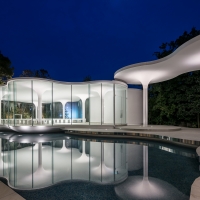
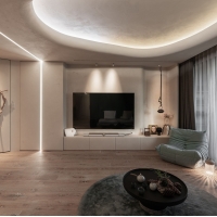
Curve and Ground
-
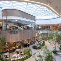
Starfield Coex Mall
-
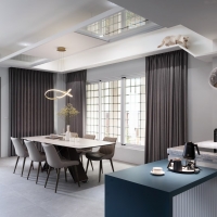
Soul Hambagu
-
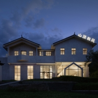
Shan Ding You Feng
-
PARK O CIEL
-
Upward House
-
Unfolding Harmony
-
Quiet Contemplation
-
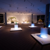
The Origin of Ikebana Transition Exhibition
-
Jamitan. Crimson blossomed pond
-
HAKUROU
-
Moments of Magick
-
Soft Echo
Designed by sketchbooks.co.kr / sketchbook5 board skin