EXHIBITION
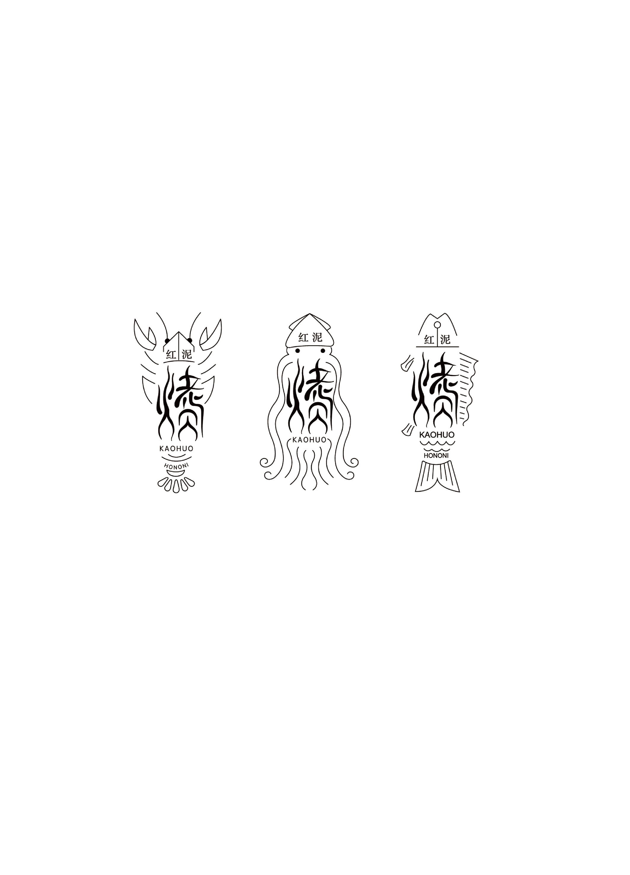
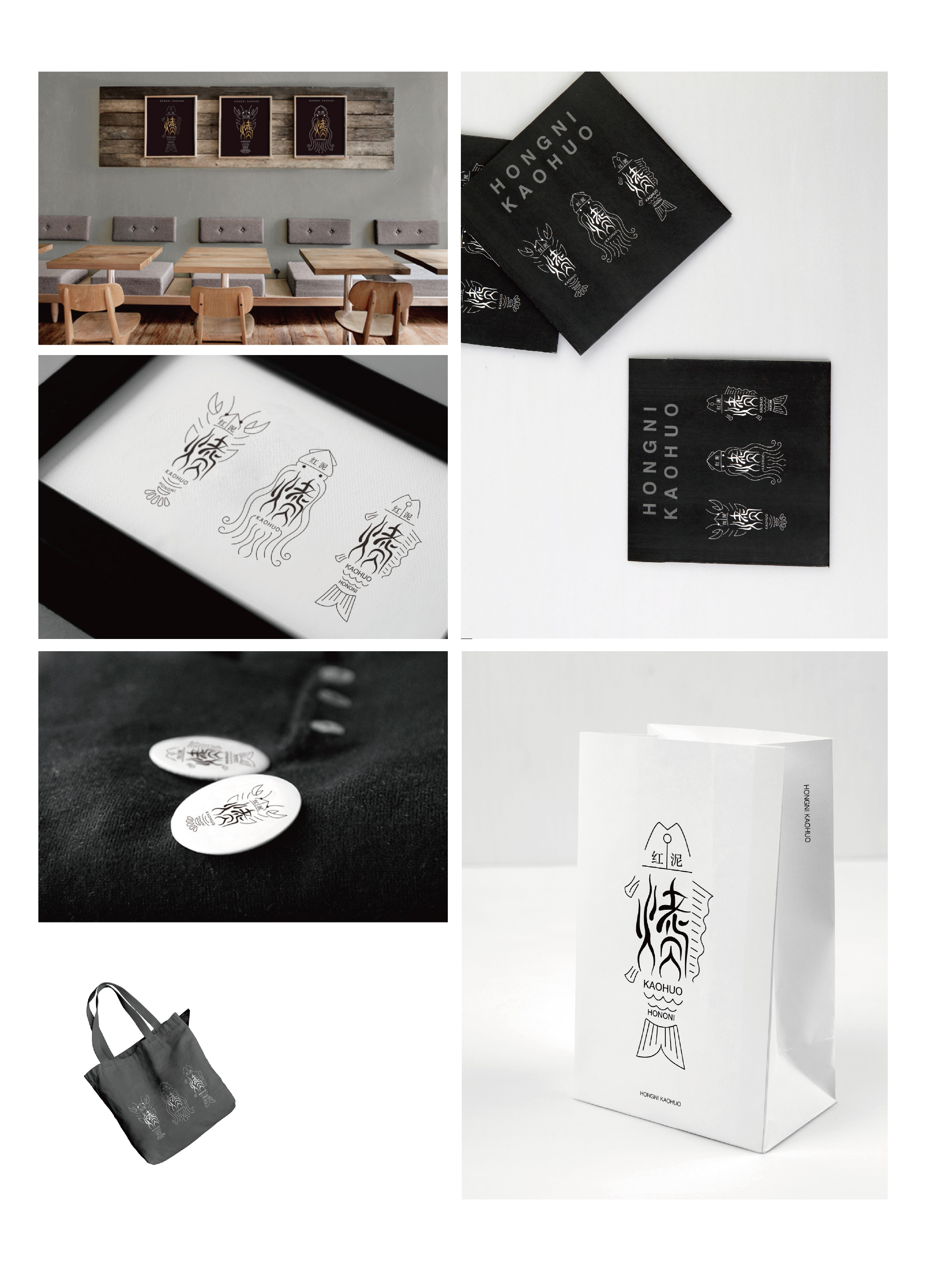
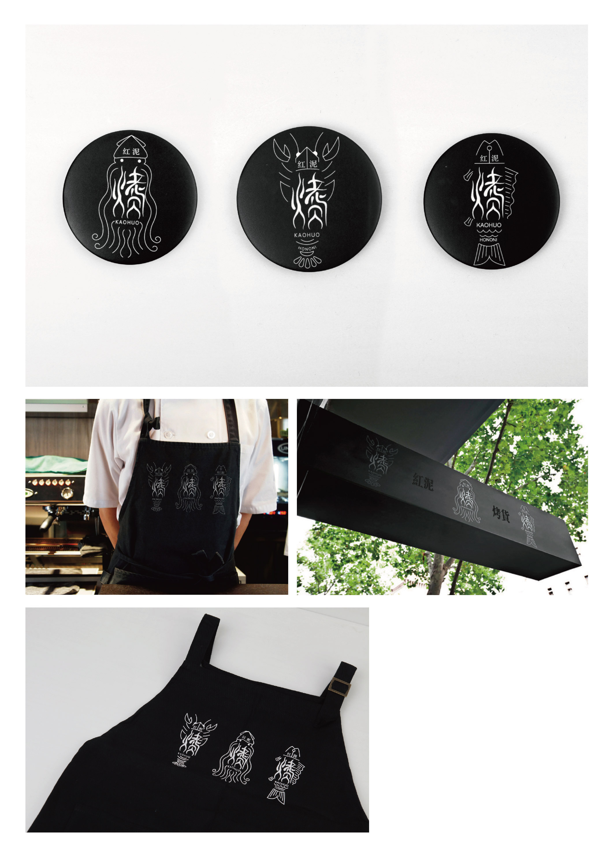
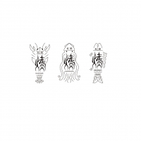
KAOHUO Logo
| Country | China |
|---|---|
| Year | 2017 |
| Award | WINNER |
| Affiliation | Fine Arts Department of Hangzhou Normal University |
| Designer | Lin Guosheng (林国胜), Hu Bin(胡 彬) |
| Description(English) | 1. The main body of the logo is composed of two characters—“bake” and “goods”(“烤”“货”), which is a symbol of the compound characters. 2. “火(Fire)” in the “烤(bake)” vividly shows a status of the burning raging flame. 3. The logo of compound character does not exist independently; instead, it combines a picture of shrimp, squid and sea-fish outlined by thin lines with the logo of main body, forming a novel and flexible logo variant, which further emphasizes the positioning for the baked seafood products that the logo intends to convey. |
| Description(Native) | 1、 标志主体由“烤”“货”二字组成图形,是合文标志。 2、 “烤”字的“火”字旁形象地描绘出熊熊火焰正在烧烤的状态 3、 合文标志并不是独立存在的,由细线勾勒的虾、鱿鱼、海鱼图形与主体标志相结合,形成新颖灵动的标志变体,进一步强调了标志所要传达的海鲜烤货的产品定位。 |
-
Tor Manish Brand Design
-
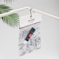
Village11factory Makeup Packaging
-
A corporate brochure for a web solutions company
-
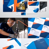
PRORIL Brand Design
-
Severance Han Implant Clinic
-
the beginning of Korean Celebration, Society M
-
2017 Gong Yoo Live 'Make A Wish' Concert Poster
-
2PM CONCERT '6Nights'
-
workshop boardgames
-
Nebula
-
Kia Niro App
-
H-Point (HP) and Mind Point (MP)
-
Isn’t it great to be Alive!
-
Moérie - Beauty Care
-
Promes Brand Design
-
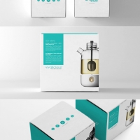
China Tea Branding & Packaging Design
-
Holly II Restaurant Brand Identity
-
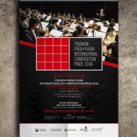
Brand Identity Younghi Pagh-Paan International Composition Prize
-
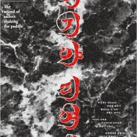
Eogiya diyeocha
-
Frame in Winter
-
From scratch-the design of the exhibition
-
Hidden Cliff Hotel & Nature Brand Design & Identity
-
KAOHUO Logo
-
Malaysian Festive Packaging Collection
-
Parents-Kids Storytelling Handwash Bottle
-
SounAD FAN
-
the eyes
-
Cang Inn
Designed by sketchbooks.co.kr / sketchbook5 board skin

