EXHIBITION
Yoo Beer
| Country | Chinese Taipei |
|---|---|
| Year | 2023 |
| Award | WINNER |
| Client | Yoo Beer |
| Affiliation | Union Atelier |
| Designer | Weiche Wu, Jiasin Jhang, Haojun Wu |
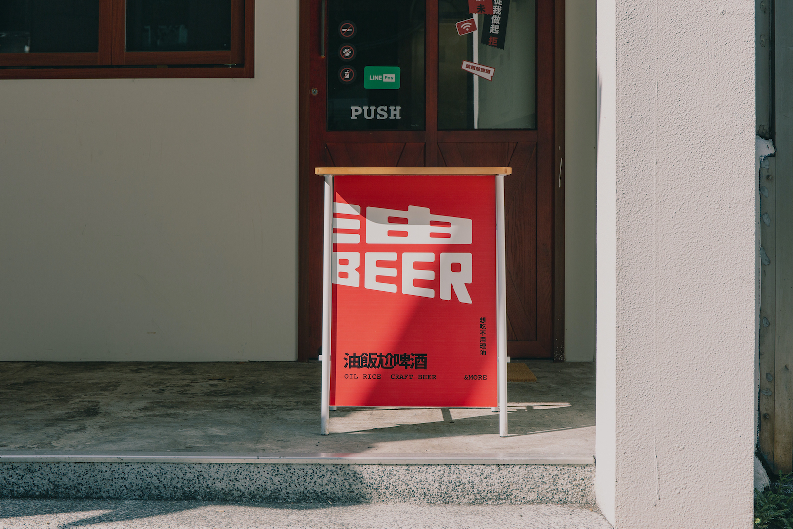
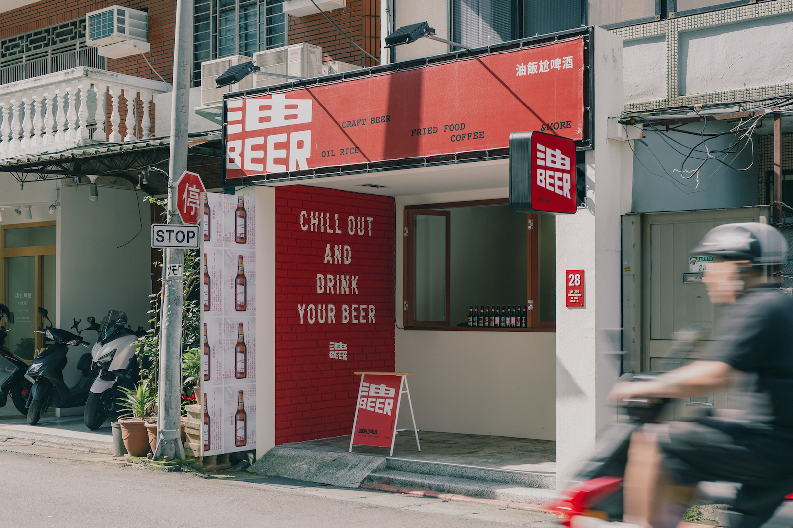
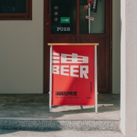
| Description(English) | YOO BEER is a restaurant brand of oil rice and beer. The distinct oil rice and carefully brewed beer create a Taiwanese flavor in the combination of food and drink, representing the inseparable relationship between the two. Thus, the perfect ratio of 1:1 was used as the core concept in the logo design, deconstructing and reconstructing the brand name into the imagery of oil rice and beer. This symbolizes how oil rice and beer complement each other as the main characters, and usage scenarios, creating different forms for the logo representing oil rice and beer respectively, guiding the audience to associate the brand visually. |
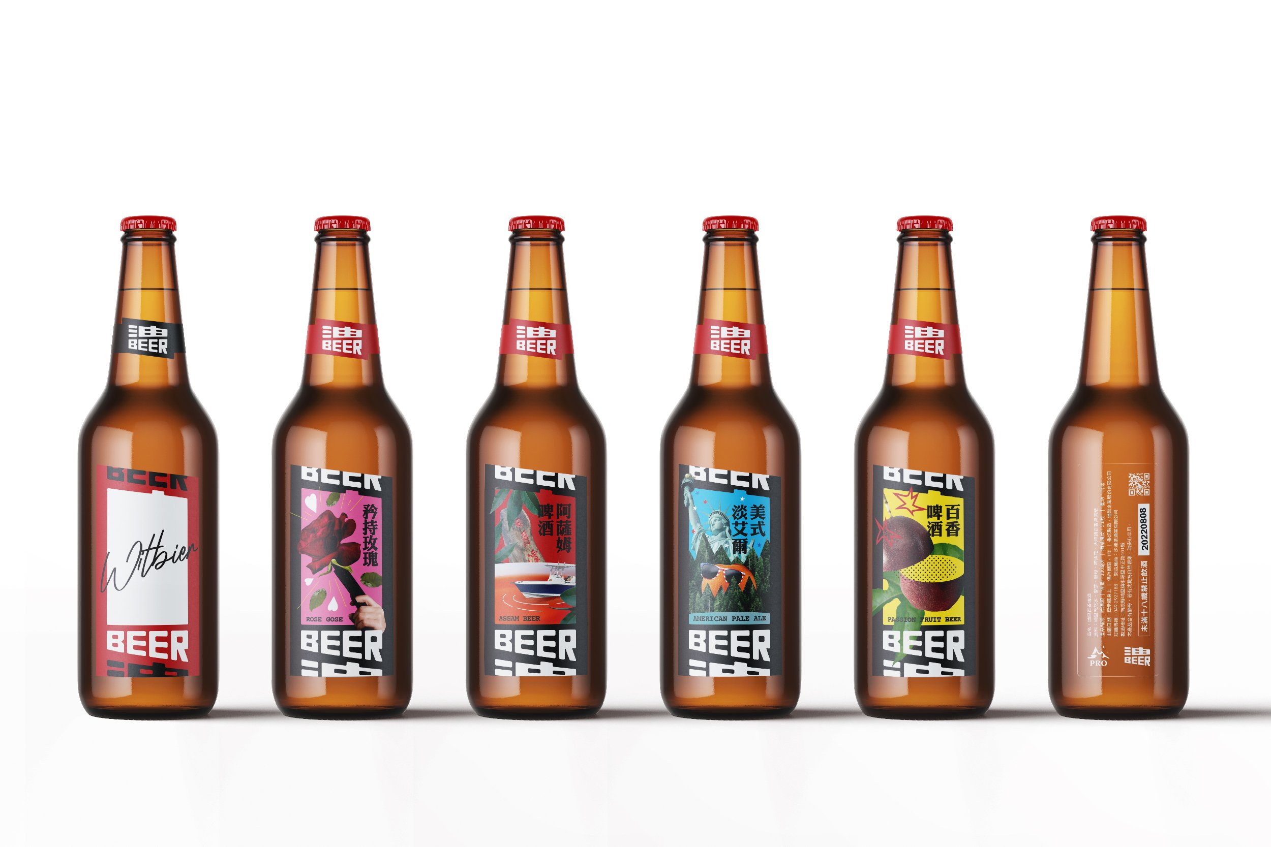
| Description(Native) | 1:1的完美比例,少了誰都不完美的存在 粒粒分明的油飯以及嚴選好水釀造的啤酒,組成了充滿台味的飲食組合,更代表了兩者之間密不可分的關係。因此在標誌設計中將1:1的完美比例作為核心概念,將品牌名稱油BEER轉化為油飯與啤酒的意象進行解構與重組,象徵了油飯與啤酒互為主角且相輔相成、少了誰都不完美的存在。在標誌的型態變化中,也考量了不同的使用情境,特將標誌區分出屬於油飯以及啤酒的不同型態,在視覺上引導觀者進行聯想。 除此之外,基於油飯在辦桌文化中所代表的象徵性,在品牌的視覺語彙中也將辦桌文化進行延伸,發展出大圓桌等元素進行應用並設計出系列主視覺,營造出能產生大眾共鳴的品牌情境;在色彩計畫中選用辦桌文化中常見的紅作為主色調、搭配黑色作為輔色,強化了品牌的文化意涵外,亦使整體視覺效果更為強烈。 在啤酒瓶貼的設計中,採用自由大膽的超現實手法將啤酒口味進行呈現,推出百香、矜持玫瑰、美式淡艾爾、阿薩姆、小麥白啤酒等五款各具特色的視覺設計;最後在餐點包裝上則使用標誌的連續與重複強調了解構與重組的意象。 |
| Website | www.unionatelier.com |
| Positive Comments |




|
-
The Project collaborated by Samlip and Knoted
-
Gloaming Inspiration
-
Treasure of Spring
-
zheng tian wan
-
CLASSIDIA
-
Preface to Lanting
-
Leaflet for Dalgubul Center for Independent Living
-
HONGSAMJIN
-
Worldwide Journey of Banban
-
Zebra Logic Learning Tablet
-
QingLv
-
Yoo Beer
-
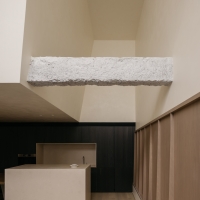
Ethereal Woodland
-
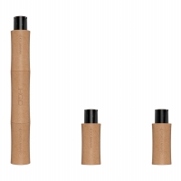
Bamboo Electronic Cigarette
-
Yiwu Peach Blossom Land Villa
-
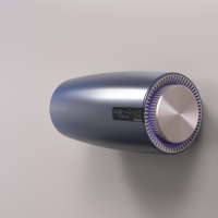
UV Air Sterilizer Virus care
-
Air purifier and sterilizer
-
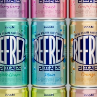
REFREZ
-
DOGYAM
-
MARSA HQ
-
Tranquility Grey
-
New Chinese Moon Series Interior Design
-
Art Toy Cafe
-
The mystery of flowers
-
Gujin Rebranding
-
A Realm of Tranquility
-
The Vintage
-
Porcelain Art Gallery
Designed by sketchbooks.co.kr / sketchbook5 board skin

