
EXHIBITION
SPARROW Branding
| Country | Japan |
|---|---|
| Year | 2021 |
| Award | WINNER |
| Affiliation | Hiroshi Kurisaki Design |
| Designer | Art Director Hiroshi Kurisaki, Image Director shuntaro bird and insect ltd, Photographer Daisuke Abe, Retoucher Akko Noguchi, Ikebana Artist Saihou Ozono |
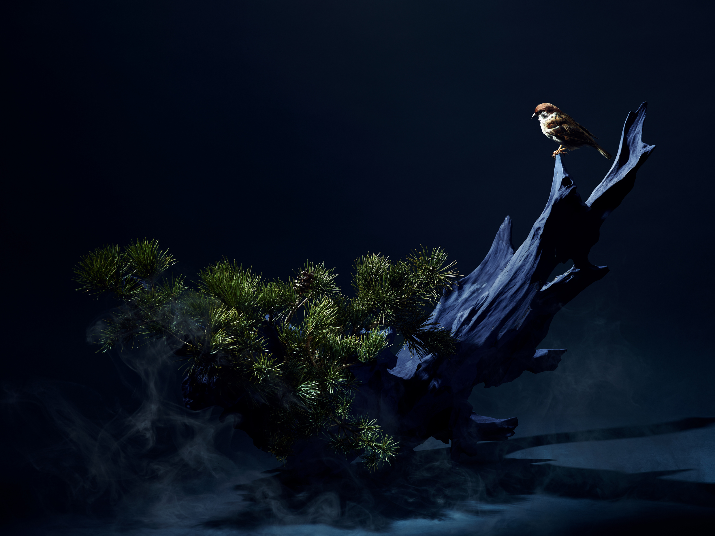
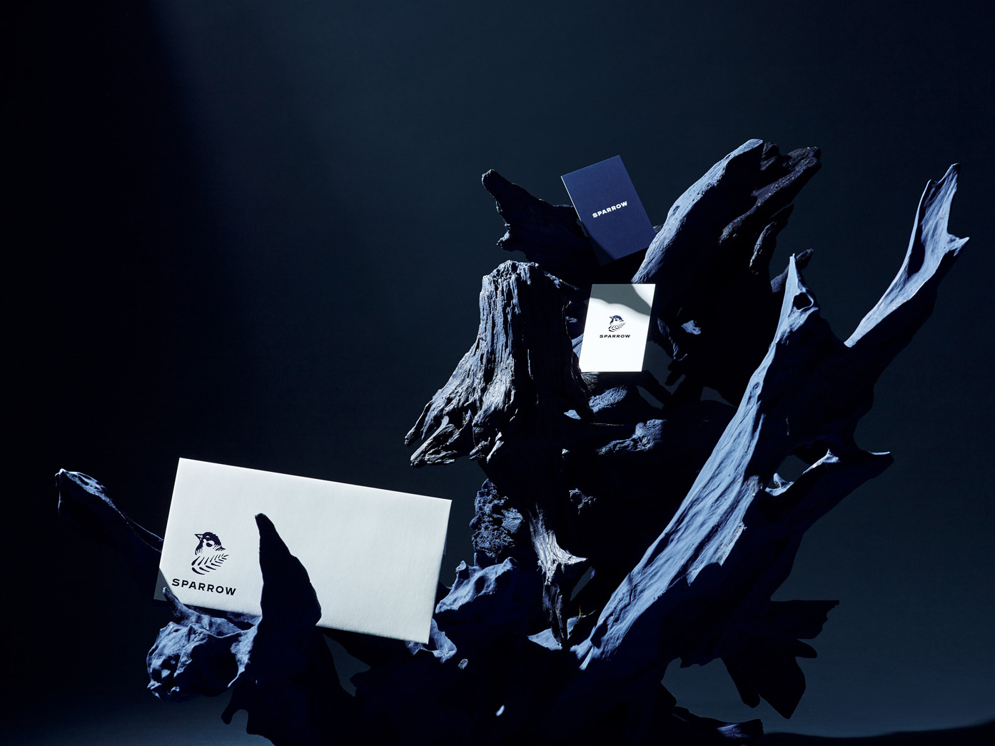
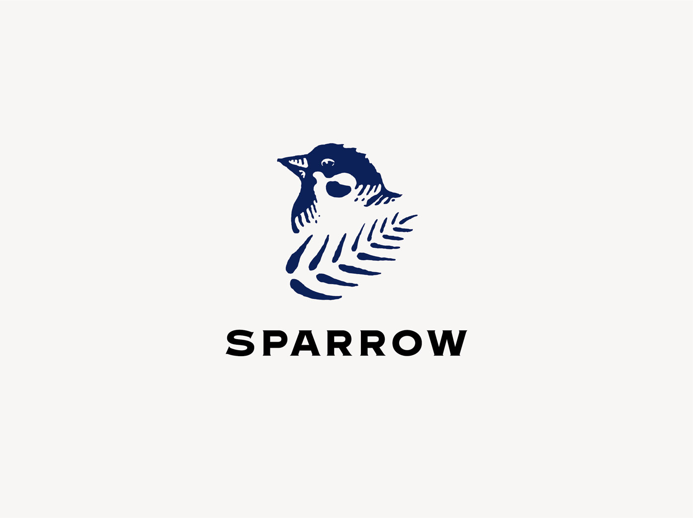
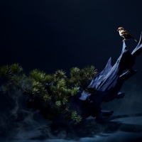
| Description(English) | We designed a brand identity for SPARROW, a Tokyo-based advertising production company founded in 2020. Our design features a sparrow, the origin of the company’s name, with a pine tree as a symbol tree. The idea comes from a story of a pine tree protecting a sparrow from all harm, which inspired the company’s founder. It represents a wish that this new company will be protected against difficulties and steadily move forward. Hiroshi Kurisaki Design Office was responsible for all visual images including logo, main visuals, and all stationaries. |
| Description(Native) | 株式会社SPARROW(スパロー)のブランディングデザインを担当しました。社名のスパロー(雀)と、松の木が雀をあらゆる厄から守ったという、創業者の方がインスパイアされた話を元に松をシンボルツリーとしてあしらいました。色味はロゴ、名刺、キービジュアル全てネイビーで統一し、ブランディングに一貫性を持たせました。 最初の課題として、スパロー立ち上げ時は会社に特定のロゴ、キービジュアルが存在しておらず、まずはロゴを制作することで会社の顔をデザインする所からスタートしました。設立時のメンバーは比較的若い方よりベテランが多かったので、明度の高い明るい勢いのある色味より、落ち着いたベテラン揃いらしい重厚感あるダークネイビーを使用しています。 そしてシンボルツリーの「松」、「ネイビー」、「雀」をブランディングの軸として全要素に展開しています。松のビジュアルも華道家に入っていただき、松自体がアートワークのような存在感を持つよう美を追求しました。 |
| Website | www.hiroshikurisaki.com |
| Positive Comments |


|
-
AI Avatar Communication Application
-
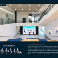
LIFE IS BETTER WITH FORENA FRIENDS
-
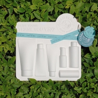
OLIVE YOUNG THANK YOU GIFT
-
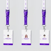
Codeit Identity
-
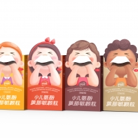
Goodbaby®Cold Medicine Package
-
Fishing TV Channel ID
-
Burning Snow
-
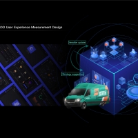
GDO User Experience Measurement tool
-
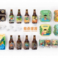
Formosa Cheers
-
S.O.U.L Brand Identity Design
-
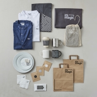
its magic Brand Identity
-
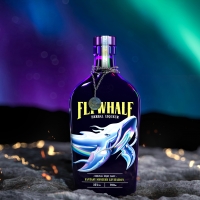
FLYWHALE
-
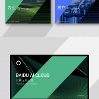
Baidu AI Cloud Communication Design
-
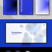
PaddlePaddle Brand Design
-
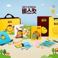
ViSKit
-
COUCOU Rebranding
-
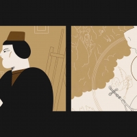
The history of THE LAST JUDGEMENT by Memling
-
THE LEGENDS
-
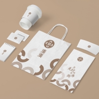
SPARROW Branding
-
Happy Stretching Day
-
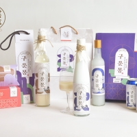
KOREA GOHEUNG YUZA WINE
-
Guunmong
-
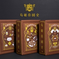
Wutang Empire
-
Wonder Biker
-
HISTO+
-
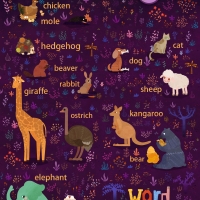
WordUpUp
-
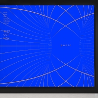
panic: Panic Disorder Seminar
-
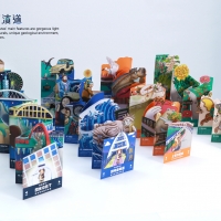
Heterogeneous symbiosis
Designed by sketchbooks.co.kr / sketchbook5 board skin