English

EXHIBITION
Communication
Lugano Region
| Country | Switzerland |
|---|---|
| Year | 2019 |
| Award | GOLD WINNER |
| Client | Ente Turistico del Luganese |
| Affiliation | Caselli Strategic Design |
| Designer | FabioCaselli |
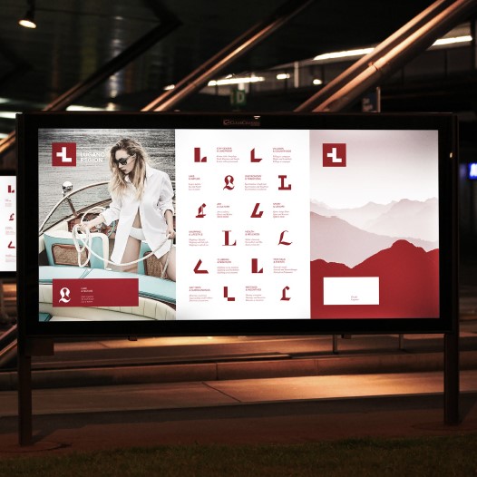
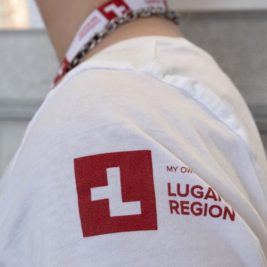
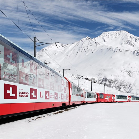
| Description(English) | With its mix of cultures, Lugano represents a very atypical destination within Switzerland: palm trees, olive oil, Mediterranean weather and cuisine can all be found in a safe, quiet and efficient Swiss environment. The brand essence that emerged from this context is "differently Swiss" which has been translated visually in an alteration of the Swiss flag to form the letter "L" of Lugano. A graphic system that aims at displaying the variety of the regional offer has been conceived by designing for each category a specific font in order to give each time a different connotation to the letter “L” of Lugano. |
| Description(Native) | With its mix of cultures, Lugano represents a very atypical destination within Switzerland: palm trees, olive oil, Mediterranean weather and cuisine can all be found in a safe, quiet and efficient Swiss environment. The brand essence that emerged from this context is "differently Swiss" which has been translated visually in an alteration of the Swiss flag to form the letter "L" of Lugano. A graphic system that aims at displaying the variety of the regional offer has been conceived by designing for each category a specific font in order to give each time a different connotation to the letter “L” of Lugano. |
| Website | www.caselli.ch |
| Positive Comments |


|
-
Yu Zhong Bu Tong Brand Identity
-
Ji Shi Dao Herbal Tea Packaging Design
-
Still Life Still LIves
-
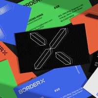
BorderX Rebranding
-
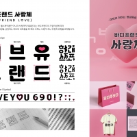
BODYFRIEND Key Value Font Pack
-
Midea smart blue
-
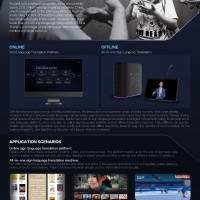
Xiling AI Sign Language Platform
-
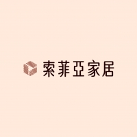
Suofeiya home collection Visual Identity
-
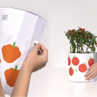
Columbia 75 degree incline in Package
-
443 GARDEN Art Pattern
-
Bamboo Slips Liquor
-
NEWBLE Watch balanced world
-
Korea 195 Grapefruit Biscuit Packaging Design
-
NYGDESIGN Brand Design Upgrade
-
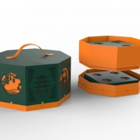
Moon Cake Box
-
Post Morden Life


Designed by sketchbooks.co.kr / sketchbook5 board skin