
EXHIBITION
7eleven New Wave Store
| Area | Korea |
|---|---|
| Year | 2025 |
| Award | WINNER |
| Client | 7eleven Co., Ltd. |
| Affiliation | korea Seven Construction Interior Team |
| Designer | Kim Hong Chul |
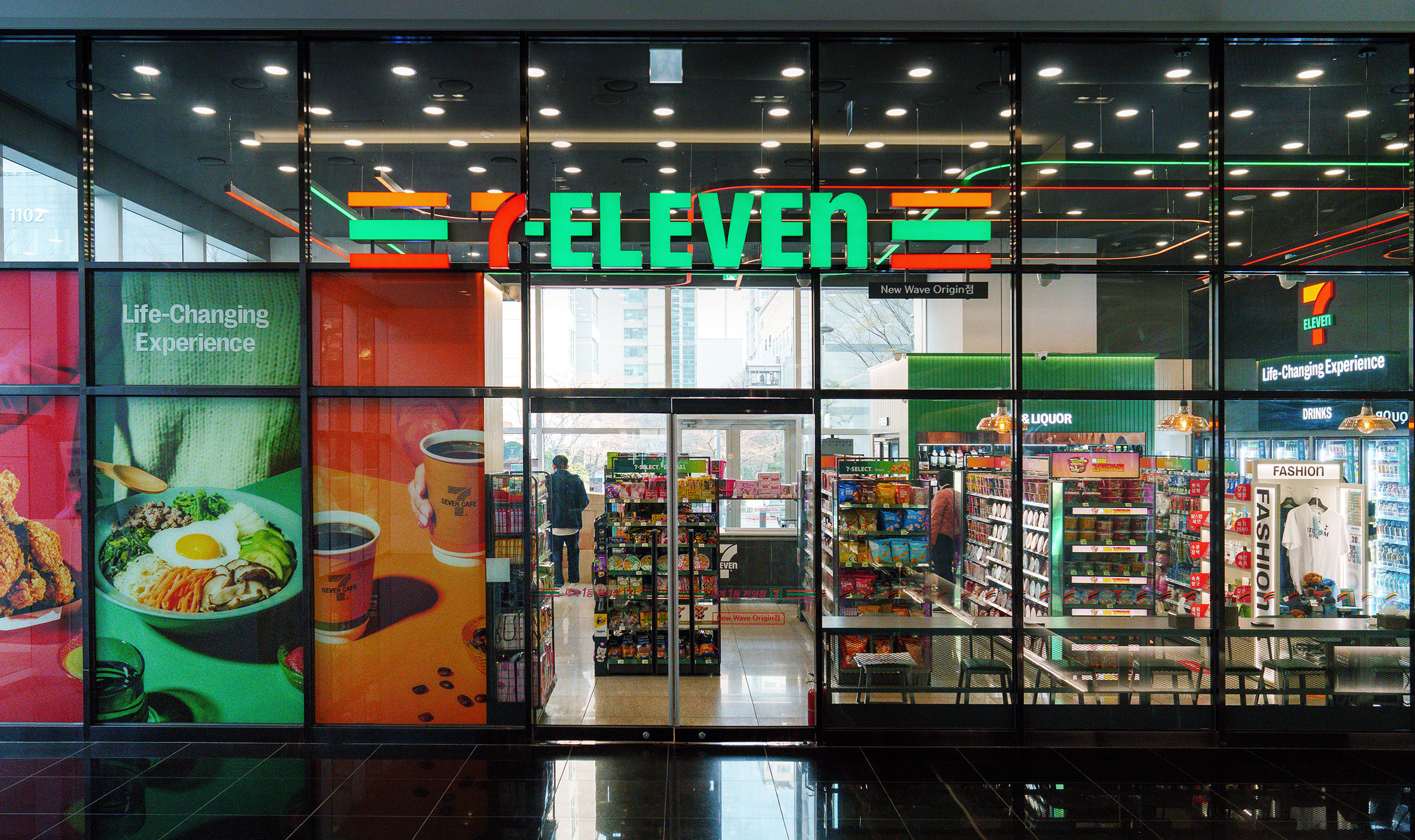
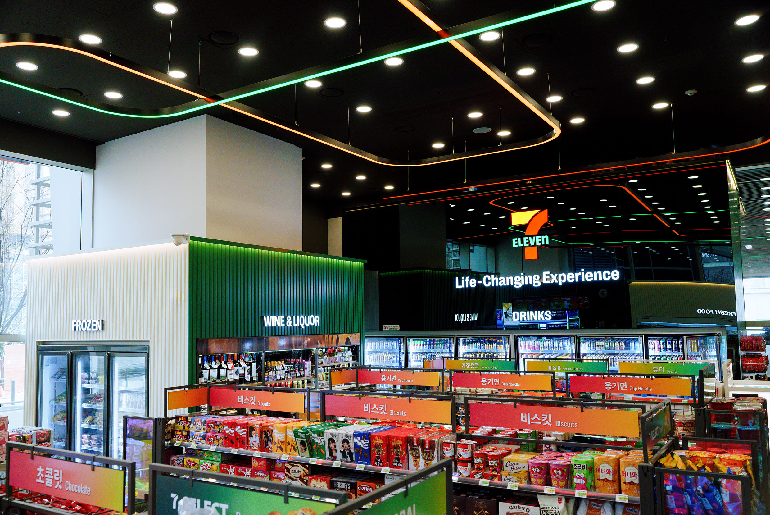
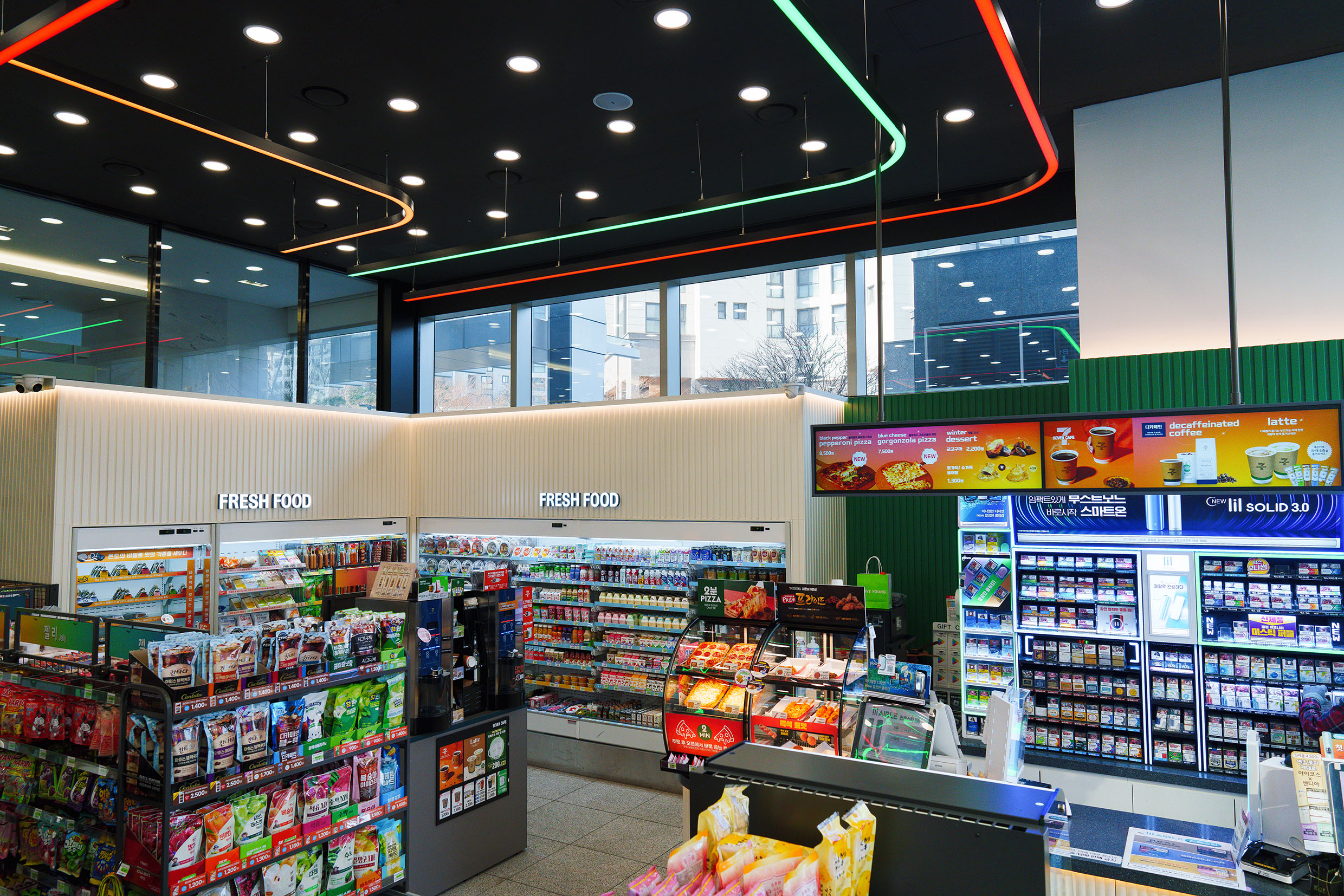
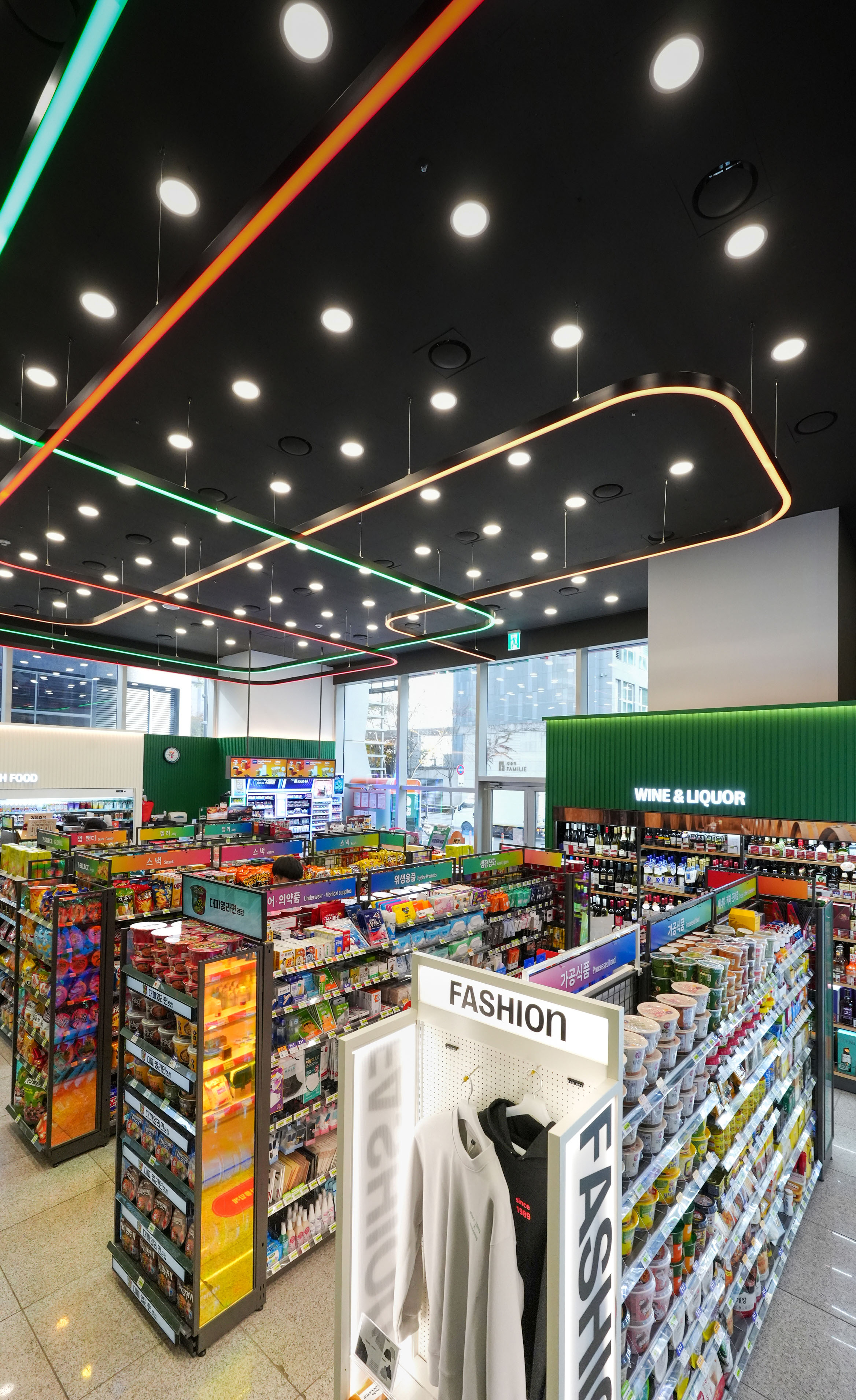
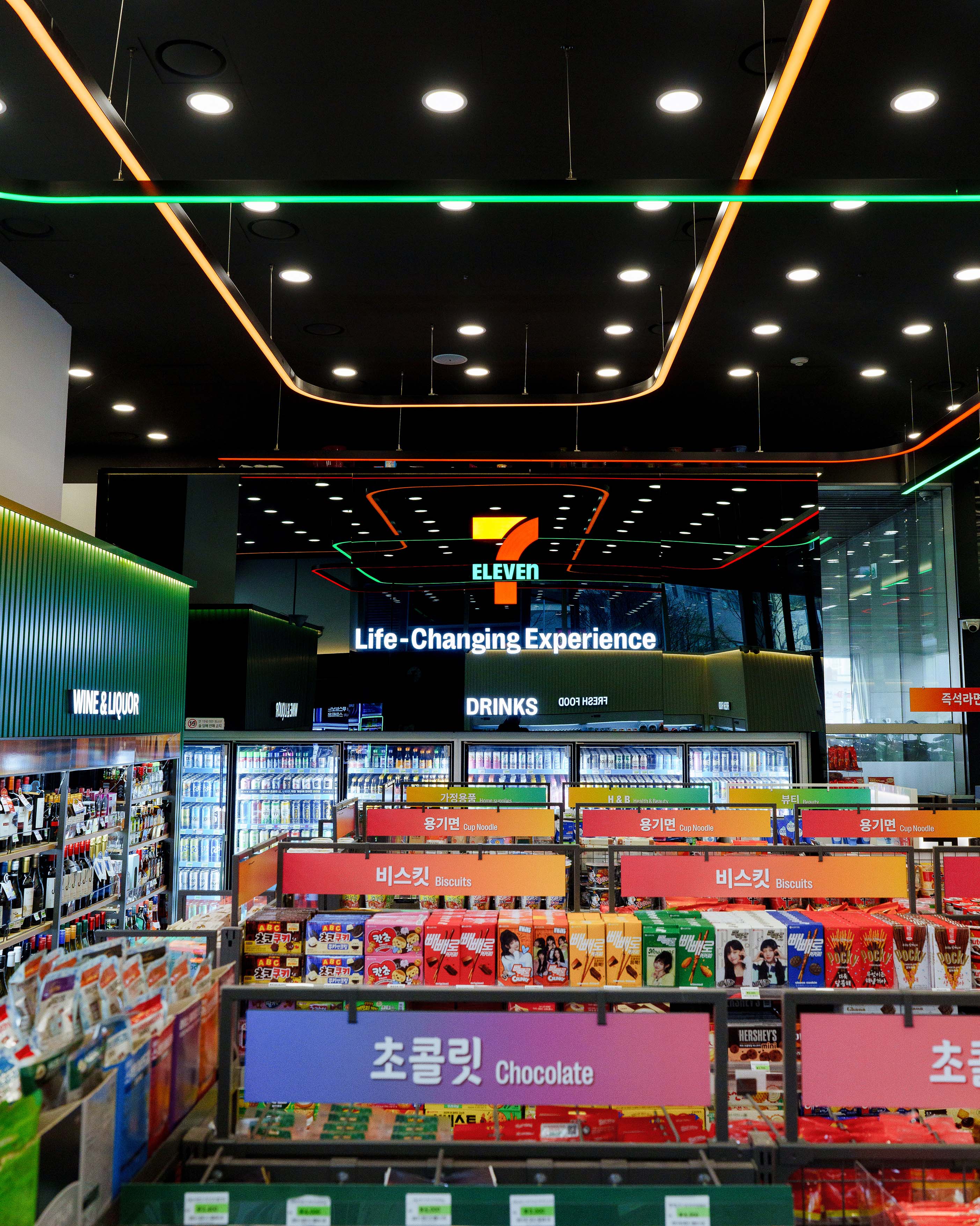
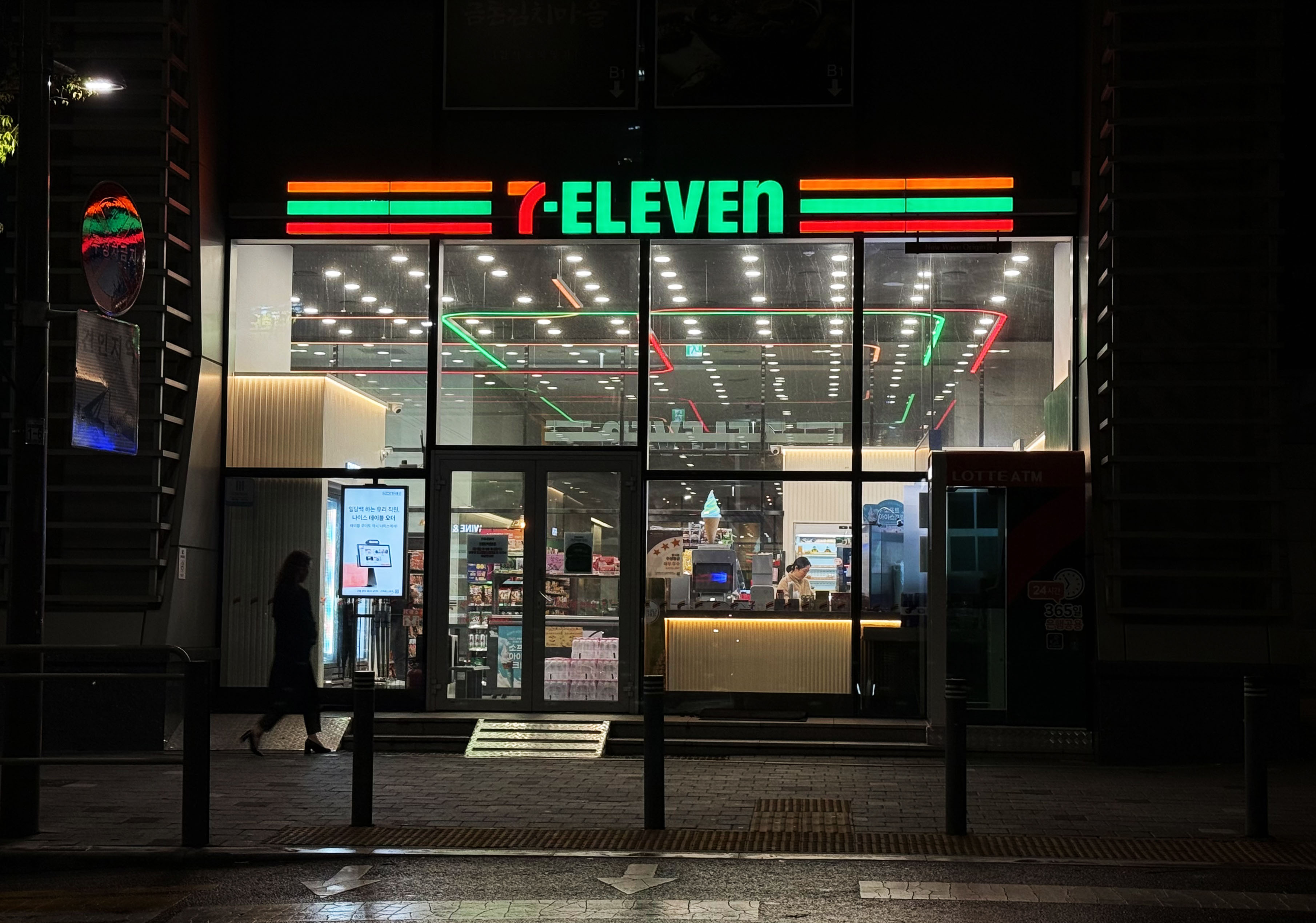
| Description(English) | The concept of 7-Eleven New Wave Store’s interior design is ‘POP Color’. It is using seven trendy key colors that are cute and fun, reminiscent of gift stores also reinterpreting lifestyle and separating each space. Among them, the signature colors orange, green and red are expressed as sign lighting, which not only conveys visual content, but also provides the effect of strongly planting 7-Eleven brand image.The store walls maintain a balance between the refreshing atmosphere of the color white and the calming color of green and a sophisticated esthetic is added with a black-colored wall which has used a reflective material as a focal point. |
| Description(Native) | 7-Eleven New Wave Store 인테리어 디자인 컨셉은 'Color POP'입니다. 마치 유럽의 팬시점을 연상케 하는 Cute하고 Fun한 7가지의 트렌디한 Key Color를 활용하여 라이프스타일을 재해석 및 공간을 구획하였습니다. 그중에서도 시그니처 Color인 Orange / Green / Red 를 사이니지 조명으로 표현하여 시각적인 콘텐츠로 정보를 전달하는 것은 물론, 사람들의 시선을 끌고, 나아가 브랜드 이미지를 강력하게 심어주는 효과를 제공합니다. 점포 벽면은 White의 산뜻한 분위기와 Green의 평온한 Color로 균형을 유지하고 포인트로 Black 반사 벽면을 통해 세련미를 더 하였습니다. Stripe 인테리어 마감재는 간소한 선의 형태로 Modern & Simple 분위기를 연출하고. 따뜻한 색조의 간접 Lighting 요소는 아날로그적인 감성과 고유하고 매력적인 분위기를 조성합니다. |
| Website | www.7-eleven.co.kr |
| Positive Comments |


|
| Judging Comments | The 7-Eleven New Wave Store adopts a ‘POP Color’ concept, using seven trendy hues to create a fun, lifestyle-inspired retail space. Signature orange, green, and red appear in sign lighting to strengthen brand identity. It was praised for delivering a refreshing yet sophisticated atmosphere while enhancing the store’s visual impact. |
-
Child Fraud Awareness Program
-
ERNO Brand Identity Design
-
Hima cafe
-
STUDIO X Plus U Branding
-
Seoul Construction Site Fence Design Guideline
-
Public Design Project Incheon Camping Operation
-
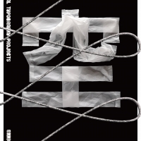
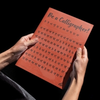
Emptiness is Form - Typography Exhibition
-
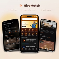
Hive Match
-
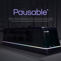
Pausable
-
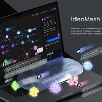
IdeaMesh
-
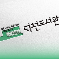
Brand Identity Development of Deokcheon Library
-
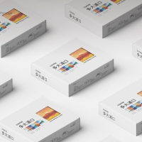
Dadaepogu Coffee Package Design of Saha Center
-
the typeface of Yeongwol County
-
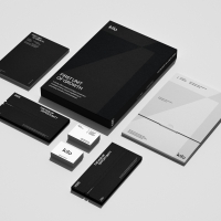
KILO Corporate Identity Design
-
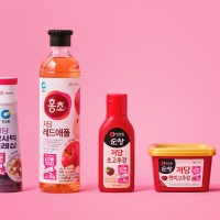
Chungjungone low tag design system
-
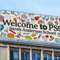
Public School 9 Brand Identity
-
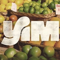
Yim Coconut Water Brand Identity and Packaging
-
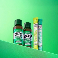
CONDITION
-
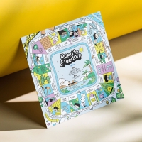
Modern Slavery Awareness Education Board Game
-
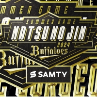
Japan pro baseball team ORIX BUFFALOES summer game
-
ERNIE Branding Visual Design
-
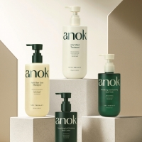
Anok
-
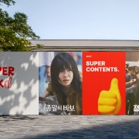
STUDIO SUPERPICK BRANDING
-
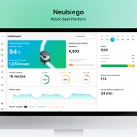
Neubiego
Designed by sketchbooks.co.kr / sketchbook5 board skin