EXHIBITION
KOKO Store
| Area | Taiwan |
|---|---|
| Year | 2017 |
| Award | WINNER |
| Client | 國泰世華銀行/Cathay United Bank |
| Affiliation | Chen Interior Design |
| Designer | Cheng-Chen Chen |
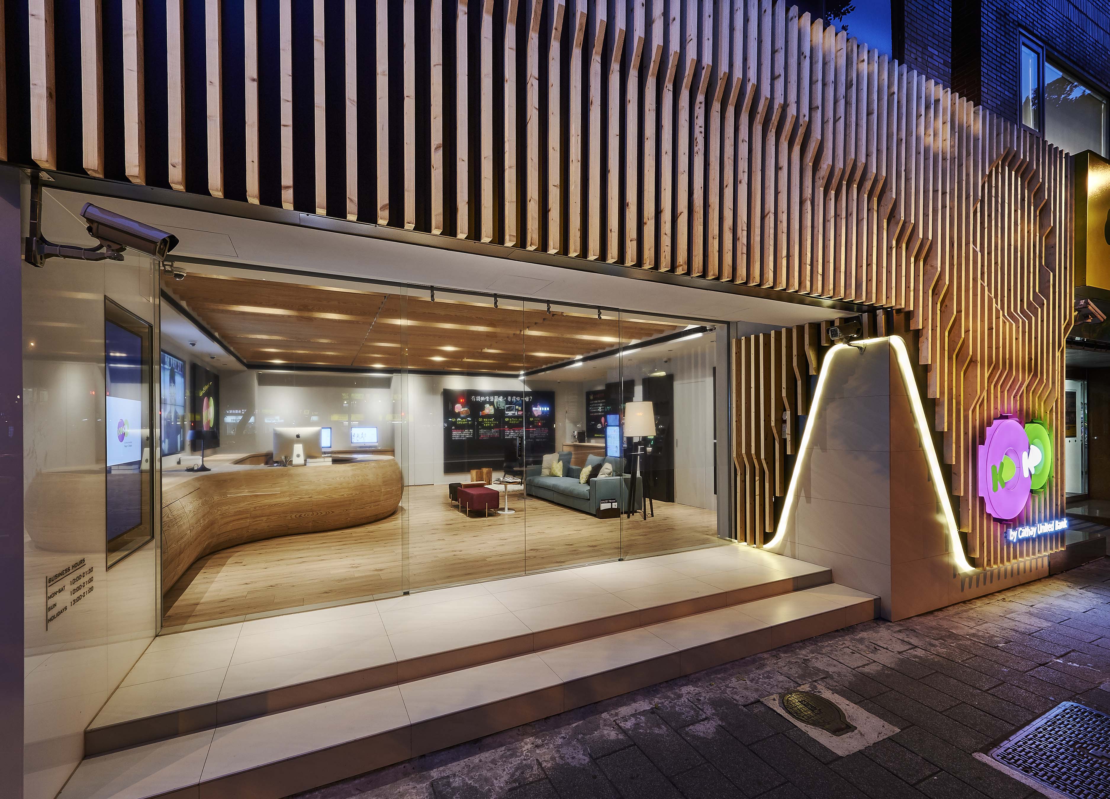
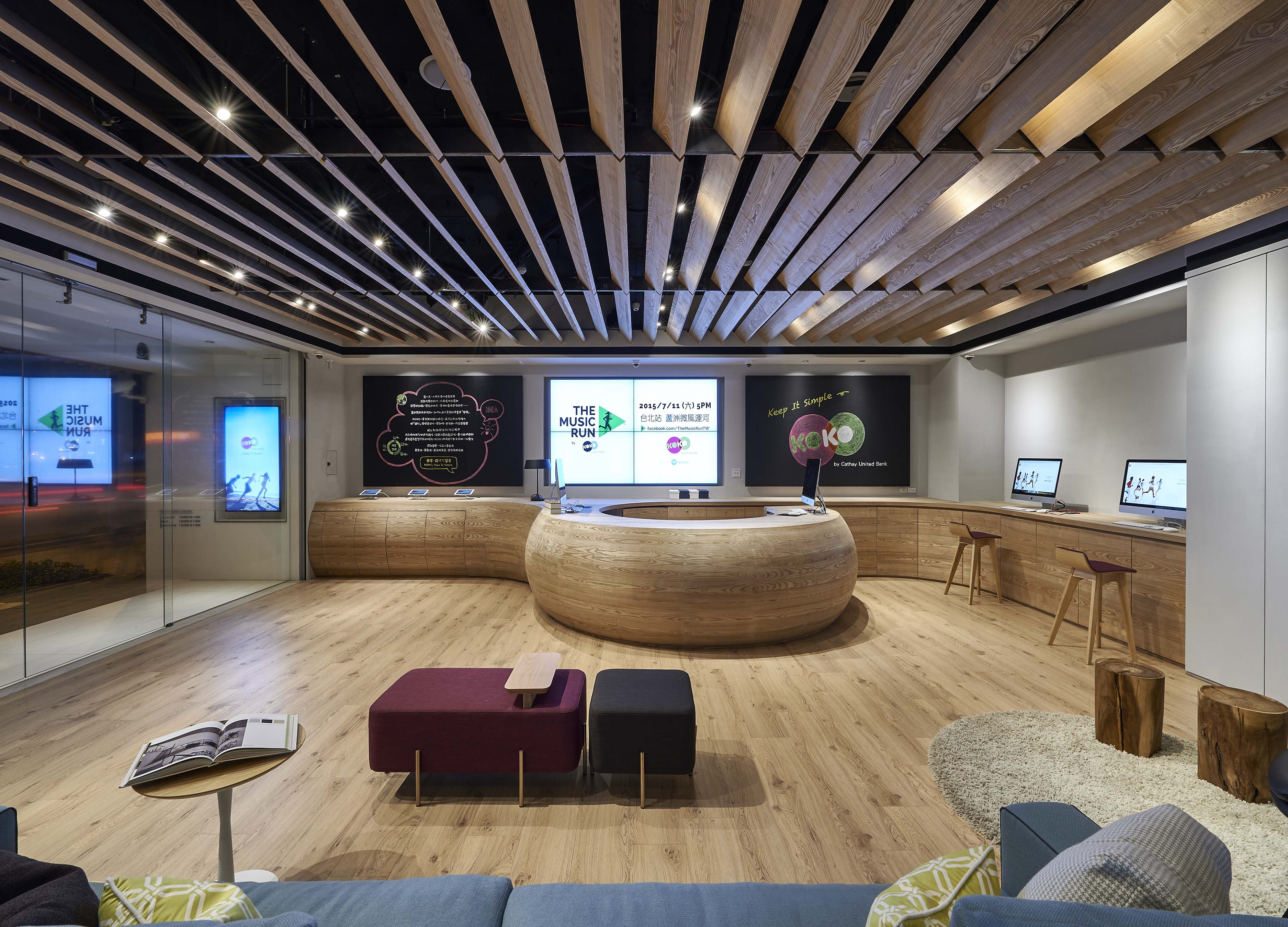
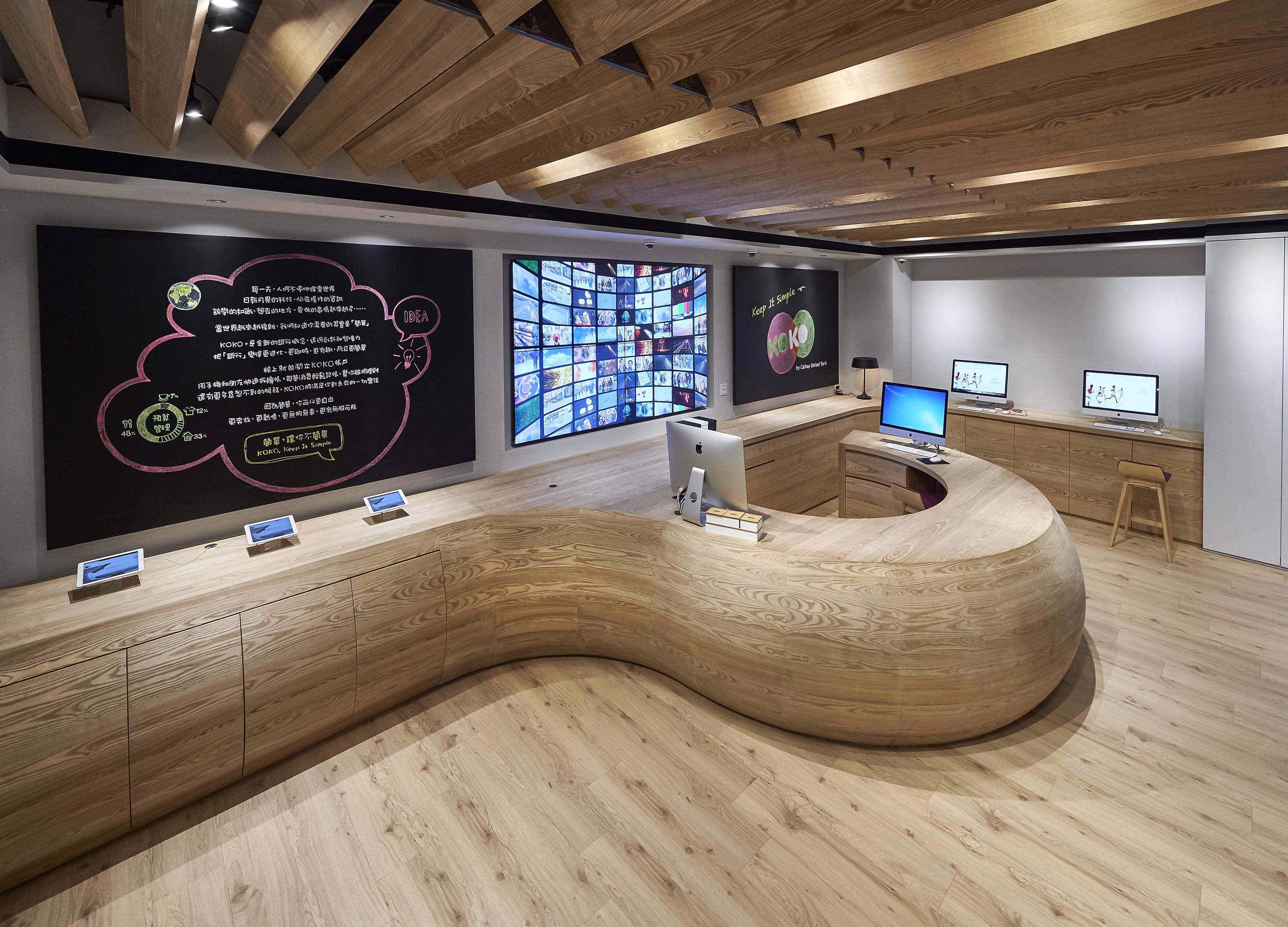
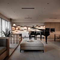
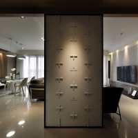
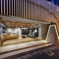
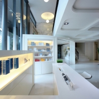
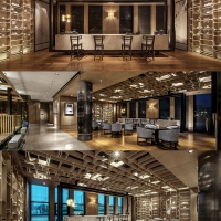
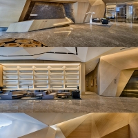
| Description(English) | We are trying to break the existing impression of bank, extending he levels of the space and the elimination of cold color which relates to the atmosphere in a hospital waiting room. The point of this design is making people to feel at home. There are no complex decorations but trying to return to the most comfortable space. We use a lot of wood factor in this design, the atmosphere of Taiwan's banks in the past is always passive for customers, but KOKO digit bank use the devices which are easier to use for customers. And we replace traditional marble countertops to wood counter, the lower counter for eliminating the distance. |
| Description(Native) | 試圖打破既有銀行的使用印象,將空間層次延展及消除像在醫院候診室的冰冷氣氛,開放的空間形成,透過介質的規劃,來劃分不同的機能場域,磁性的黑板使用lofy風格的字樣設計,在沉穩的空間調性中,增加了詼諧意趣。 來到銀行就像在家的感覺,是此次設計的重點,捨棄了繁複的裝飾,嘗試將銀行的設計回歸到最舒適的空間,在設計上採用木頭為主,柔化生硬的氛圍,以往台灣的銀行總是以被動的方式供消費者使用,KOKO數位銀行採用所有設備能容易使用為主,傳統的櫃檯去掉冷調性的大理石檯面選用實木櫃檯,降低櫃台高度消除距離感。開放的等候區有著舒適的沙發,讓顧客能夠體驗到在理財中心的舒適享受,另外,運用了投影技術,讓銀行資訊24小時不間斷的放送。 |
-
SIP TEA IS ELEGANT
-
THE FOUR SEASONS
-
DOMA-Lobby Stretched
-
Embrace
-
Jenga Windows
-
KEIUN BUILDING
-
KOKO Store
-
MARU
-
PISSARRO SPA
-
POETIC LANDSCAPES
-
Pure
-
Secret Garden
-
Skynet
-
Taichi
-
Times Ocean Club House
-
Vibration
-
YI-XI-ZHI-JIAN (The space of Art therapy)
-
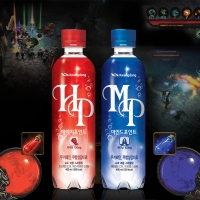
H-Point (HP) and Mind Point (MP)
-
Isn’t it great to be Alive!
-
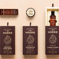
Moérie - Beauty Care
-
Promes Brand Design
-
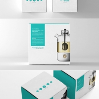
China Tea Branding & Packaging Design
-
Holly II Restaurant Brand Identity
-
Brand Identity Younghi Pagh-Paan International Composition Prize
Designed by sketchbooks.co.kr / sketchbook5 board skin

