EXHIBITION
Space
Linear Space
| Area | Taiwan |
|---|---|
| Year | 2018 |
| Award | WINNER |
| Affiliation | X-Line Design Co ., Ltd. |
| Designer | ChihChungShen |
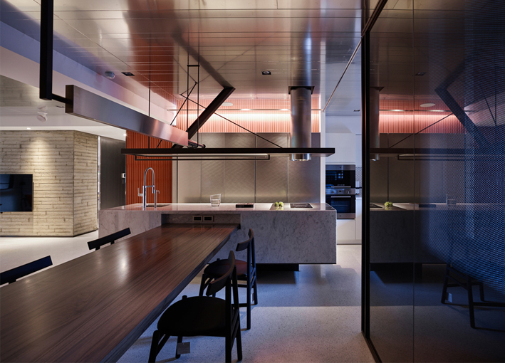
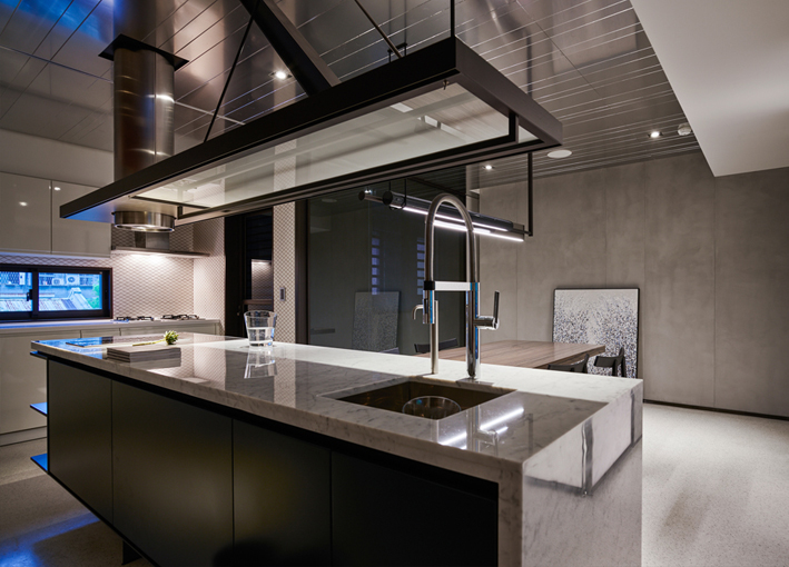
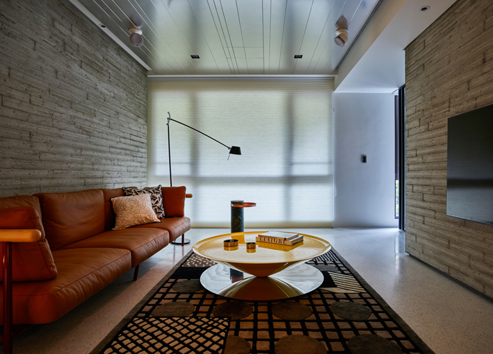
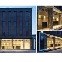
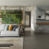
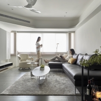
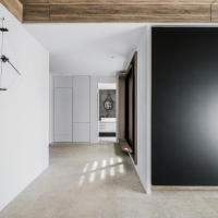
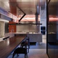
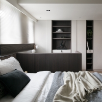
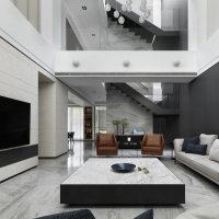
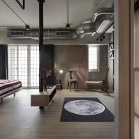
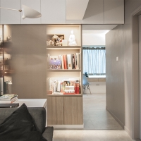
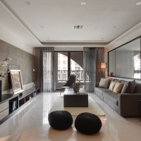
| Description(English) | This case is located in densely populated downtown Taipei, and transitional space was used as its design concept. Regarding its visual guidance, a long banded area was created to enhance its layers of visual depth to create a modern feature of simplicity. By adding mass in the central area, the designer designed a U-shaped flow to provide a visual guide from the public to the private area. The kitchen & dining area becomes a transition between public and private places to satisfy the owner’s functional need, and a moveable large sliding door was used to blur the boundary between spaces. |
| Description(Native) | 本案坐落於台北市中心,地狹人稠,各建築間距近。為釋放狹窄都市的緊繃感,以過渡空間為設計概念,藉由大面積採光窗導入空間,場域以開放式設計,將整體空間平面,畫出X軸線貫穿,區分為公共空間、半私密空間,以及隱私空間,在視覺動線上呈現出長型帶狀區域,增加視覺景深層次,造出明亮、簡潔的現代摩登風格,也舒緩原本多隔間格局所造成的狹小擁擠觀感。由於屋主曾於時尚產業工作,也非常喜好烹飪廚藝,希望新屋的餐廳區域能提供自己下廚並與親友社交互動的機能。在設計元素上,設計師也將這樣的生活素養引導入空間內,將廚房餐廳區域作為公開與私密間的過渡場域,滿足機能上的需求,同時為凸顯獨特美學品味,在沙發背牆與電視主牆上,用比較繁複的工法讓混凝土呈現材質特有的肌理紋路,或是透過早期的磨石子地坪與鋁板天花板的上下對比,產生視覺的反差,製造衝突美學的平衡。居住者最重視的廚房區,採用活動式大隔屏開關,虛化空間界線,也更容易引導光影對流,並加入中島與線性雕塑結構,甚至是壁面的立體角磚,呈現出充滿力與美的建築雕塑線性美學。設計師透過將中心區域打造量體,規劃U字型動線循序引導三大區域,也讓量體的三個面向依序引導視覺動線從公共延伸到隱私。多樣化材質的混搭美學與空間整體的動線重組,輔以頗有雕塑意味的家具增添藝術氣息,在台北繁華的街弄中,以本質美學再度演繹了屋主對居家的獨到生活品味與情感。 |
-
Diameter
-
factory of apparel B
-
Green Life
-
Immaculate white
-
K11 Art Mall
-
Line Composition
-
Linear Space
-
Parkview
-
Primus Hotel
-
Rising sun of song
-
The house of light
-
Zen
-
Just Stay Resort
-
ichiei Branding
-
MUSUBUDON
-
MOMENT GARDEN
-
輕工業風 / LIGHT LOFT
-
Alchemy
-
AIWA nursery
-
Apartment JE
-
Balance and Space
-
Communication space
-
Feast for the Senses
-
Habour Apartment
Designed by sketchbooks.co.kr / sketchbook5 board skin

